Always Been Right Font
Free for personal useAbout
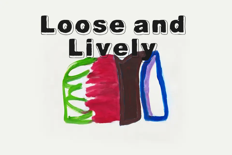
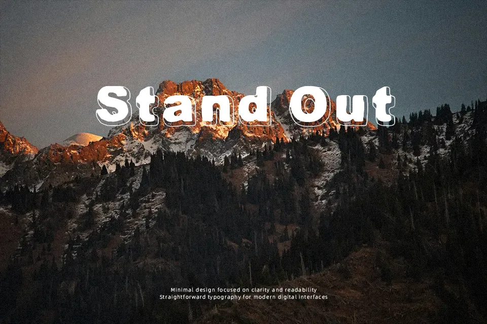
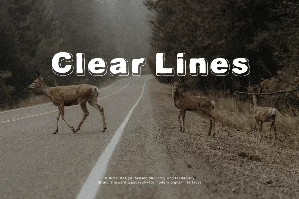
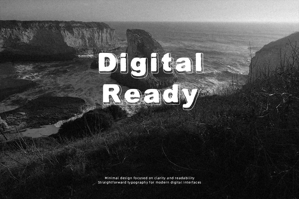
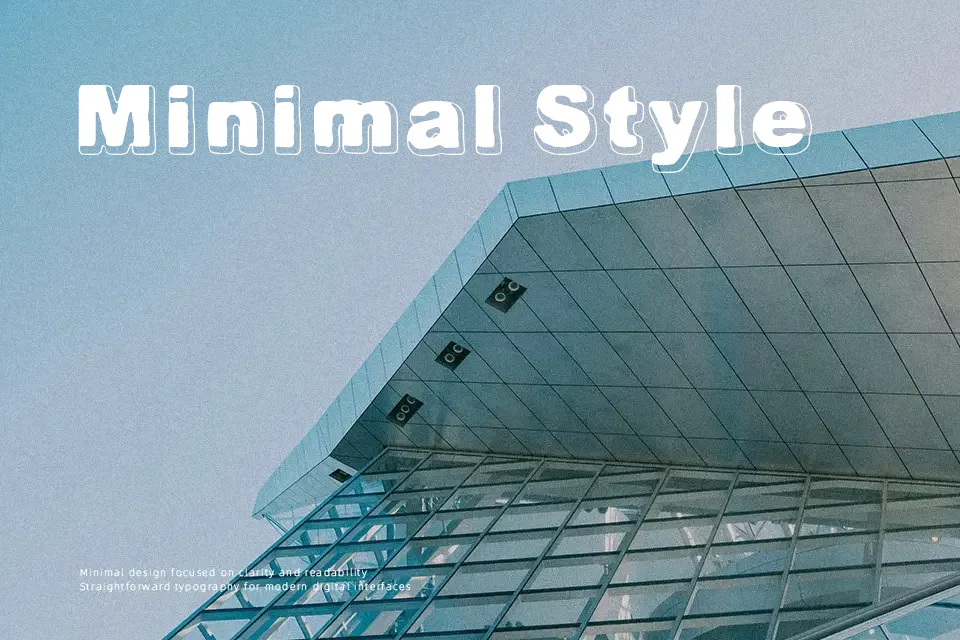
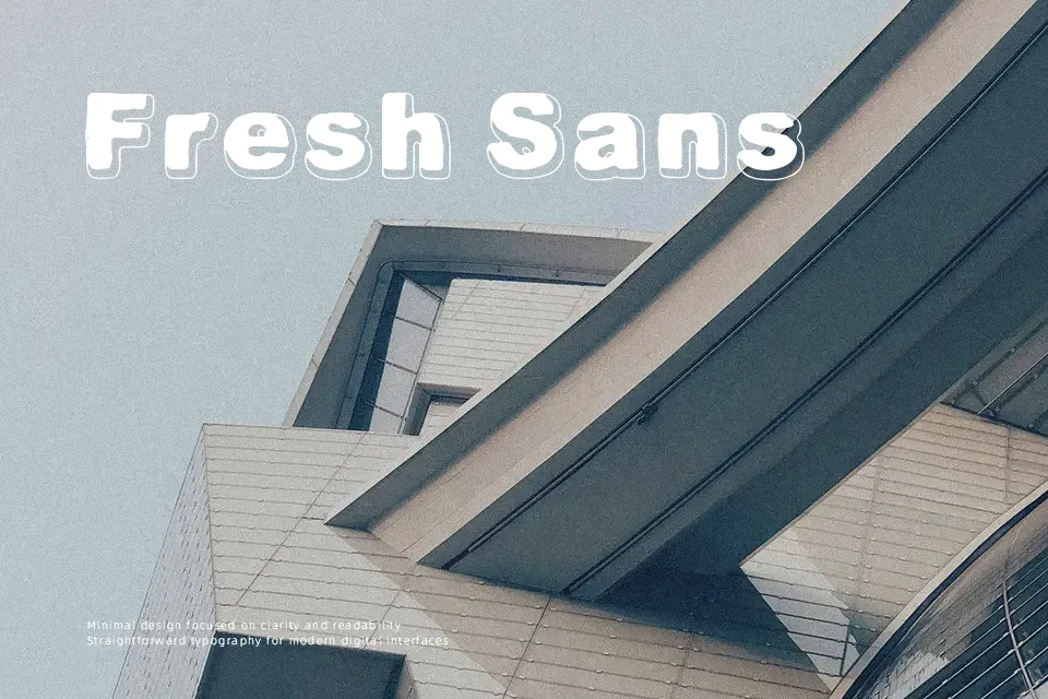
There’s nothing subtle about Always Been Right — and that’s the point. The letterforms are uniformly thick with low stroke contrast, and the built-in drop shadow gives each character immediate depth without any layering work on the designer’s end. That retro poster quality makes it a natural fit for event flyers, carnival-style signage, or a food truck brand trying to stand out at street level. Where it earns real marks is in short, high-impact headline treatments where the sheer weight creates a visual anchor. The limitation worth noting: the monospaced character spacing and shadow density make it poorly suited for anything beyond a few words — long titles start to feel congested, and small-size usage kills the shadow detail entirely.
Best For:
– Retro-themed event posters and concert flyers
– Children’s product packaging and cover titles
– Food truck or carnival-style brand headers
– Short social media graphic headlines
Not Ideal For:
– Body text or multi-line paragraph copy
– Corporate or formal brand applications
– Small-size usage where shadow detail collapses
– Layouts requiring tight, flexible kerning control
Perfect for headline, kids, and logo, with a bold and decorative style.
License
Gallery