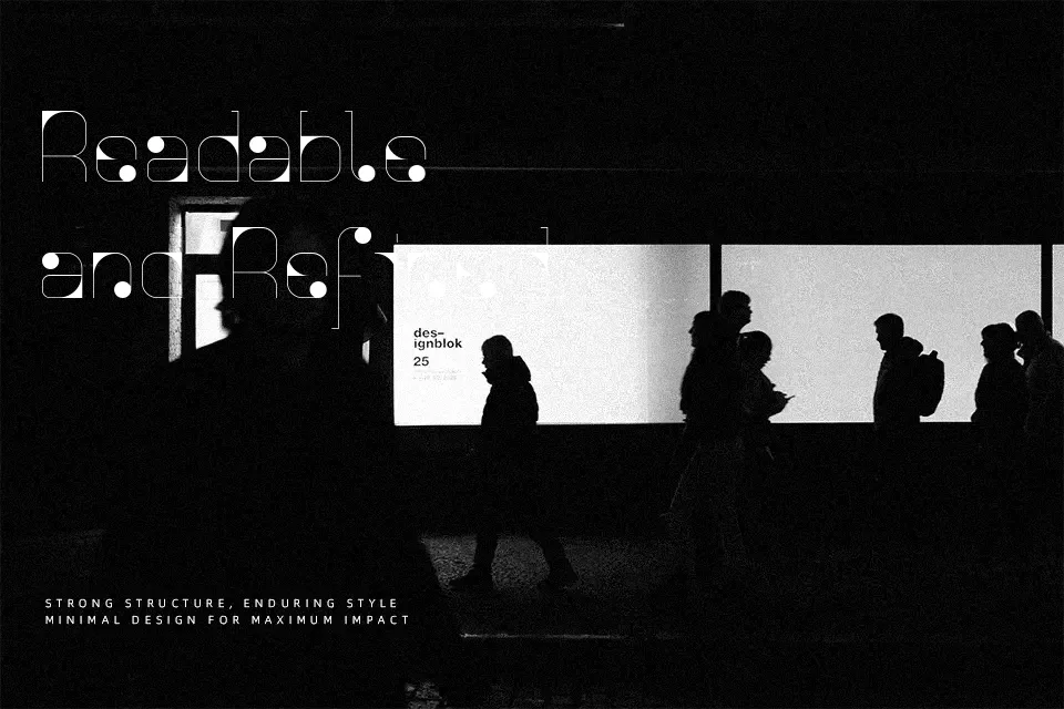
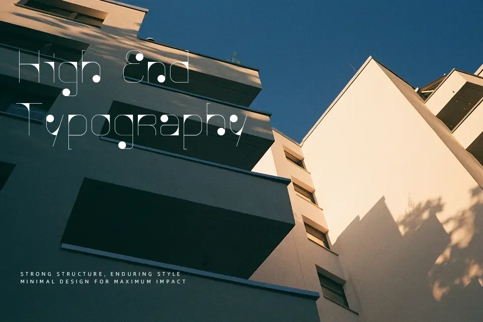
Agnes Serif Font
Free for personal useAbout
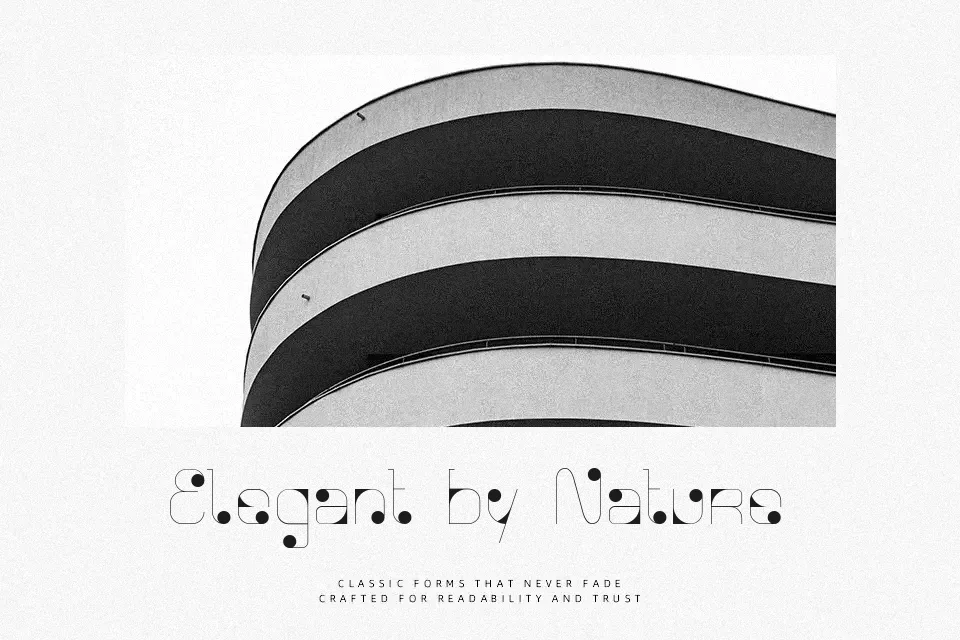
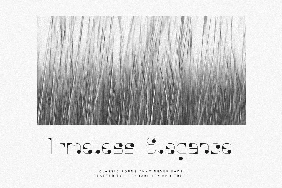
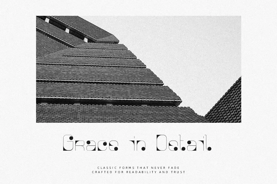
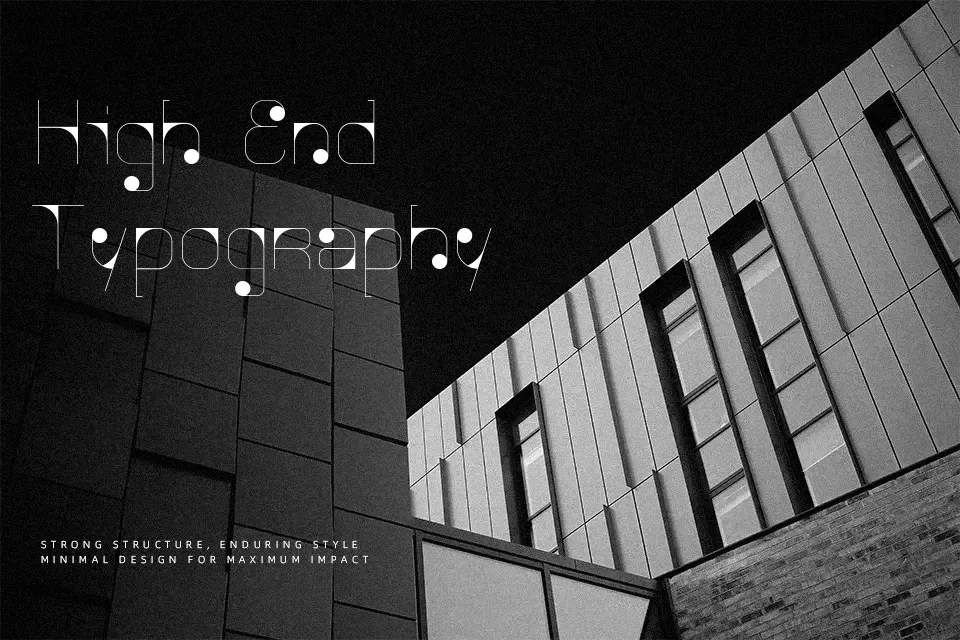
Defined by its clean serifs and moderate stroke contrast, Agnes Serif presents a controlled and traditional structure with steady spacing and readable proportions. The letterforms lean toward a classic editorial aesthetic, making it comfortable for titles, magazine spreads, or branding that requires a composed tone. It performs well in medium-to-large sizes where its details remain visible. However, in smaller digital text or dense paragraphs, it can feel a bit rigid and less fluid compared to more contemporary serif families. It works best when clarity and formality matter more than personality.
Best For:
editorial headlines
book cover titles
branding for boutique businesses
Not Ideal For:
long paragraph text
casual social media graphics
playful children content
Perfect for branding, editorial, and headline, with a classic and serif style.
License
Gallery