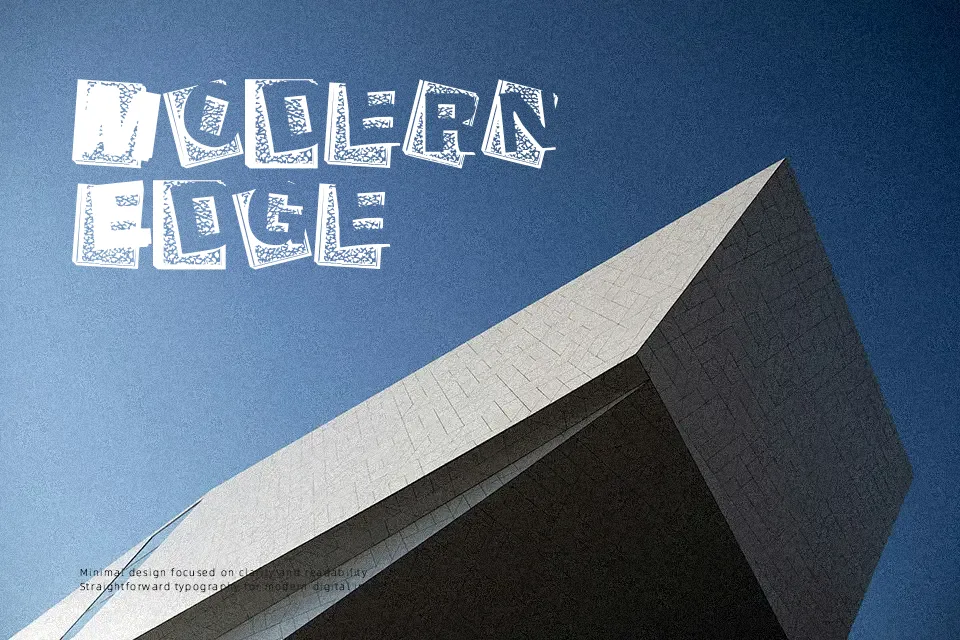
Agenda du Directeur Font
Free for personal useAbout
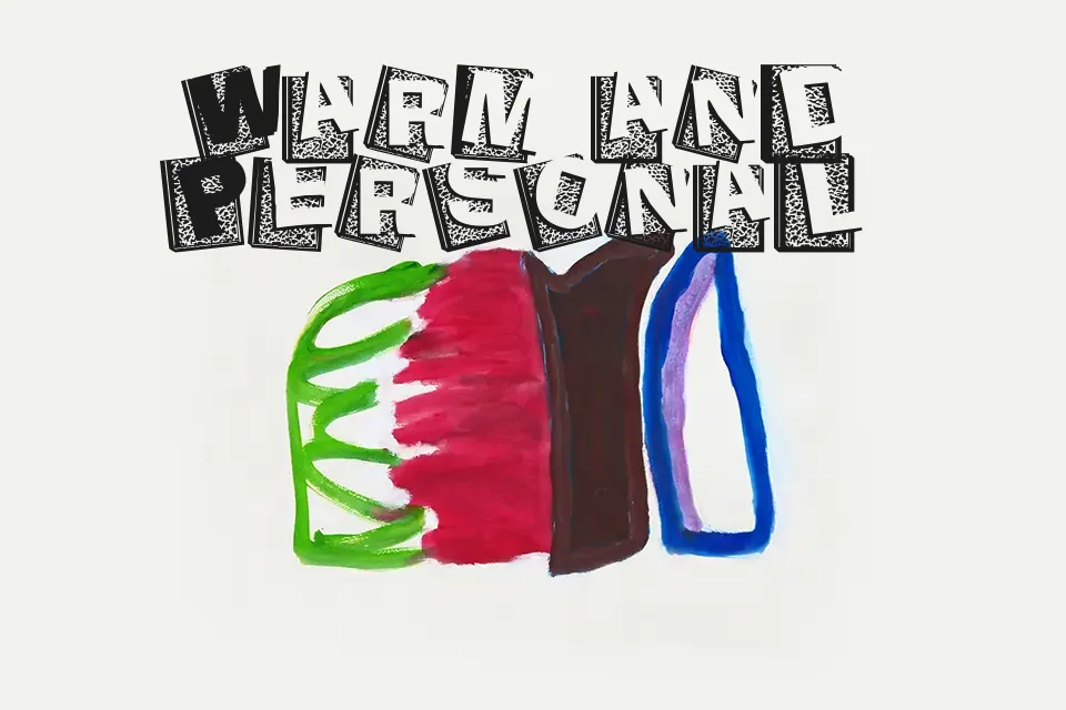
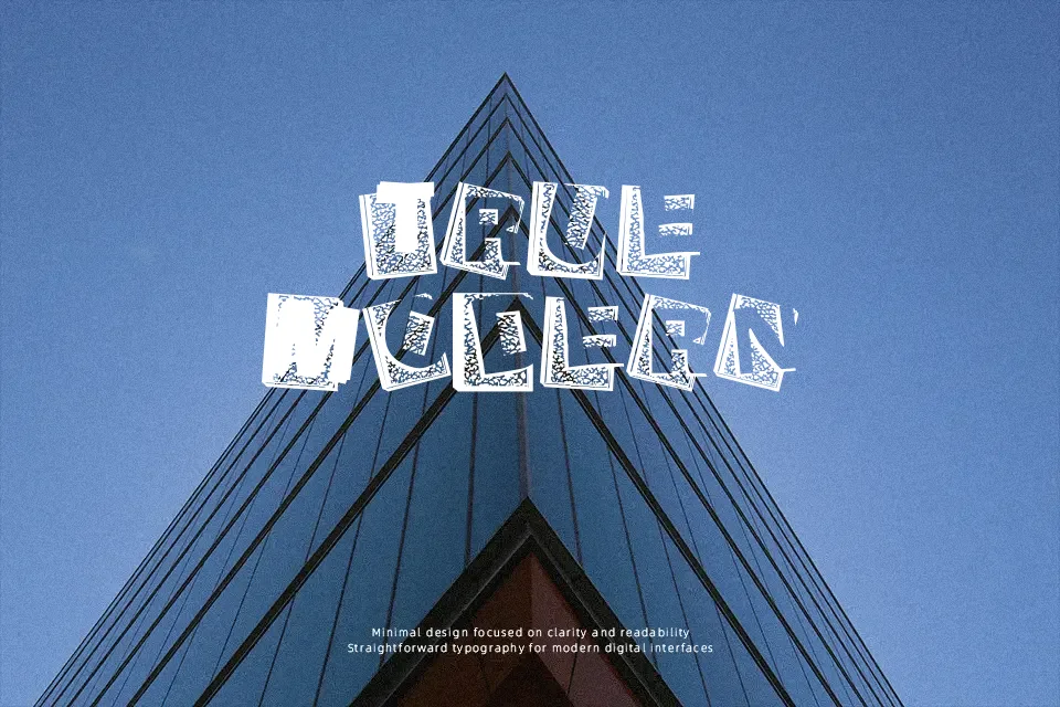
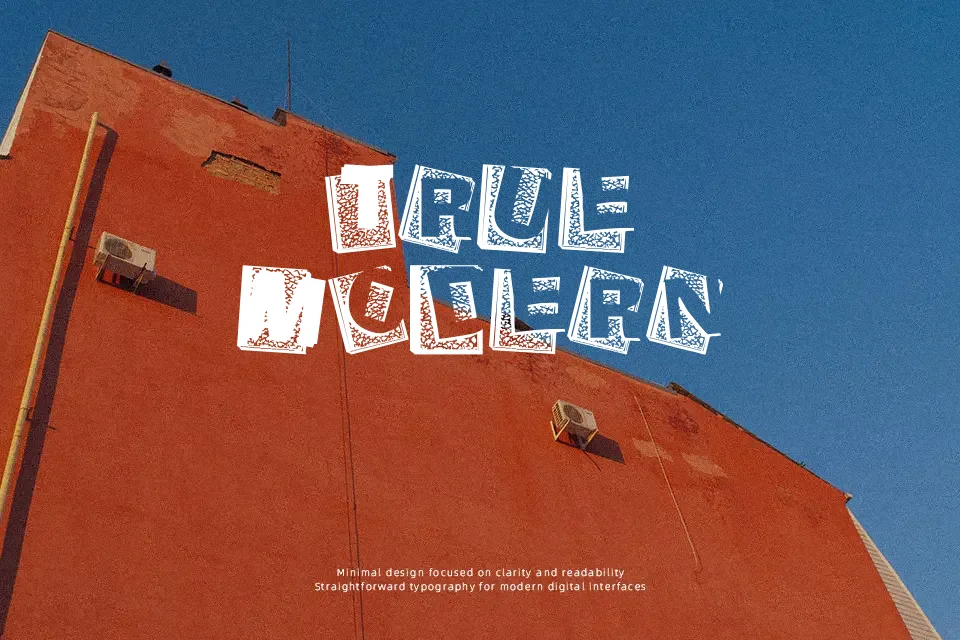
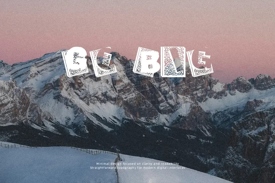
Loose strokes and uneven spacing give Agenda du Directeur a spontaneous, notebook-like appearance, as if written quickly with a pen. The letterforms lean slightly and vary in thickness, reinforcing a casual, human touch rather than precision. It carries a relaxed, informal tone that works nicely for planner covers, journaling visuals, or lifestyle blog headers. However, the irregular structure can reduce clarity in dense text or small sizes. It performs best when used sparingly as a headline or accent, but feels less reliable in professional layouts where consistency and readability matter more.
Best For:
planner or journal cover designs
lifestyle blog headers
casual social media graphics
Not Ideal For:
long paragraph text
corporate presentations
small UI text
formal branding systems
Perfect for branding, editorial, and headline, with a artistic and display style.
License
Gallery