Acros Font
Free for personal useAbout
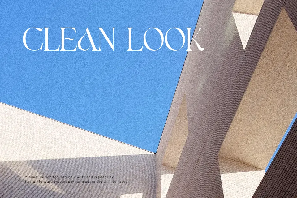
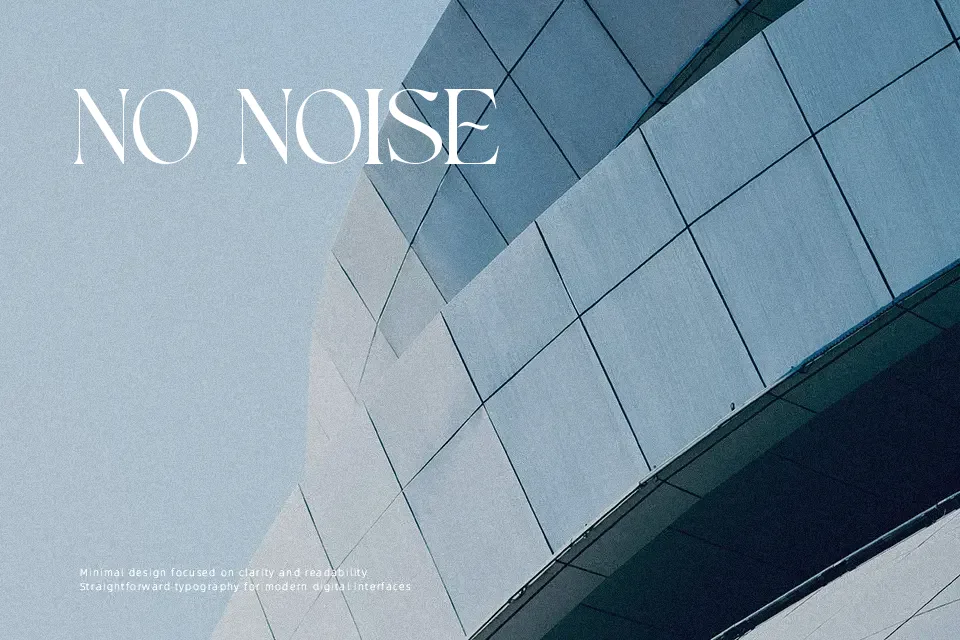
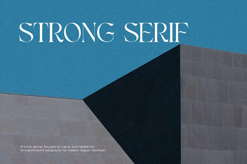
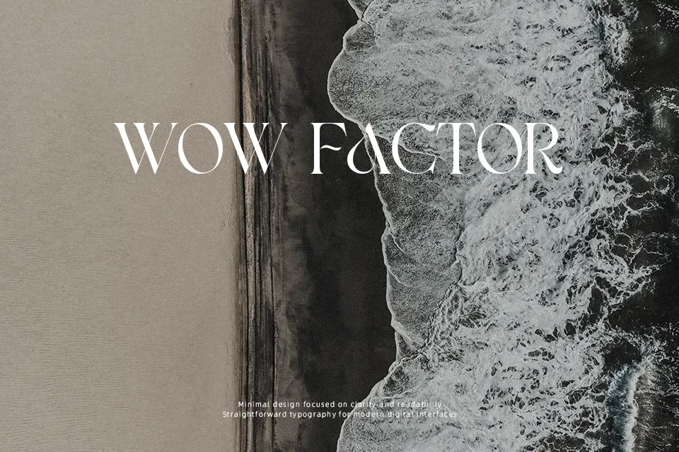
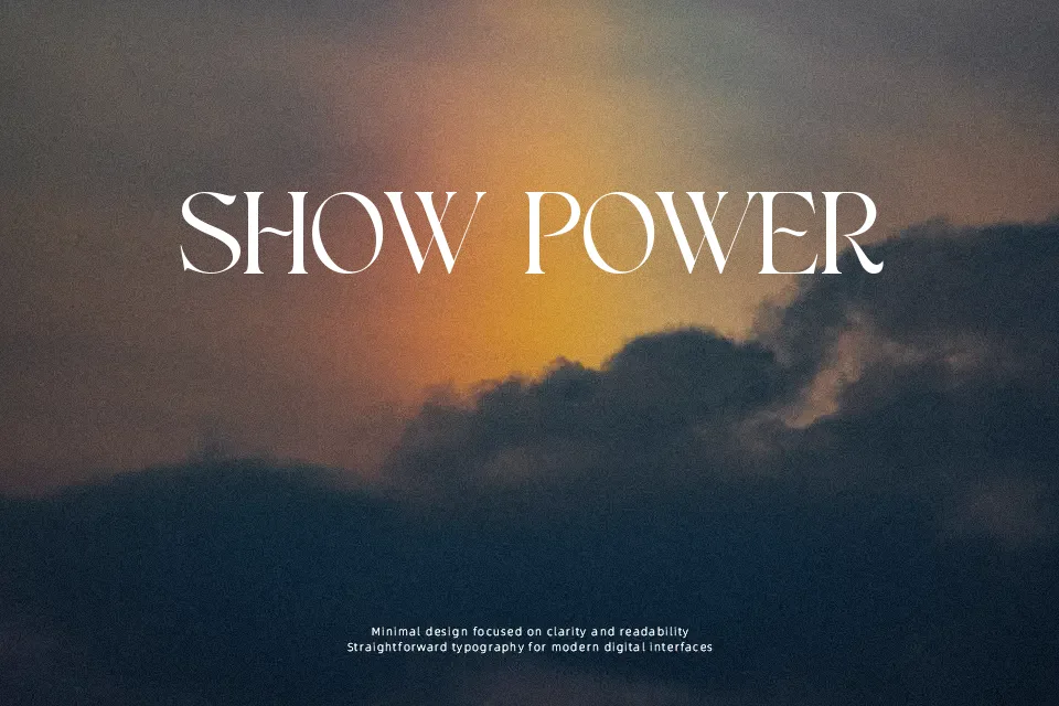
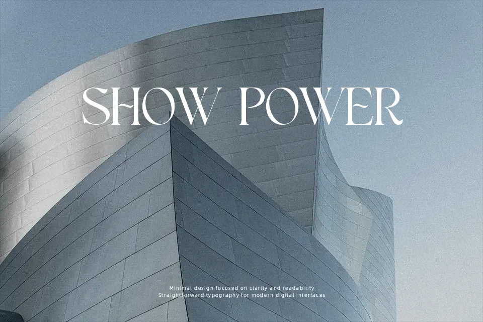
Sharp serifs and a measured stroke contrast give Acros a quietly commanding presence — the kind of letterform that reads as both polished and nostalgic without leaning too hard into either direction. It lands in a space between vintage editorial and contemporary luxury branding, making it a workable pick for product labels, logo treatments, and wedding stationery where sophistication matters. The letter spacing feels intentional, and glyph structure holds up well at display sizes. That said, the free version is a partial font — a real limitation if you need full character coverage for production work. Extended body text use is also where it starts to lose steam; the decorative weight of the serifs works against sustained readability at small sizes. Best approached as a headline and display tool, not a workhorse typeface.
Best For:- Boutique product packaging and label design
– Logo and branding projects with a vintage-luxury feel
– Wedding invitations and upscale stationery
– Social media headers and editorial poster headlines
Not Ideal For:- Long-form body text or editorial copy at small sizes
– Corporate or minimalist brand identities
– Projects requiring full Unicode or multilingual character sets (free version is partial)
– Fast-read UI contexts such as navigation or app interfaces
Perfect for branding, business card, and editorial, with a classic and display style.
License
Gallery