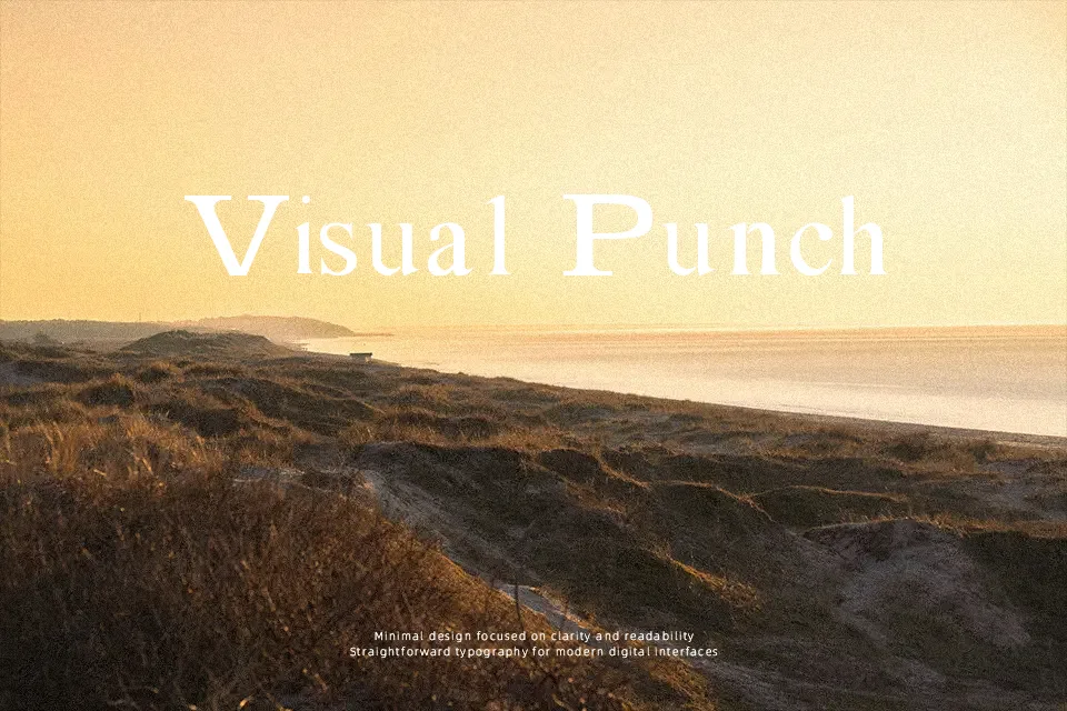
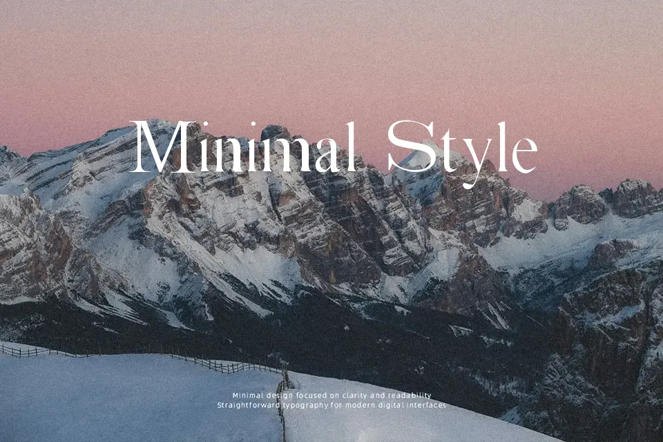
Absortile Font
Free for Commercial UseAbout
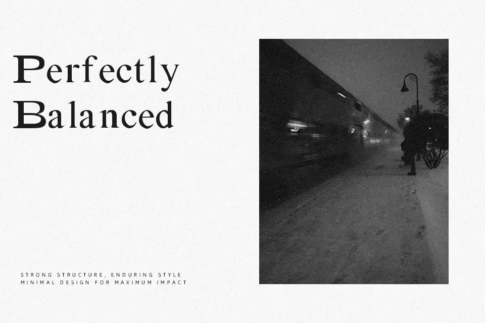
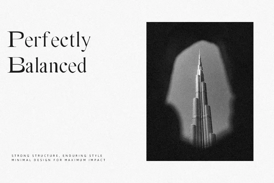
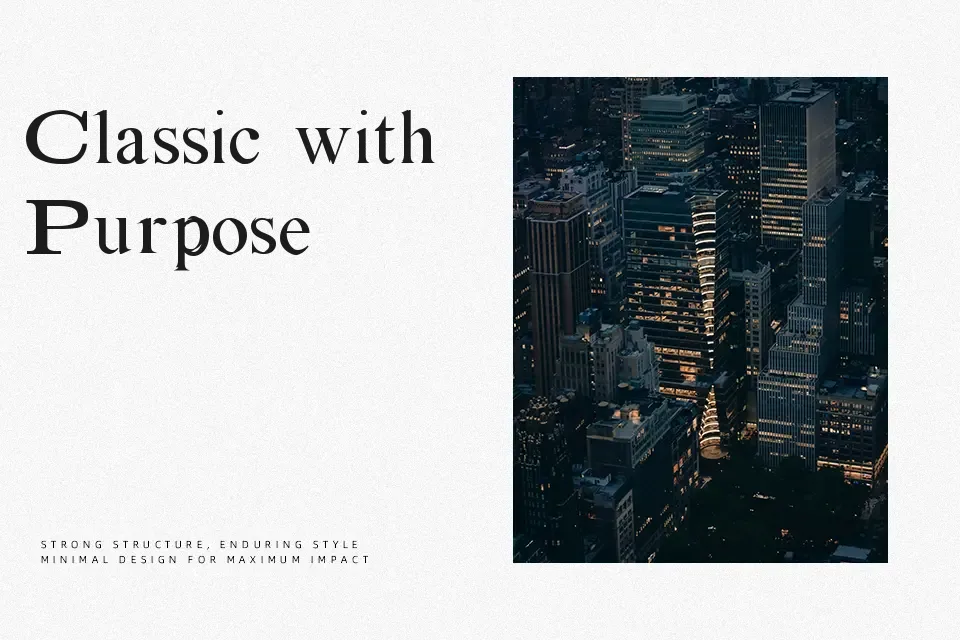
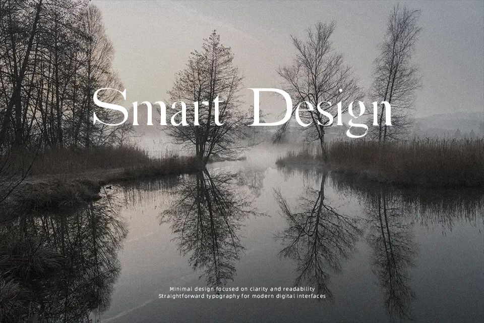
Absortile carries a striking tension — its letterforms are disciplined in structure yet visually disrupted, producing what the designer describes as a “glacial effect.” Strokes feel deliberate but skewed, giving text a cold, unsettling rigidity rather than free-flowing distortion. That balance makes it useful for album artwork headers, underground event posters, or niche apparel labels where controlled strangeness reads better than raw chaos. The bold variant adds weight without sacrificing the font’s peculiar character. That said, legibility drops sharply at small sizes — this is not a workhorse font for body copy or interface text. Works well when the design deliberately embraces an icy or disorienting aesthetic; works poorly when clarity and approachability are the goal.
Best For:- experimental poster headers
– underground music or event branding
– alternative apparel label design
– horror or dark-themed visual projects
Not Ideal For:- body text or long-form reading
– corporate or professional documents
– UI labels or navigation text
– children’s or family-oriented designs
Perfect for branding, fashion, and headline, with a bold and decorative style.
License
Gallery