A bit Sketchy Font
Free for personal useAbout
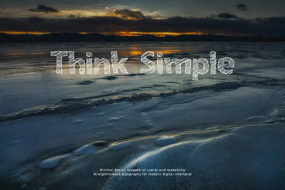
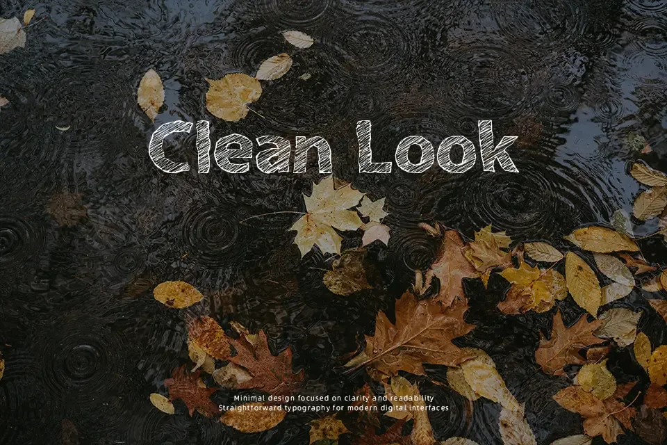
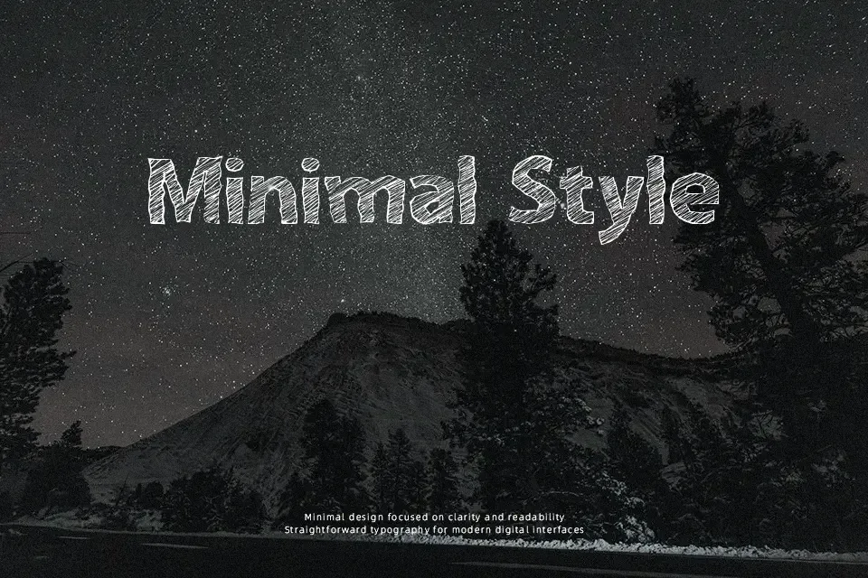
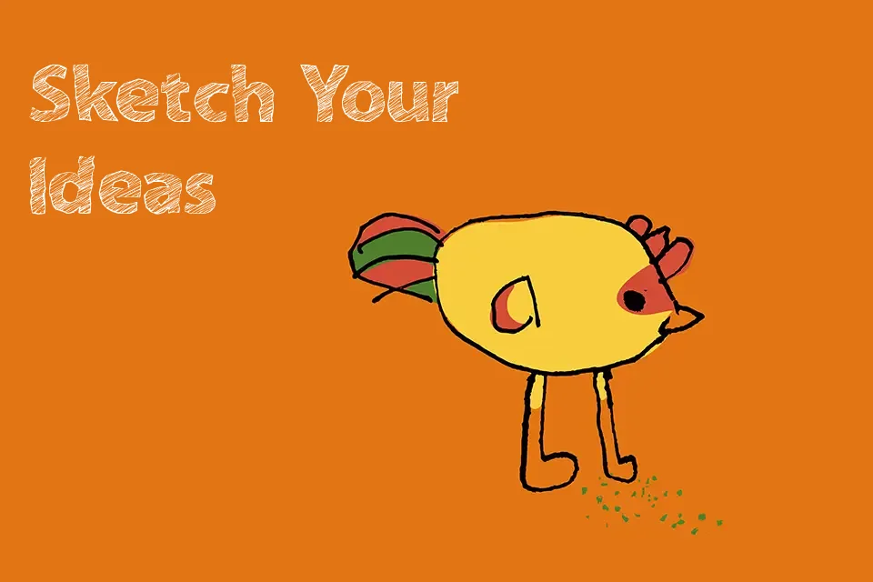
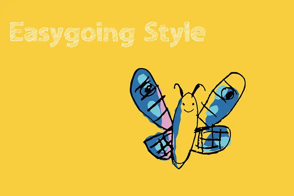
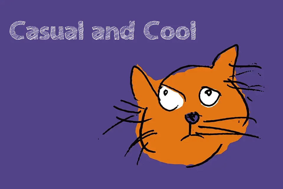
The letterforms in A bit Sketchy carry deliberately irregular edges and slightly wobbly stroke paths, giving each character the look of something quickly sketched in pencil or ballpoint pen. There’s a casual looseness to the spacing that reinforces its rough, unrefined character — this isn’t trying to look clean, and that’s exactly the point. It fits naturally in contexts where personality trumps polish: zine covers, handmade-style packaging, children’s event posters, or DIY project branding. Where it falls short is readability at small sizes — the textured edges blur together and lose legibility fast. Anyone needing consistent, professional output at body-text scale should look elsewhere. At display sizes, though, the imperfections become an asset rather than a liability.
Best For:
– Indie or handmade brand packaging headers
– Zine and DIY editorial title treatments
– Kids’ party or casual event promotional graphics
– Social media quote cards with a playful, personal tone
Not Ideal For:
– Body text or extended reading passages
– Corporate or formal brand identity work
– Small-size print applications where stroke clarity is needed
– High-precision editorial layouts requiring optical consistency
Perfect for editorial, kids, and packaging, with a artistic and decorative style.
License
Gallery