98 Bottles of Beer Font
Free for personal useAbout
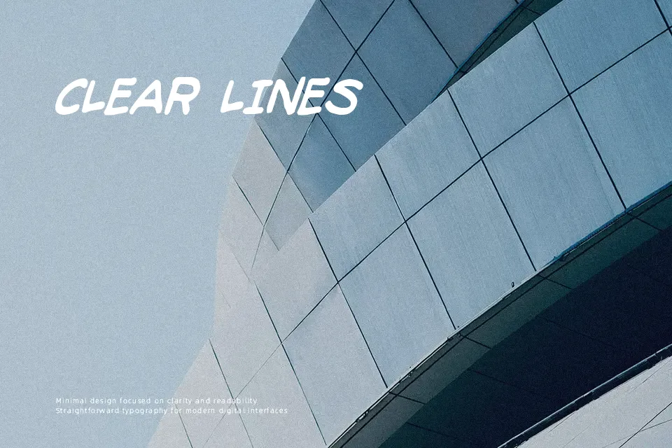
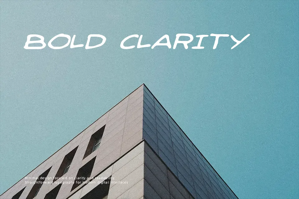
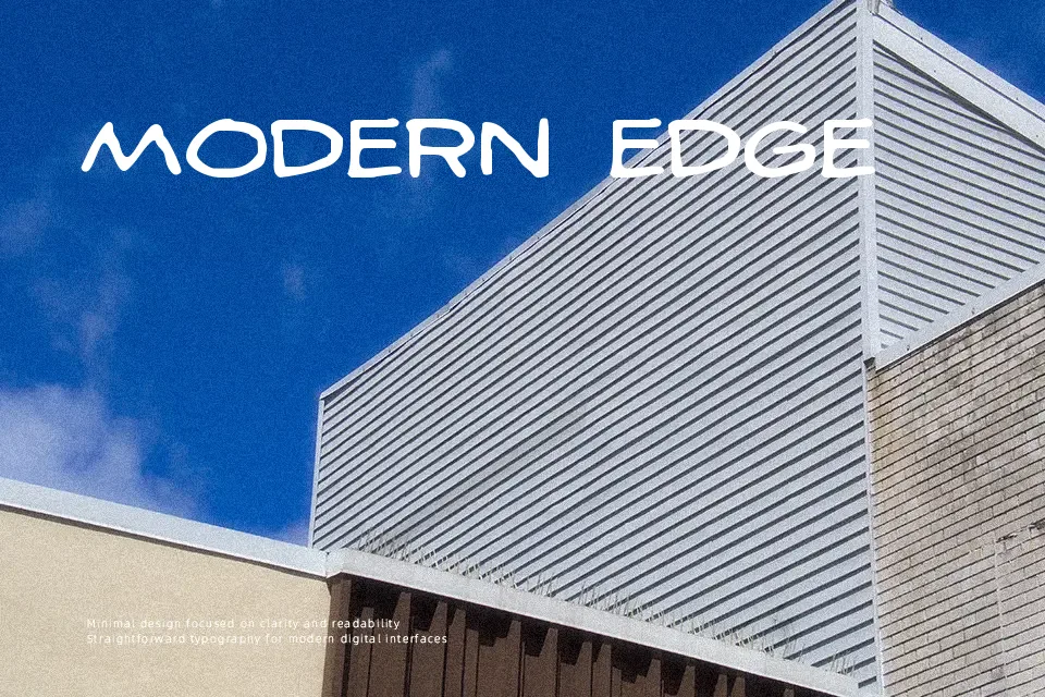
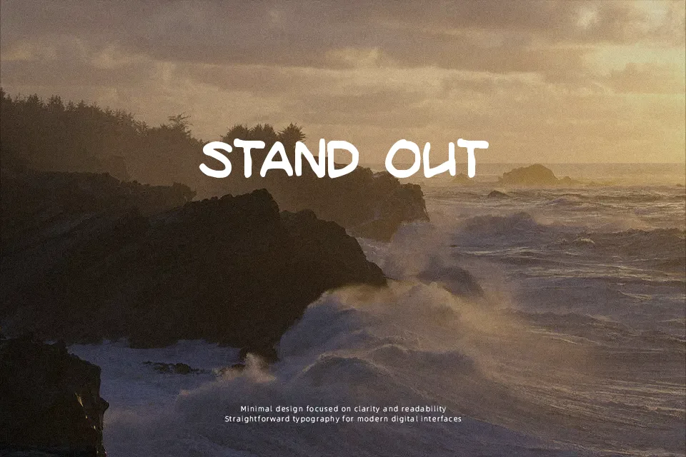
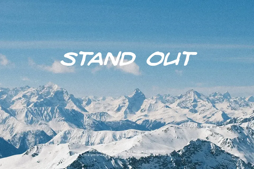
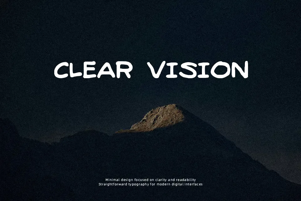
The letterforms here feel like they were scrawled after a few rounds — uneven baselines, wobbly strokes, and deliberately imperfect spacing give this font its whole identity. It reads as casual and humorous rather than refined, making it a natural fit for bar menus, event posters, drinking game graphics, or any project leaning into a fun, no-frills aesthetic. The inconsistency is the point: each character carries a hand-drawn looseness that adds character at large display sizes. That said, legibility drops noticeably at small sizes, and the informal stroke quality makes it a poor match for anything requiring authority or clarity. Use it as a headline or title element, not body copy. It works when the design concept already embraces imperfection — it struggles when dropped into a polished layout where it just reads as sloppy.
Best For:
– Bar and pub event flyers
– Drinking game or party merchandise headers
– Novelty label or packaging accents
– Casual music festival or comedy show posters
Not Ideal For:
– Small-size body text or captions
– Corporate or professional branding
– Formal invitations or editorial layouts
– Any context requiring consistent baseline alignment
Perfect for advertising, headline, and packaging, with a energetic and display style.
License
Gallery