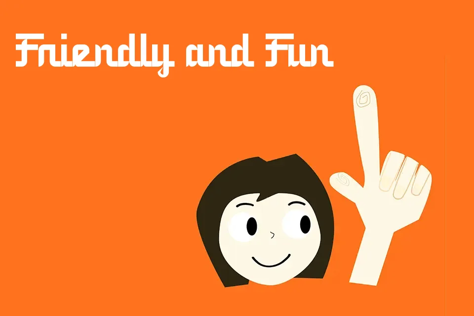
5 Railway Script Font
Free for personal useAbout
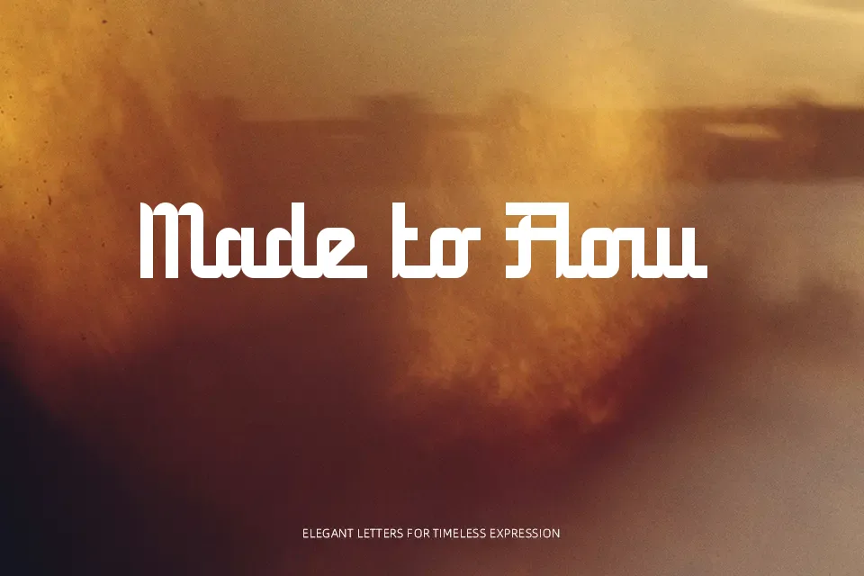
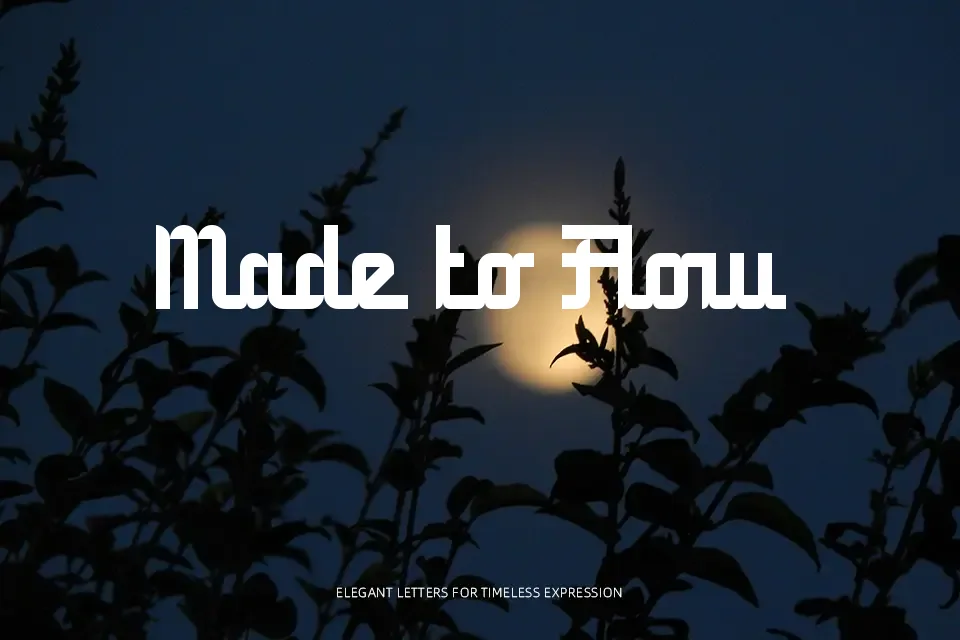
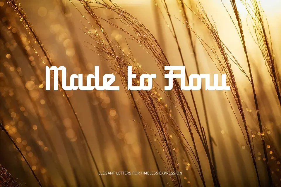
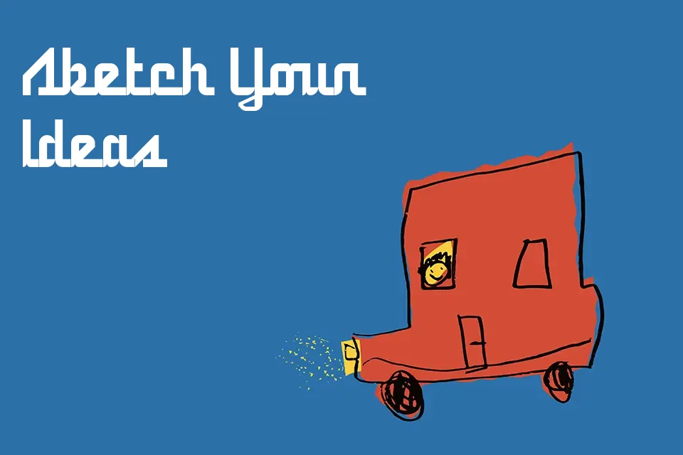
The letterforms in 5 Railway Script lean slightly forward, giving each word a sense of movement without feeling rushed. Stroke weight stays relatively consistent—this isn’t a high-contrast calligraphy style, but rather a relaxed connected script that sits closer to everyday handwriting than formal penmanship. It reads naturally at display sizes, making it a practical pick for restaurant signage, album artwork headers, or lifestyle brand wordmarks. That said, the informal construction means it loses credibility quickly in professional or corporate contexts, and small sizes will cause the connectors between letters to collapse. It works best when the designer wants approachability over authority—when the message needs to feel written by a person, not set by a machine.
Best For:
– Café or bakery menu headers
– Music event flyers and concert posters
– Lifestyle brand social media graphics
– Handmade product packaging labels
Not Ideal For:
– Body text or lengthy copy blocks
– Corporate reports or legal documents
– Small-size applications under 18pt
– High-end luxury branding requiring contrast and precision
Perfect for branding, logo, and music, with a creative and handwritten style.
License
Gallery