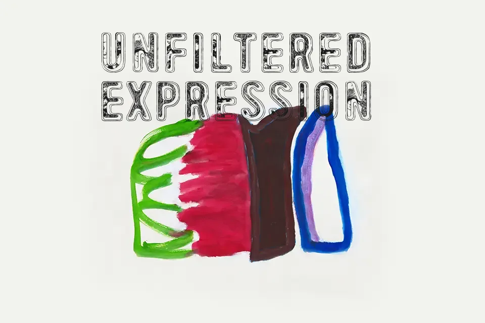
49 birthdays Font
Free for personal useAbout
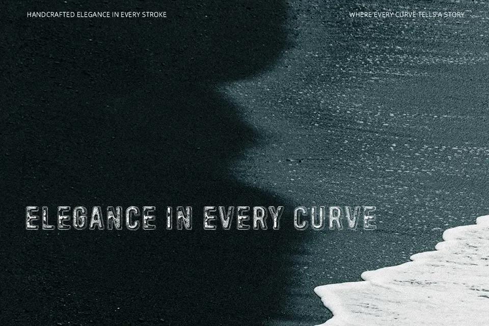
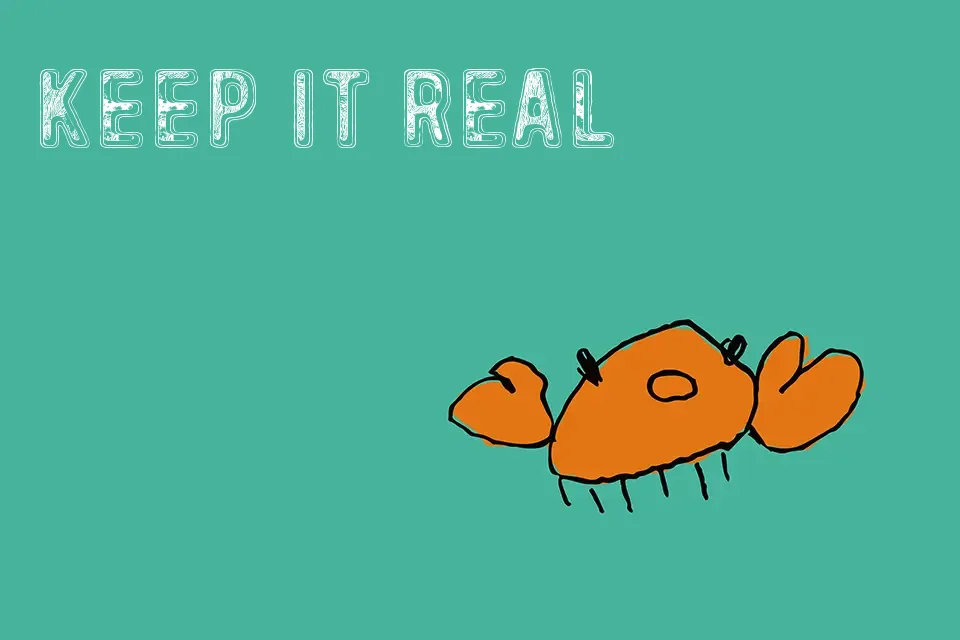
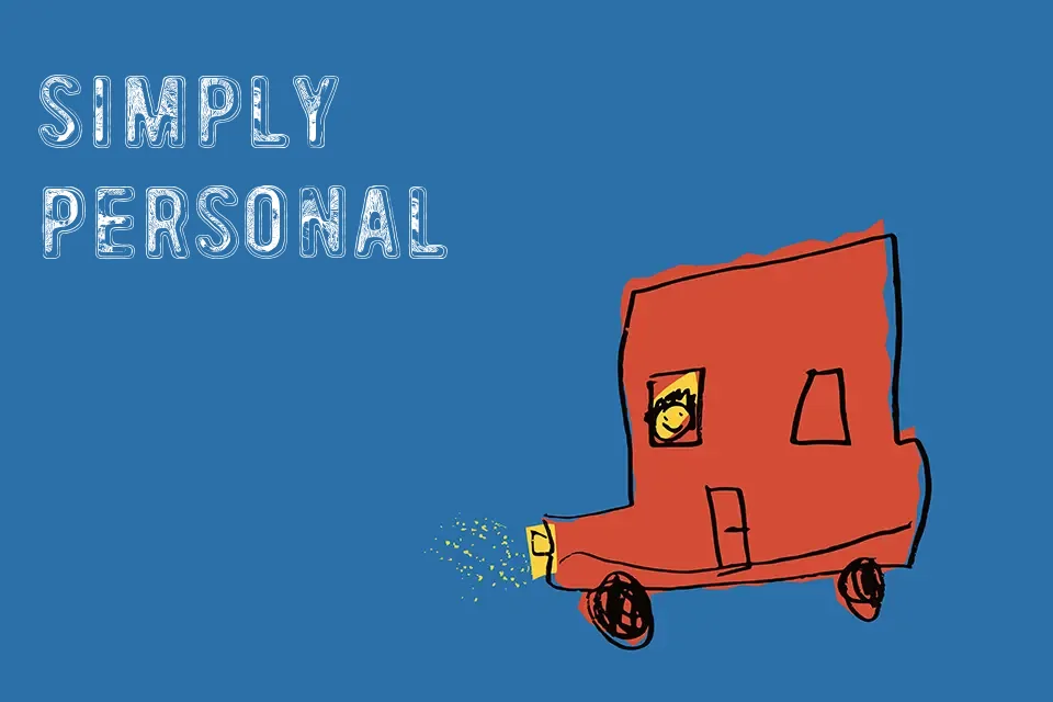
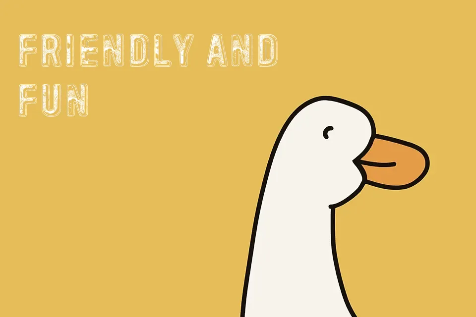
The strokes in 49 birthdays are deliberately uneven — letterforms lean slightly, vary in weight, and feel like they were drawn on a greeting card in a rush of excitement. That looseness is exactly what gives it charm. It suits birthday-themed invitations, party flyers, and casual event headers where warmth and informality are the point. That said, the irregular spacing and organic rhythm make it a poor candidate for body text or anything requiring readability at small sizes. If you need consistency across a multi-line layout, this font will fight you. Where it genuinely works is as a single headline or title element — one line, large, and let the character breathe.
Best For:
– Birthday card headline text
– Party invitation titles
– Celebratory social media post headers
– Informal event flyer accents
Not Ideal For:
– Body text or paragraph-length copy
– Small-size usage where legibility is critical
– Corporate or professional branding
– Multi-line display layouts
Perfect for holiday, invitation, and poster, with a creative and decorative style.
License
Gallery