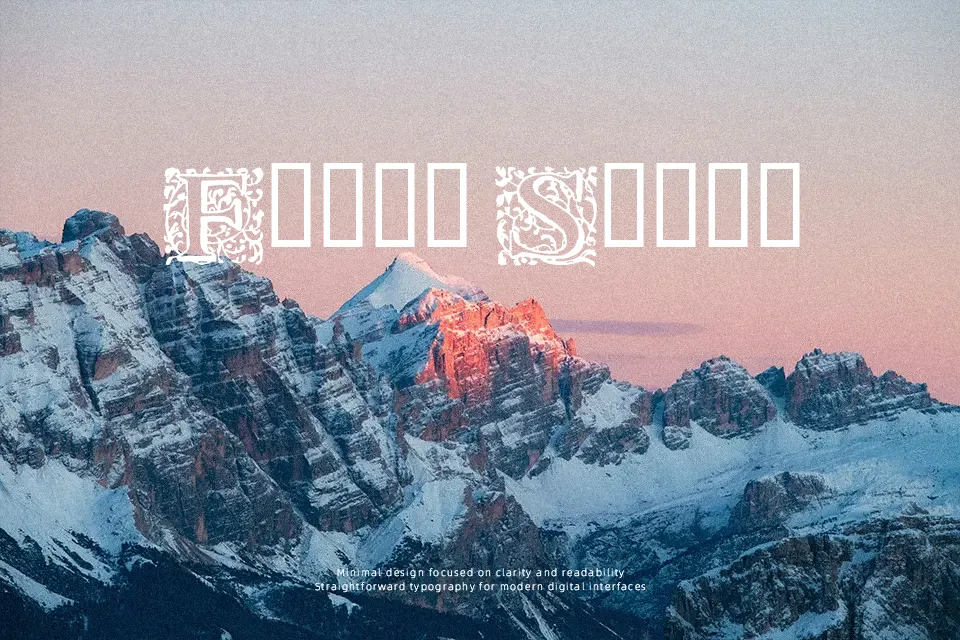
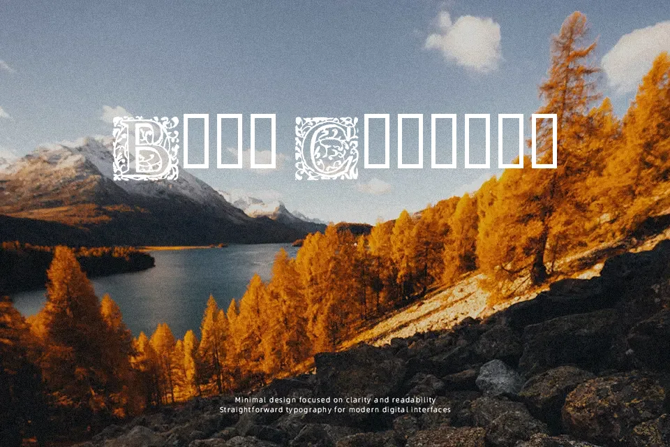
16th Arabesques Font
Free for personal useAbout
There’s a deliberate heaviness to 16th Arabesques — each character carries the weight of historical ornamentation, with tightly interwoven strokes that echo 16th-century manuscript and tilework motifs. The contrast between thick and thin lines is dramatic, giving it a ceremonial, almost ritualistic presence on the page. It works well anchoring a book cover title, a luxury heritage brand identity, or decorative chapter headers where mood outweighs readability. That said, the dense ornamentation becomes a liability below 36pt — details collapse and legibility suffers quickly. It’s a display-only choice, and even then, pairing it with clean body text is essential to avoid visual fatigue.
Best For:
– Heritage book cover titles and decorative chapter headings
– Ceremonial event posters or programs with a historical theme
– Ornamental logo marks for artisan or antique-style brands
Not Ideal For:
– Body text or any extended reading context
– Digital UI or screen display at small sizes
– Modern minimalist or corporate branding
– Multilingual typesetting beyond basic Latin characters
Perfect for branding, editorial, and invitation, with a ancient and calligraphy style.
License
Gallery