DK Toverheks Font
Free for personal useAbout
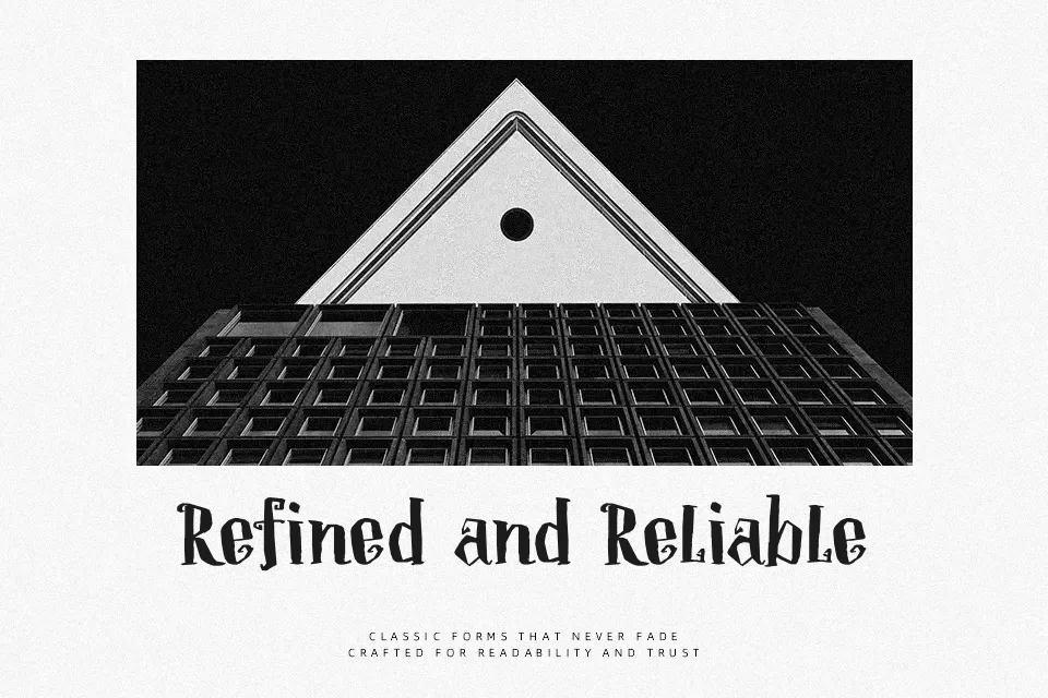
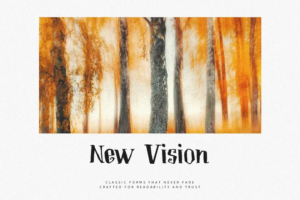
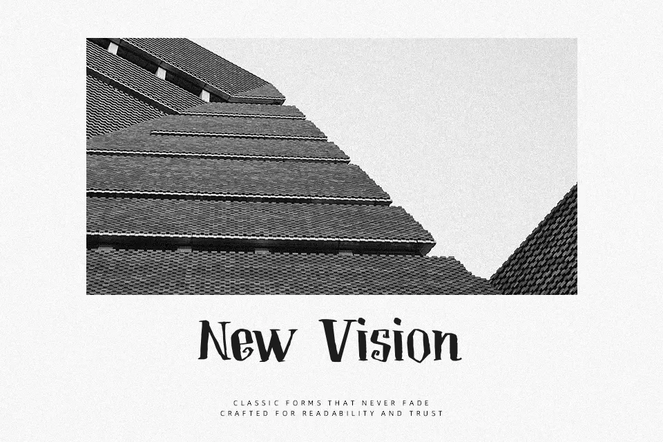
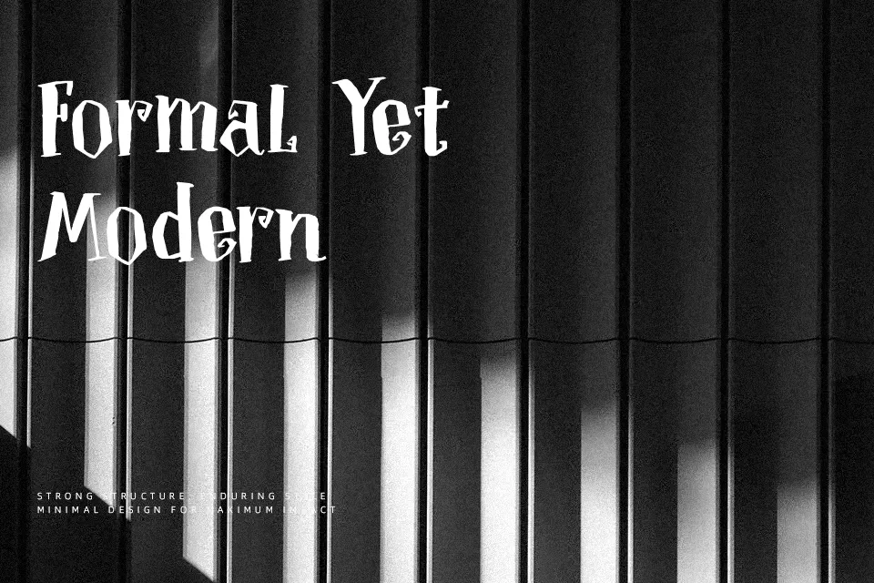
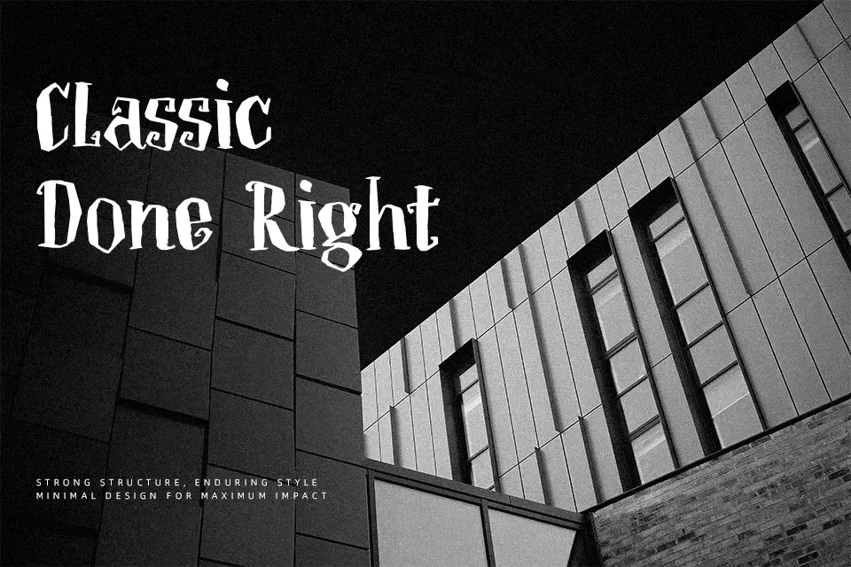
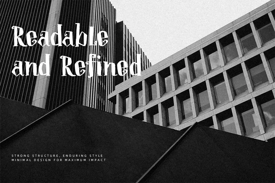
DK Toverheks has a narrow, high-contrast serif structure with pointed strokes, rough edges, and curled terminals that give it the feel of an old spellbook title . It sits between a didone-style display face and a theatrical decorative headline font, so it carries drama without becoming unreadable too quickly. I would use it for Halloween posters, fantasy chapter openers, themed invitations, or dark editorial covers where a little tension helps the layout. It starts to lose clarity in body copy, compact mobile UI, or clean corporate work because the sharp details and tight texture need room to breathe
Best For:
Halloween posters, fantasy book covers, themed invitations, chapter title pages
Not Ideal For:
Small app labels, long reading passages, minimal corporate branding, dense packaging copy
Perfect for editorial, halloween, and headline, with a dark and decorative style.
License
Gallery