DK Paviljoen Font
Free for personal useAbout
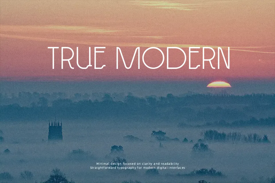
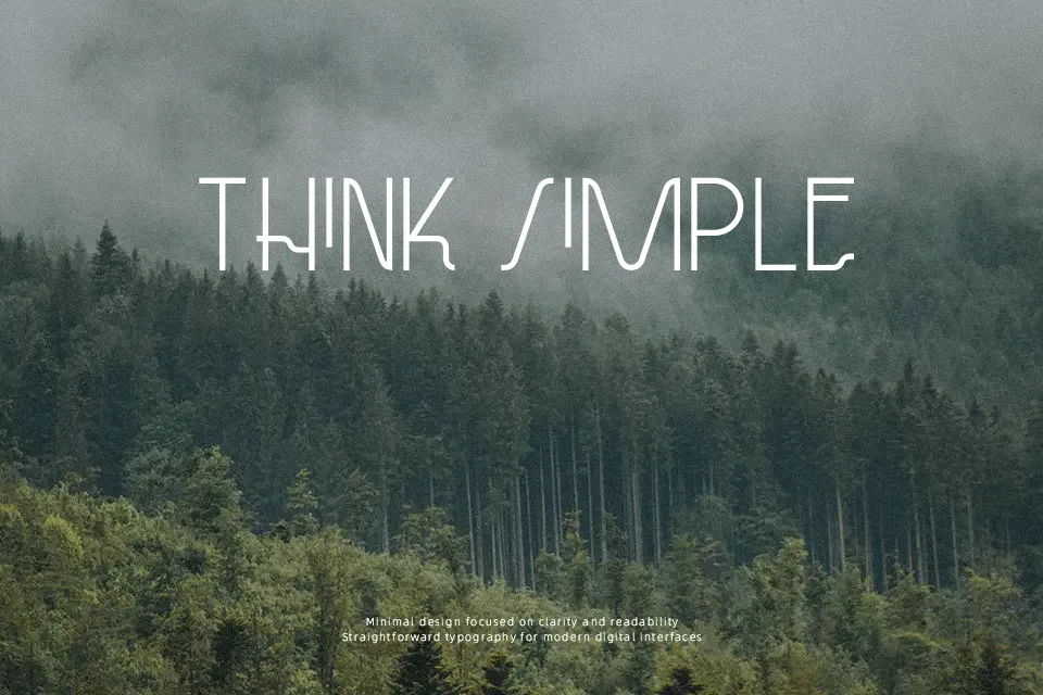
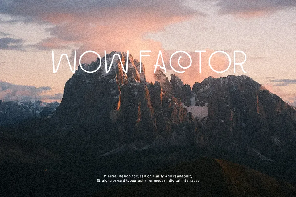
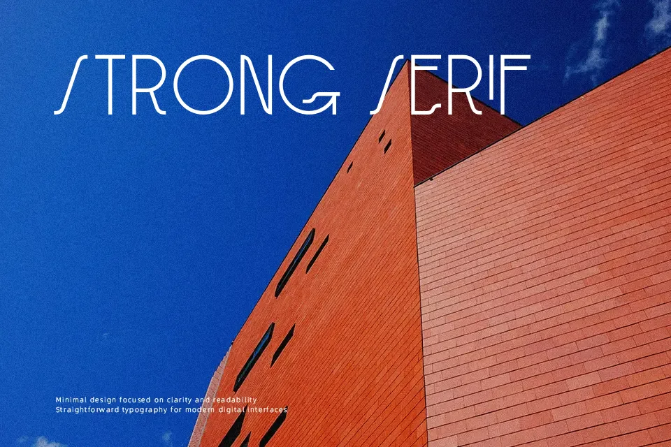
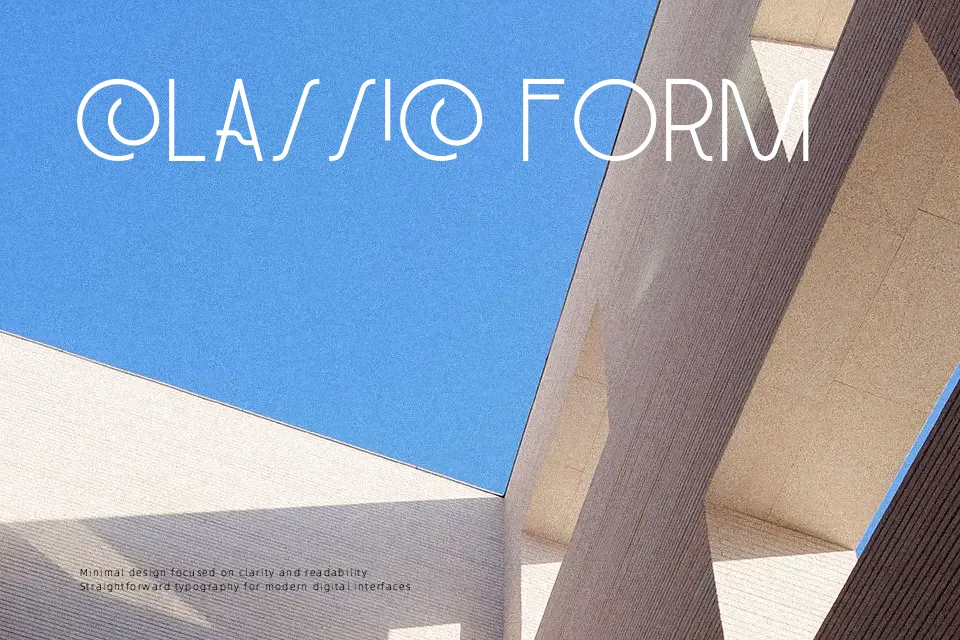
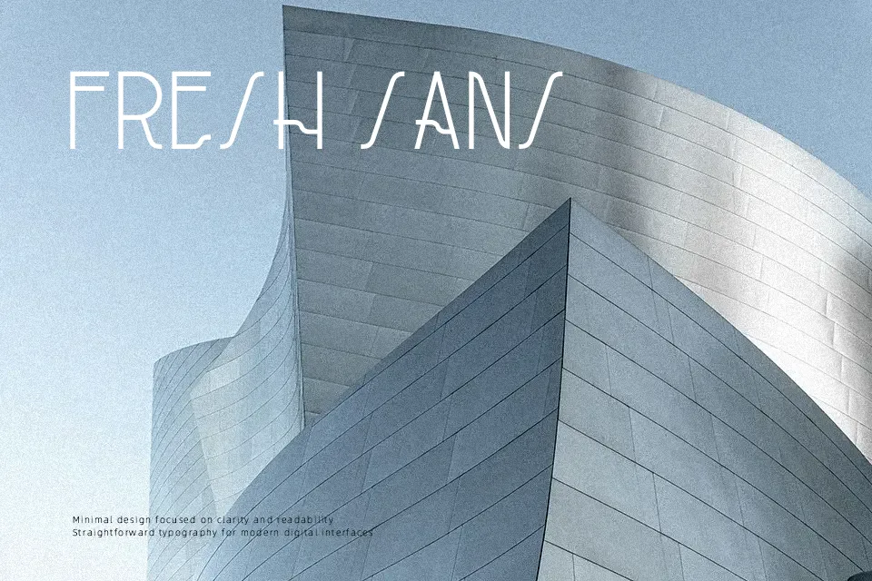
DK Paviljoen Font leans into a refined Art Deco look with very thin strokes, tall proportions, and generous internal space. The letterforms feel architectural rather than casual, with a clean structure that gives headlines a polished vintage tone. It works best when you want a poster, venue identity, cocktail menu, or product label to feel slightly nostalgic without turning ornate. The style has presence, but it is not built for dense copy or small interface text, where the light construction starts to disappear. If you like display fonts that feel decorative yet restrained, this one lands well in larger sizes.
Best For:
art deco posters,venue branding,cocktail packaging,headline signage
Not Ideal For:
body text,small mobile UI,dense editorial copy,technical documents
Perfect for branding, headline, and packaging, with a classic and decorative style.
License
Gallery