DK Oyuki’s Ghost Font
Free for personal useAbout
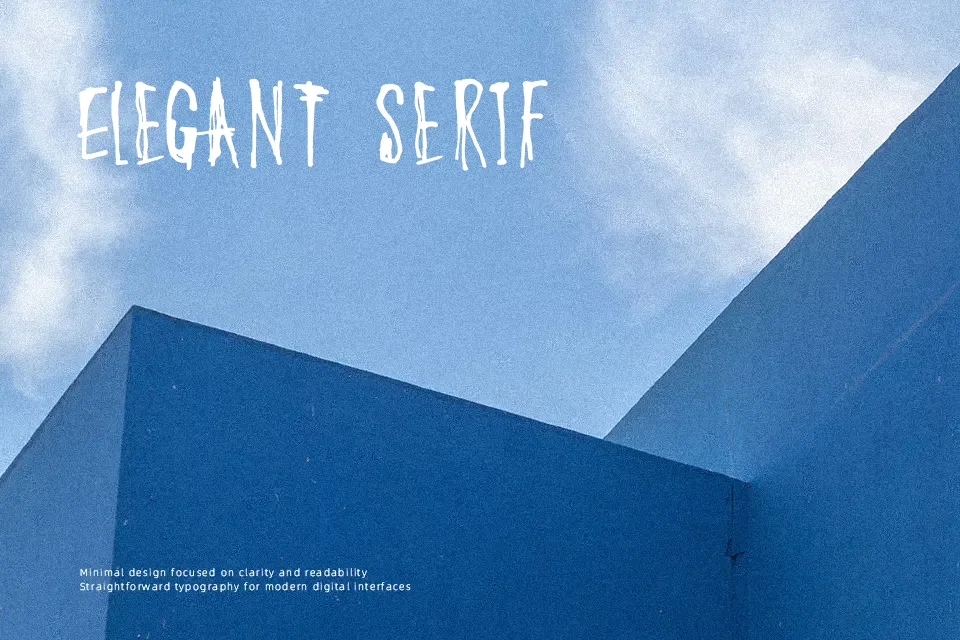
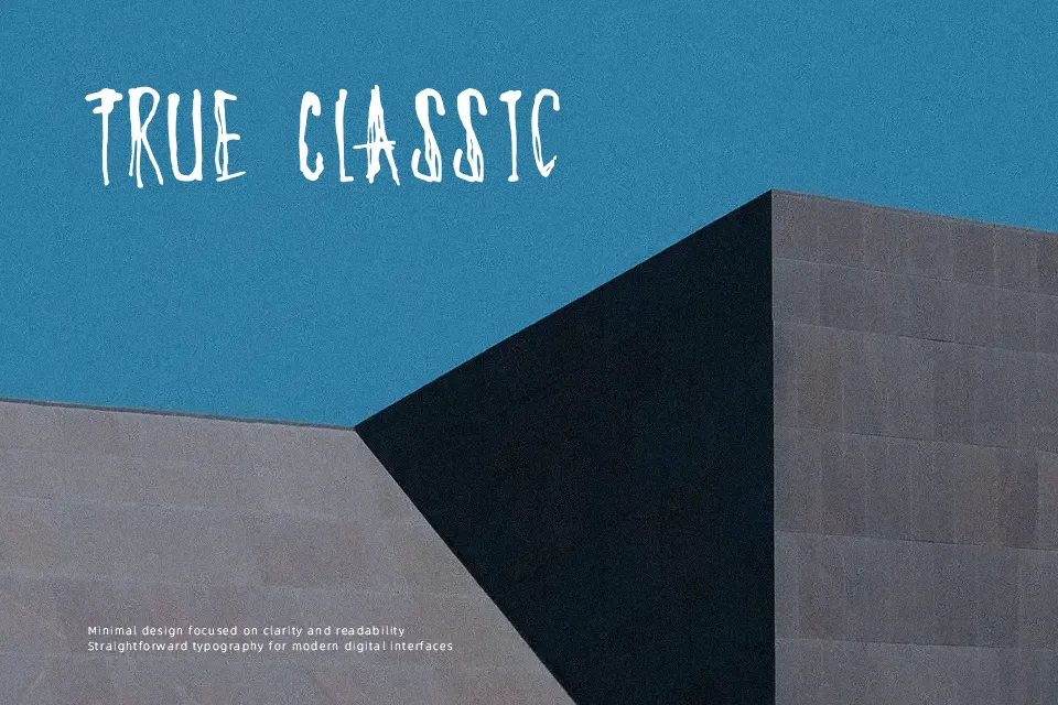
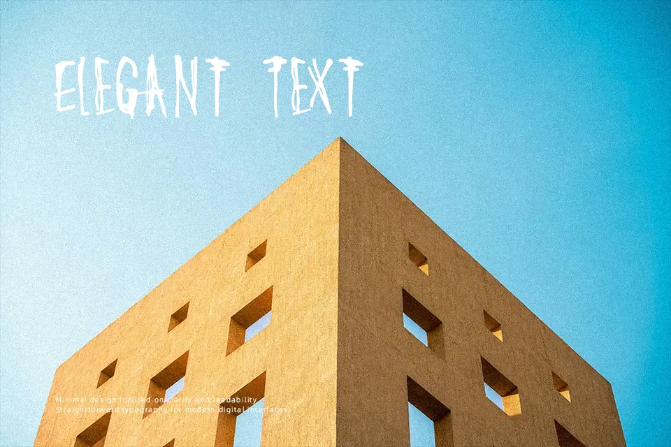
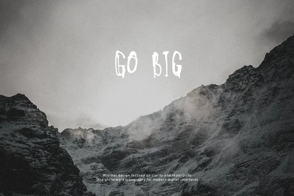
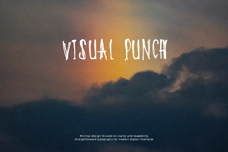
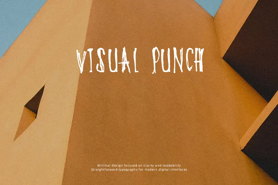
DK Oyuki’s Ghost uses tall, slender letterforms, dry brush-like edges, and irregular spacing that gives headlines a nervous, handmade pulse. The strokes stay fairly light, so it feels eerie rather than blunt, closer to ghost-story lettering than a heavy horror block font. It works nicely on haunted house flyers, supernatural podcast art, dark fiction chapter openers, or seasonal café signage where a theatrical tone helps. I would keep it for short lines and large sizes, because the spacing starts to feel twitchy in dense layouts. For body copy, small app labels, or polished corporate branding, it loses clarity fast.
Best For:
haunted event posters, ghost story covers, indie horror title cards, seasonal café signage
Not Ideal For:
body text, small mobile labels, formal corporate branding, dense packaging copy
Perfect for film, halloween, and headline, with a artistic and decorative style.
License
Gallery