DK New Beginnings Font
Free for personal useAbout
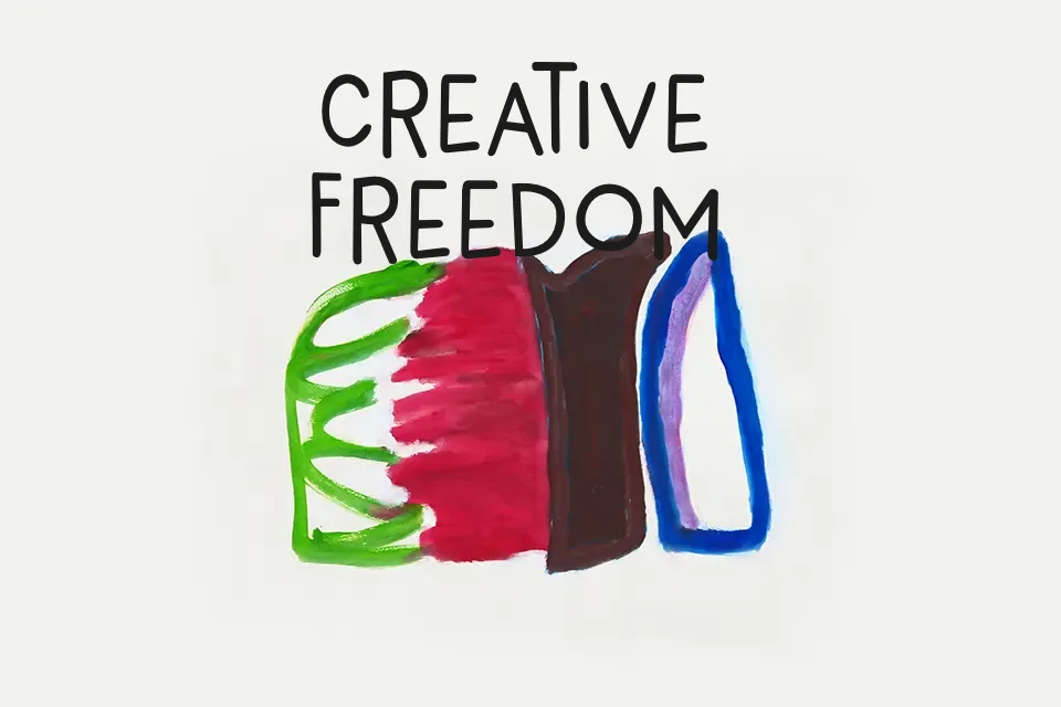
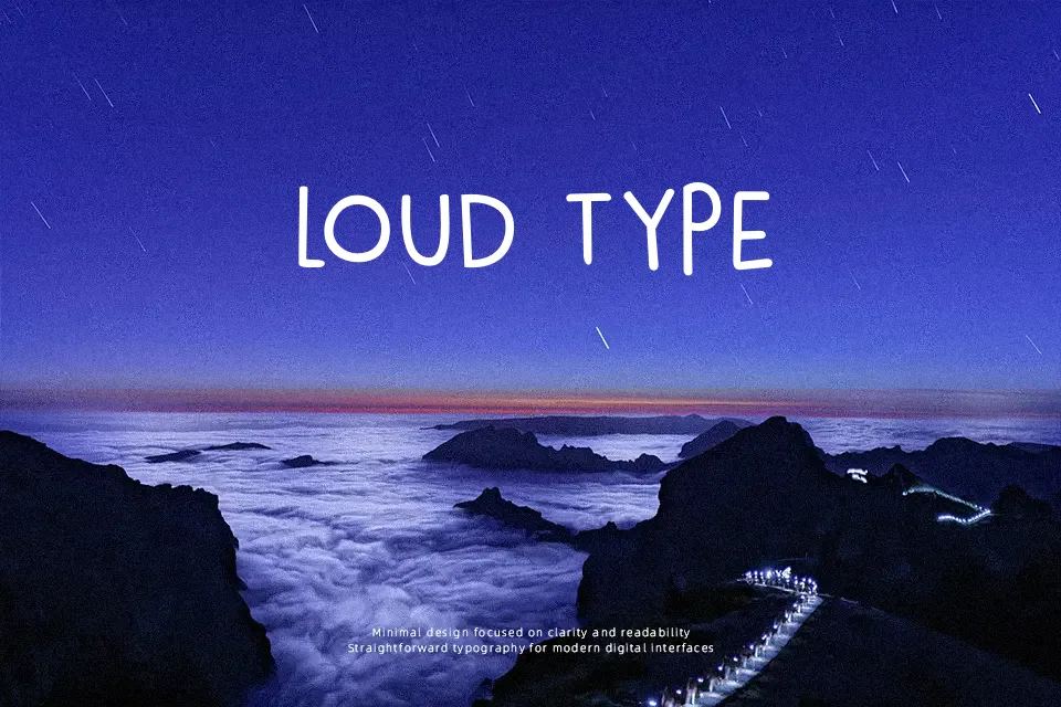
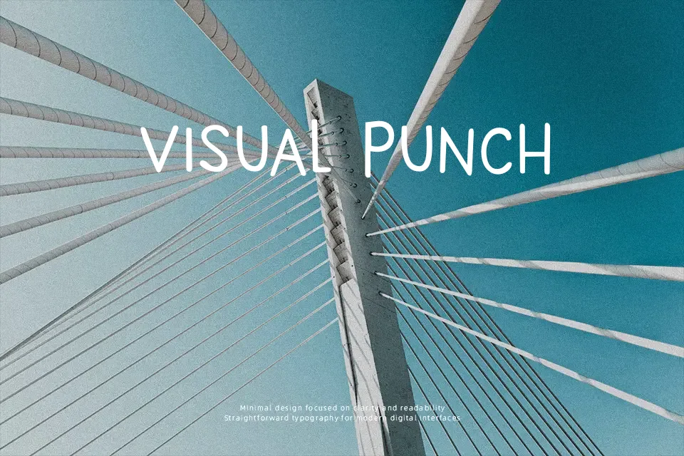
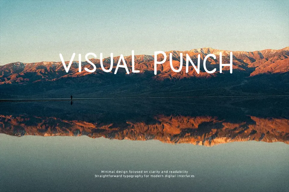
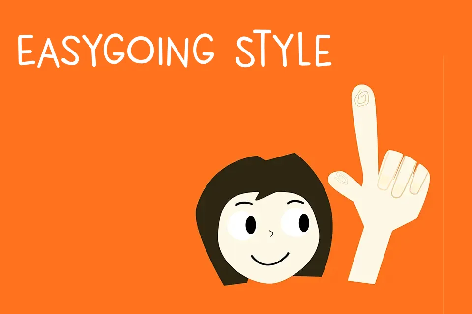
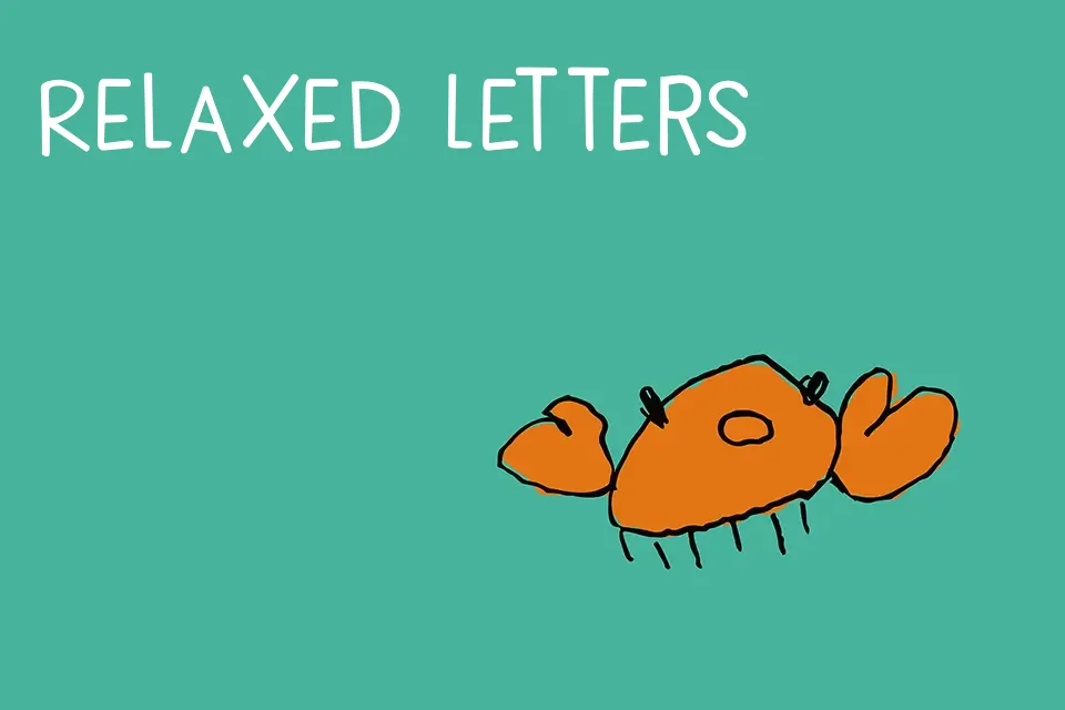
DK New Beginnings Font has tall, narrow capitals, rounded stroke endings, and slightly irregular spacing that give each line a hand-lettered bounce. The weight stays fairly even, so it reads cleaner than a rough marker font, but it still feels casual and decorative rather than structured. I’d use it for children’s book covers, quote graphics, classroom posters, or packaging that needs a friendly handmade tone without turning messy. The alternate uppercase and lowercase forms add movement in short headlines. It starts to lose control in long paragraphs, though, and the playful rhythm can feel underdressed in formal branding, invitations, or interface-heavy layouts.
Best For:
children’s book covers,product packaging,quote posters,classroom materials
Not Ideal For:
body copy,formal invitations,corporate branding,ui text
Perfect for headline, kids, and packaging, with a creative and decorative style.
License
Gallery