DK Jambo Font
Free for personal useAbout
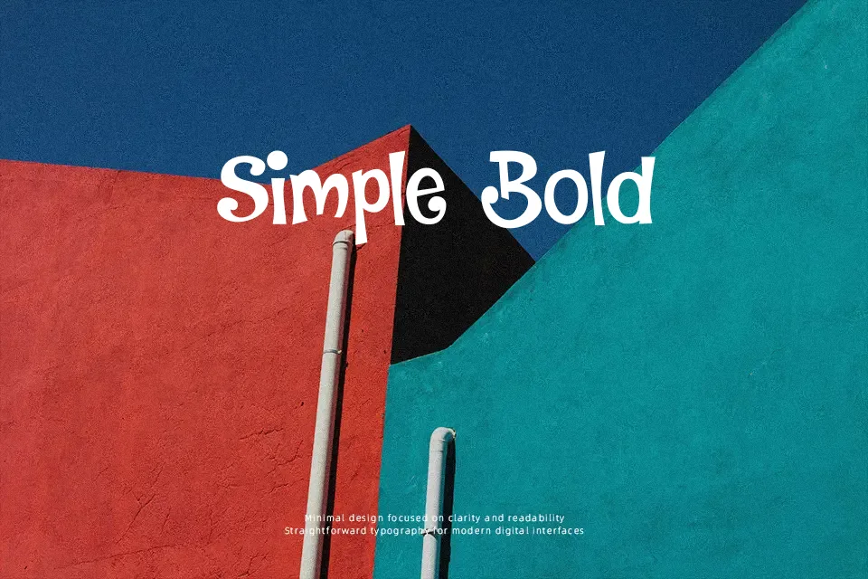
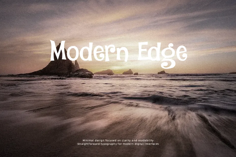
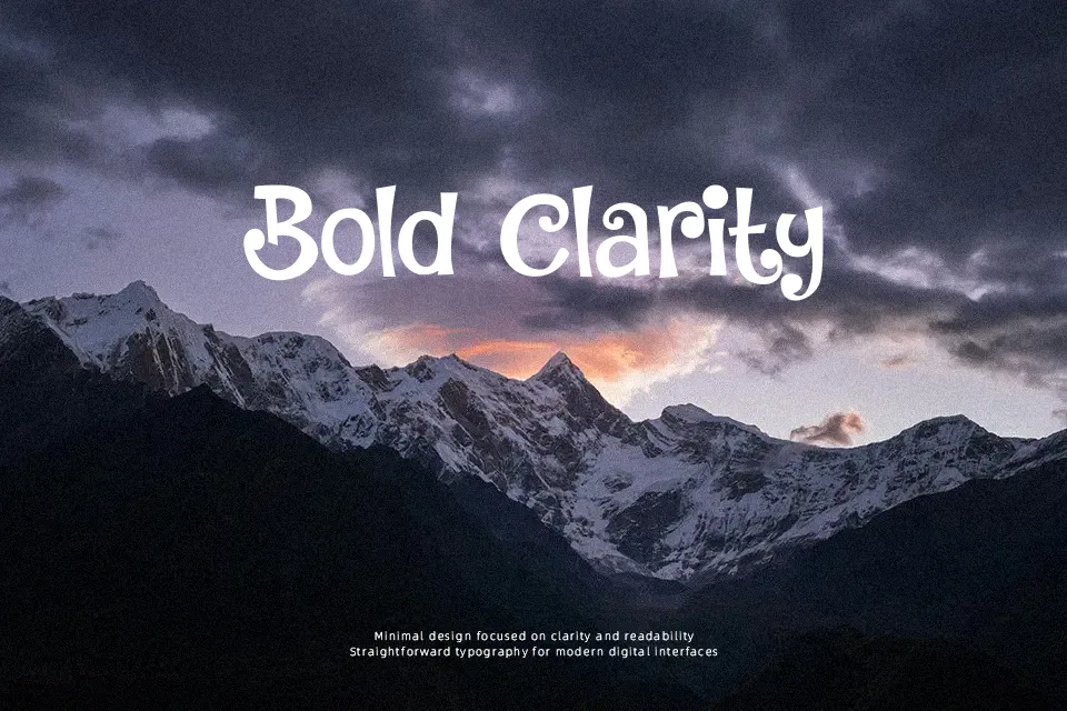
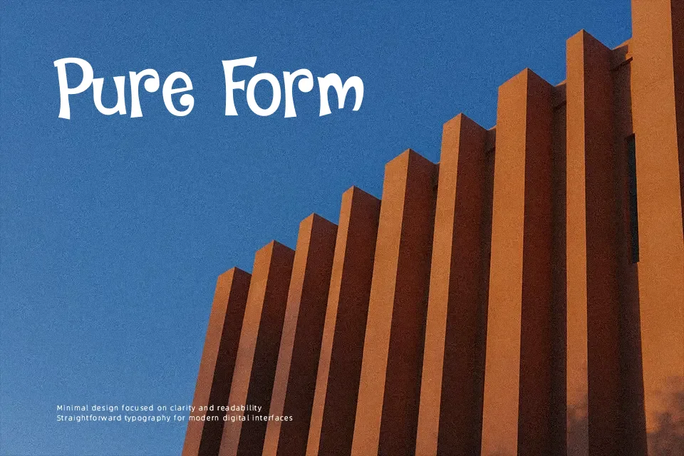
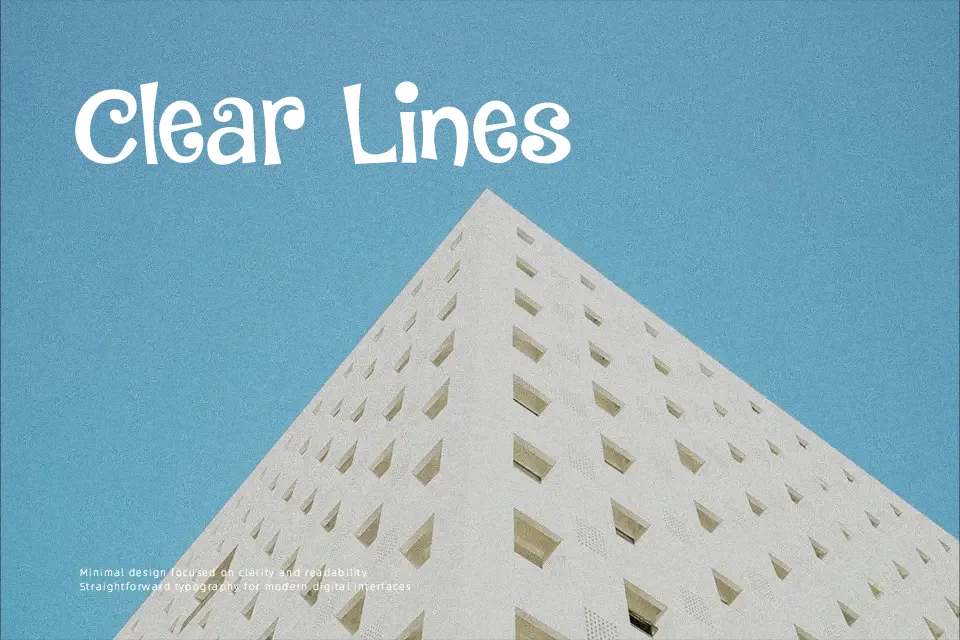
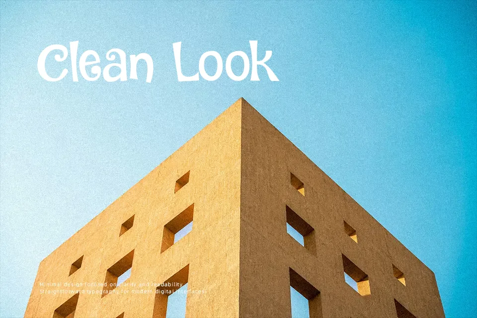
DK Jambo leans into a bouncy curly display look, with heavy strokes, rounded inner shapes, and looping terminals that make each word feel animated rather than orderly. The spacing is fairly open for a decorative face, which helps short titles stay readable even as the letters twist and dip. It suits birthday posters, cheerful packaging, classroom materials, and event invitations that need a friendly, slightly mischievous tone. I would not use it for formal branding, dense editorial work, or small labels, because the exaggerated curves start to tangle visually when the text gets longer or tighter.
dafont
Best For:
kids party posters, playful product packaging, classroom event invitations, short themed headlines
Not Ideal For:
body text, formal corporate branding, dense editorial layouts, small interface labels
Perfect for headline, invitation, and kids, with a creative and cartoon style.
License
Gallery