DK Honeyguide Font
Free for personal useAbout
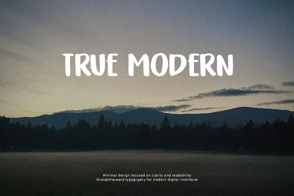
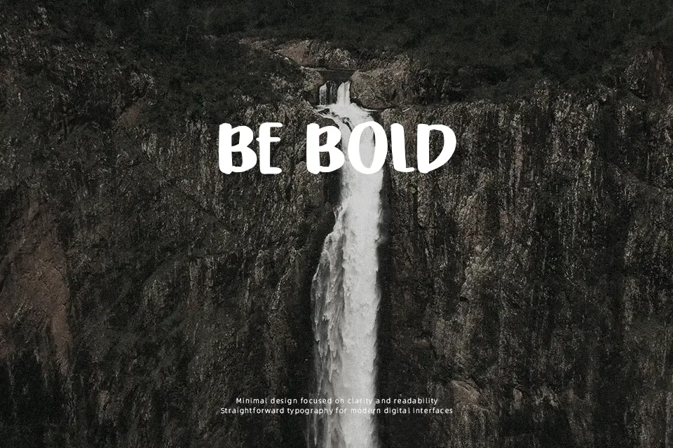
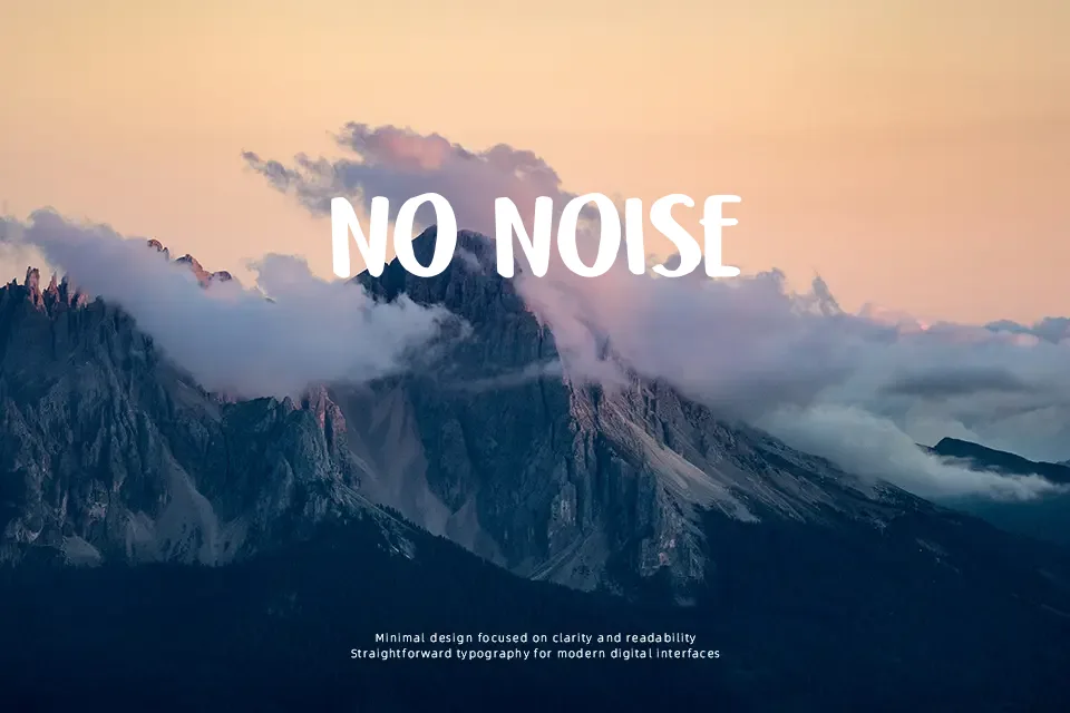
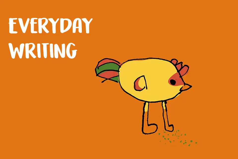
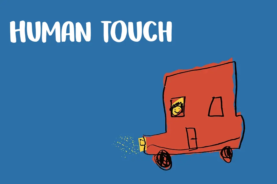
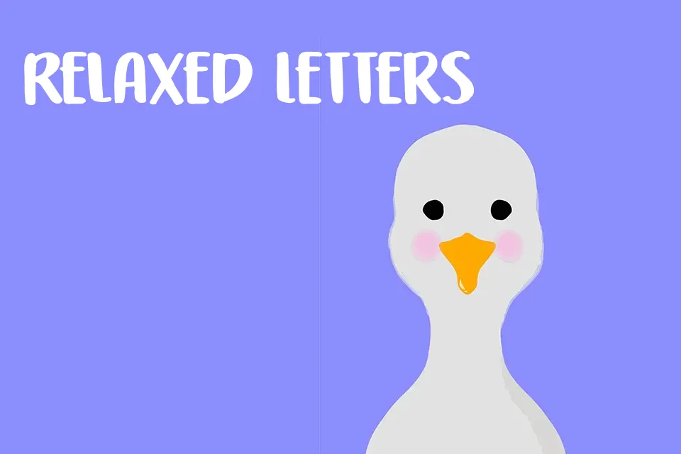
DK Honeyguide Font has thick, slightly bouncy uppercase letters with rounded ends, irregular curves, and loose handcrafted spacing that keeps it casual rather than polished. The structure feels friendly and decorative, with enough weight to stand up well on packaging, poster headlines, classroom materials, or playful brand labels. It works best when the layout wants warmth and a handmade tone without drifting into a messy brush look. I would use it for short, bold wording where personality matters more than precision. It starts to struggle in tighter editorial settings, formal branding, or any line that needs clean rhythm and easy reading at smaller sizes.
Best For:
snack packaging titles
kids event posters
playful product labels
cheerful social graphics
Not Ideal For:
long reading passages
formal corporate branding
dense editorial layouts
small interface text
Perfect for branding, headline, and kids, with a creative and decorative style.
License
Gallery