Distort Me Font
Free for personal useAbout
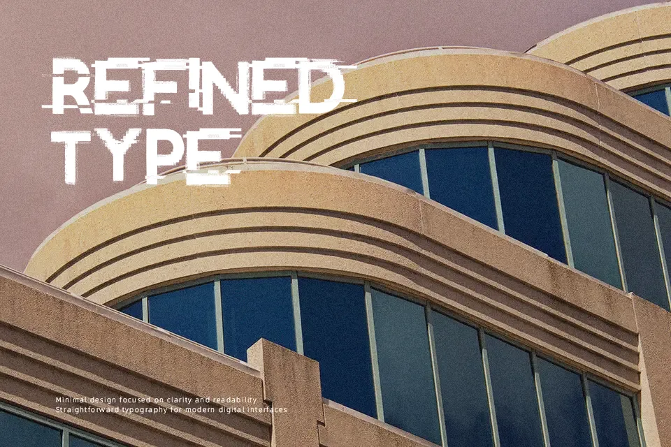
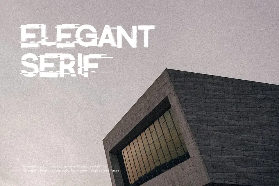
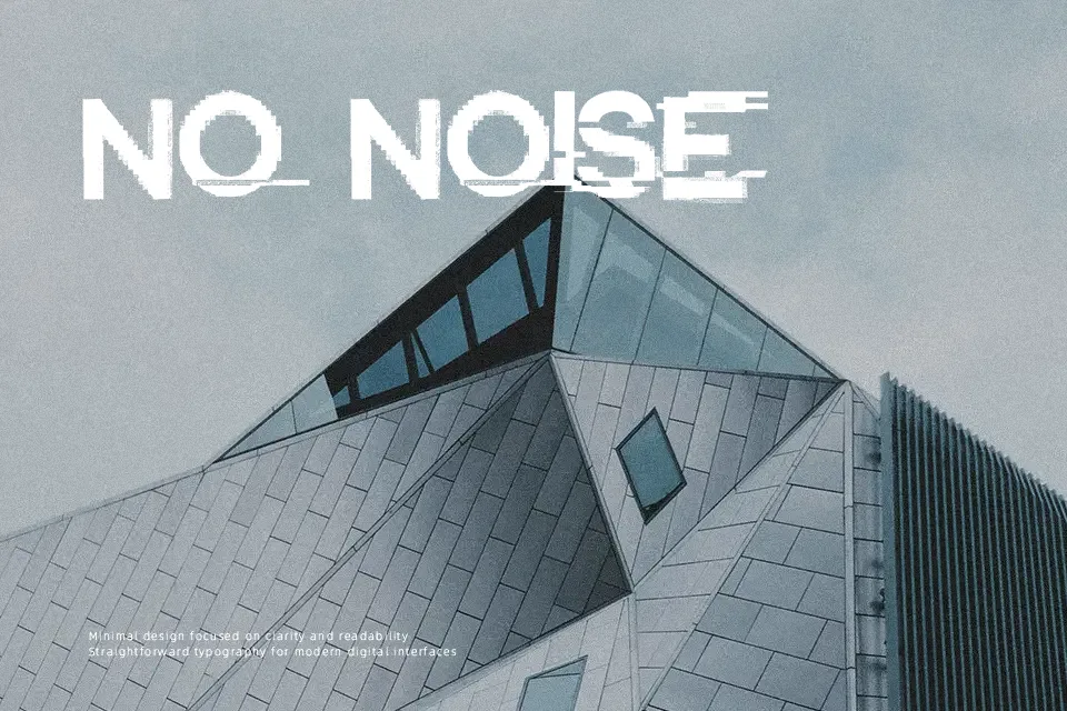
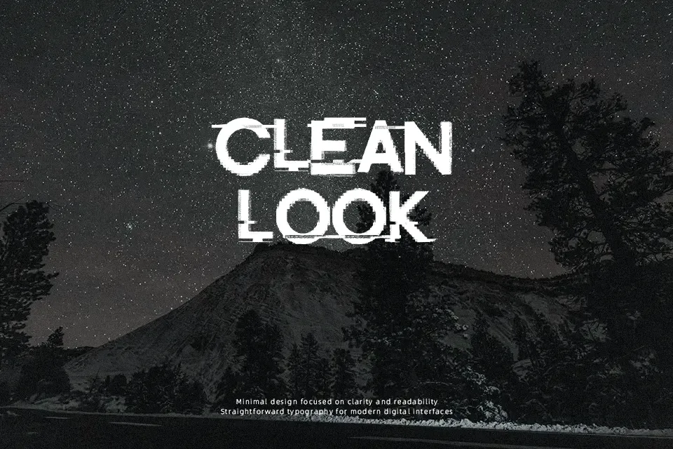
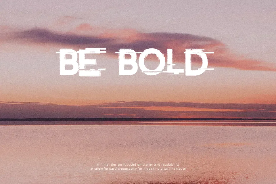
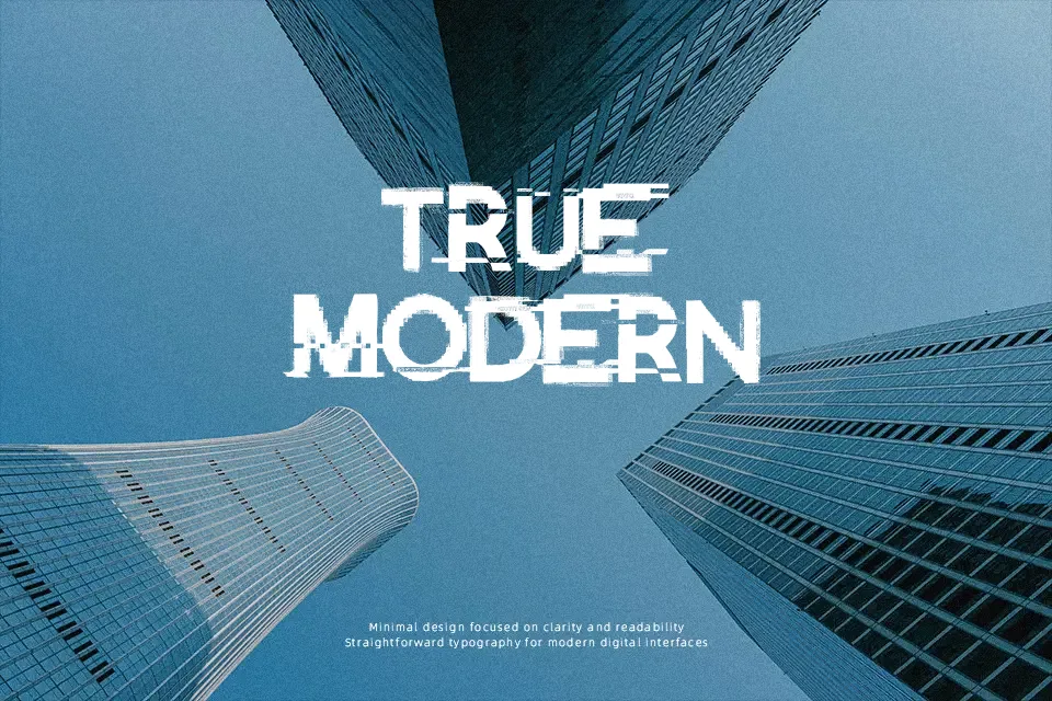
Distort Me Font leans into a damaged, high-impact look with thick letterforms, uneven edges, and a scratched, broken texture that makes each word feel noisy on purpose. The spacing is fairly tight, so it reads best at larger sizes where the distressed details stay visible instead of collapsing into a blur. It has a raw, rebellious tone that fits horror posters, mixtape covers, event graphics, and social posts that need tension rather than polish. I would use it for short headlines or one-word lockups, not for anything informational. In smaller sizes or longer sentences, the texture starts to fight readability.
Best For:
horror posters
music cover titles
Halloween graphics
edgy social headers
Not Ideal For:
body text
formal branding
small mobile UI
wedding stationery
Perfect for halloween, headline, and music, with a artistic and decorative style.
License
Gallery