DK Clair De Lune Font
Free for personal useAbout
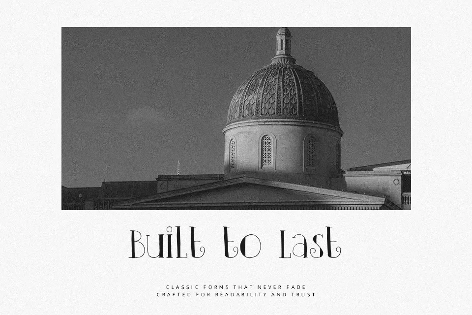
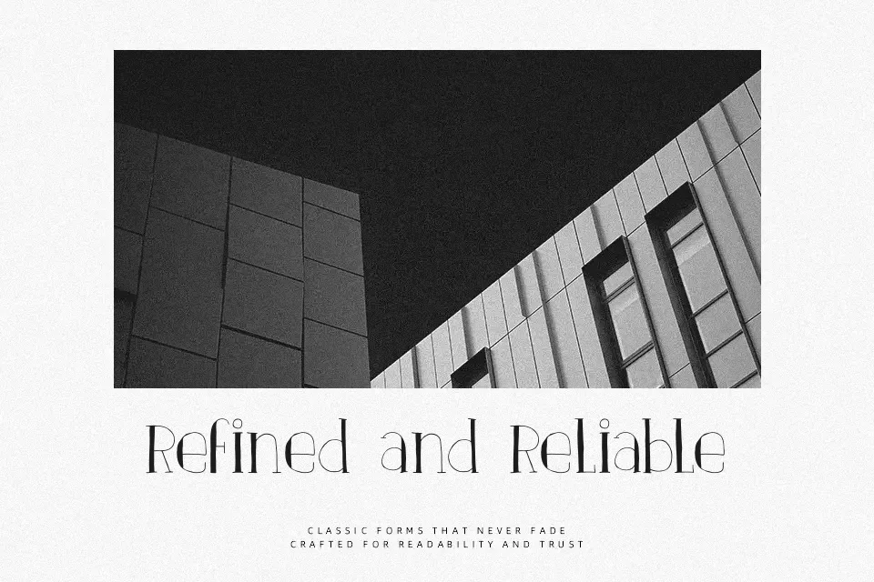
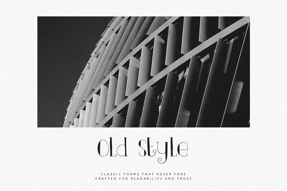
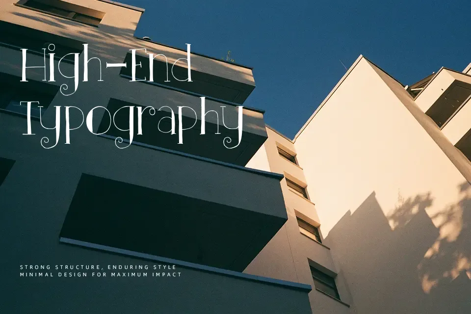
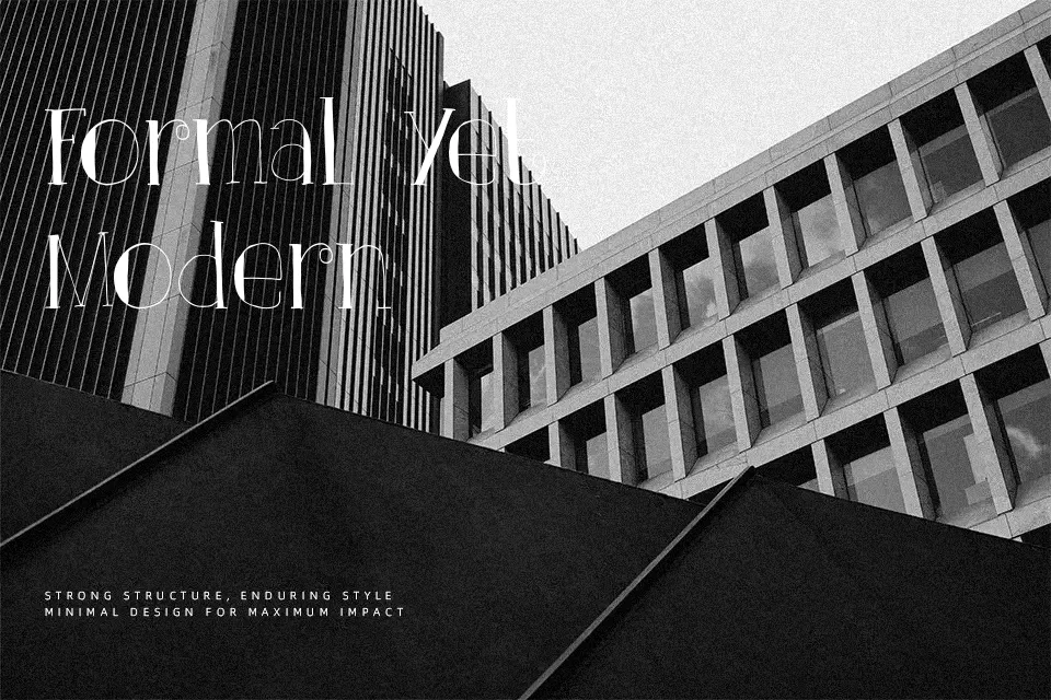
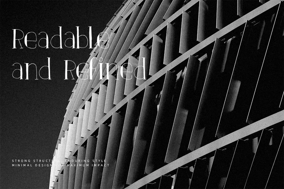
This font leans on tall proportions, hairline strokes, and sharp contrast, with a few slightly quirky curves that keep it from feeling too formal. It reads like a decorative serif with a faint Art Nouveau mood, so it works best on bookish poster titles, boutique candle labels, wedding pieces, or magazine-style hero text where you want elegance without heavy ornament. I would avoid it for body copy, app interfaces, or children’s graphics, because the thin structure and tight details lose clarity quickly once the size drops or the layout gets busy.
dafont
Best For:
boutique invitations; fashion-style headlines; candle or perfume labels; seasonal poster titles
Not Ideal For:
body paragraphs; app interfaces; small captions; kids-focused branding
Perfect for editorial, headline, and invitation, with a artistic and decorative style.
License
Gallery