DK Abeille Font
Free for personal useAbout
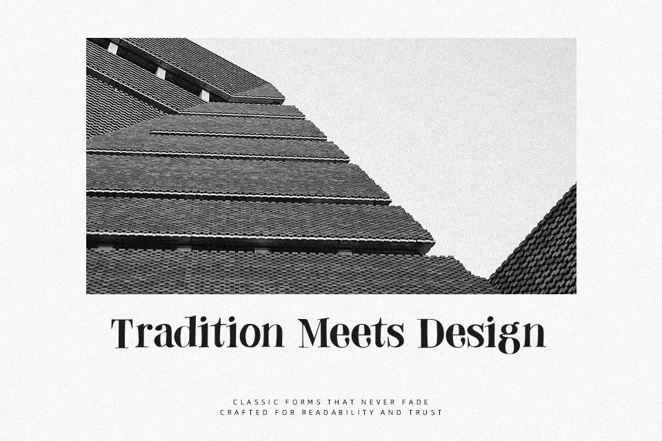
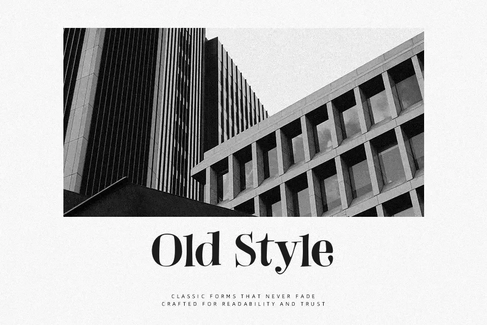
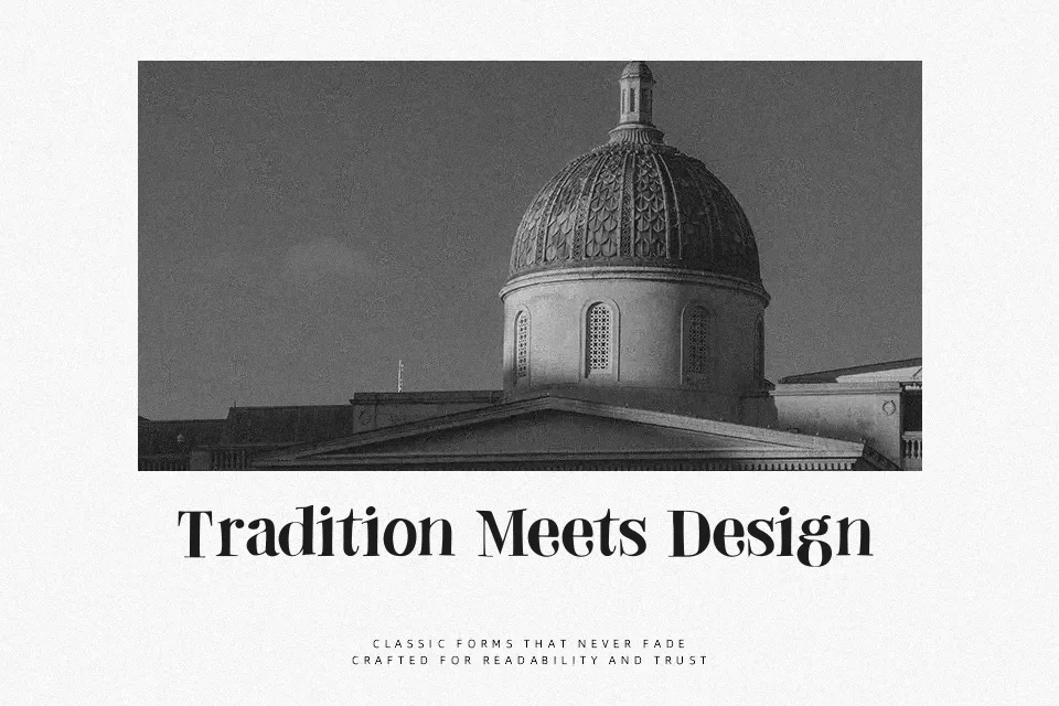
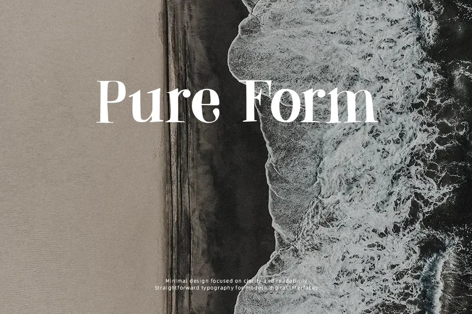
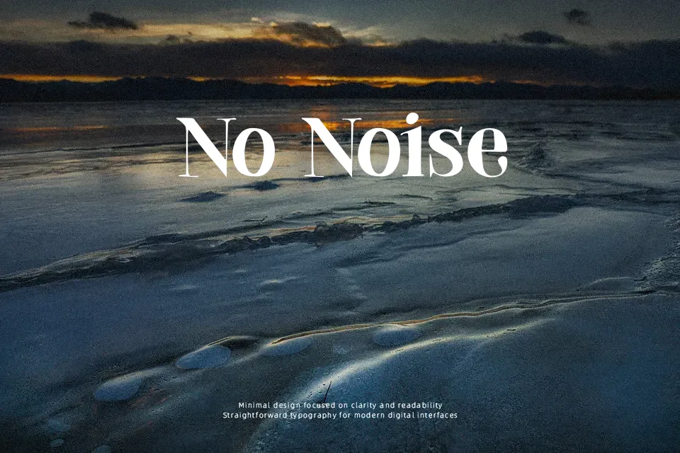
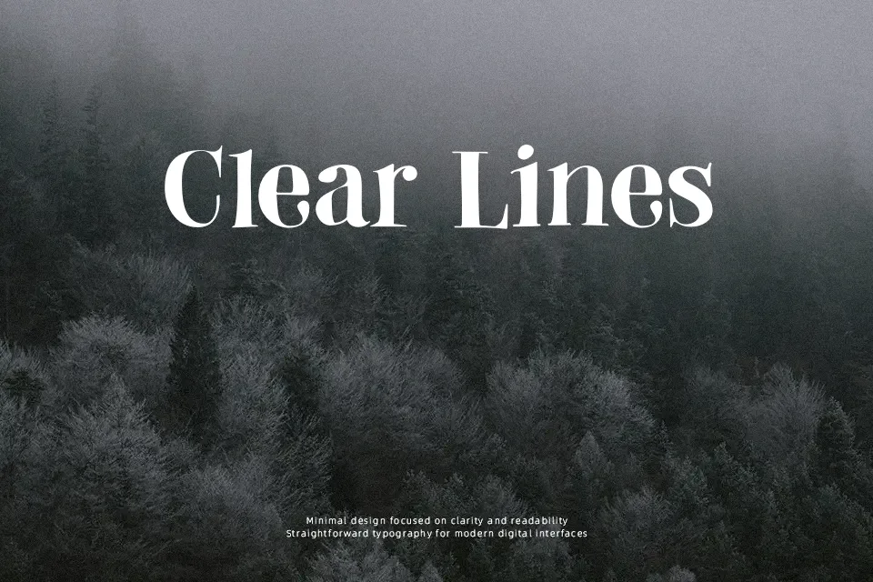
DK Abeille leans on high-contrast serif shapes, tapered strokes, and fairly open spacing, so it reads more like a decorative title face than an everyday text font. The letterforms feel polished but slightly playful, which works well on artisan food labels, spring event posters, shop signage, or editorial openers that need a softer personality. It has more charm than a standard Didone-style display face, though it is not as formal or crisp in small sizes. I would use it when the design can give the letters room to breathe; for body copy, compact mobile screens, or strict corporate layouts, it starts to feel fussy.
Best For:
artisan packaging, spring posters, boutique branding, chapter-opening headlines
Not Ideal For:
body text, compact UI labels, dense legal pages, rigid corporate layouts
Perfect for branding, editorial, and headline, with a artistic and decorative style.
License
Gallery