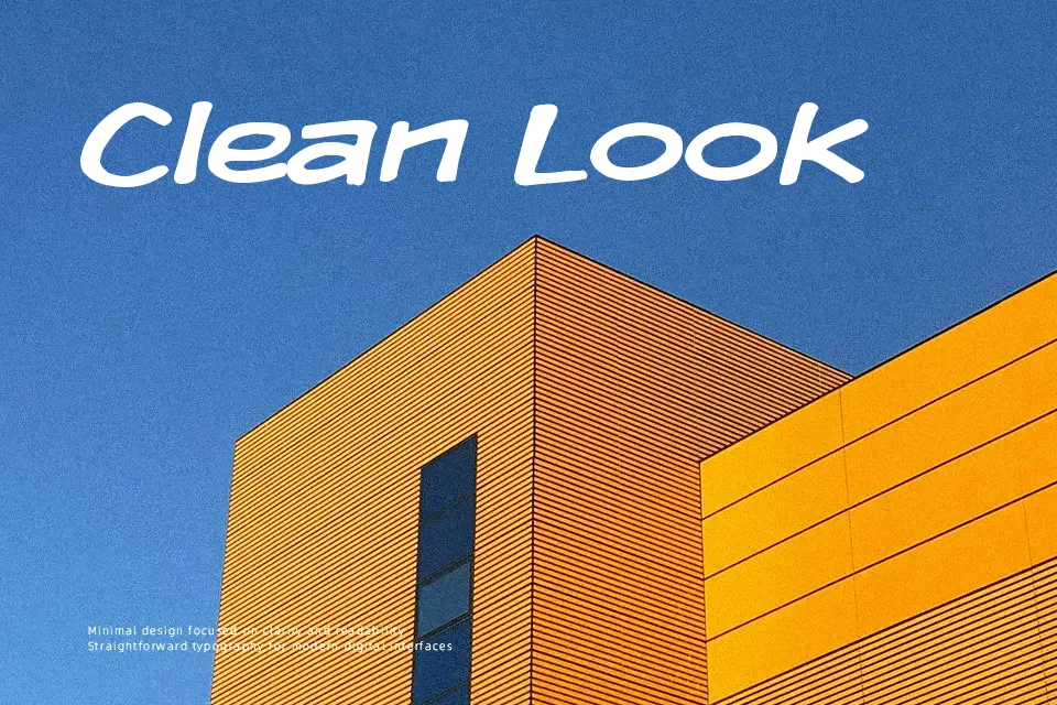
Komika Display Font
Free for personal useAbout
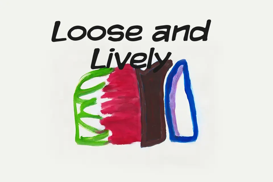
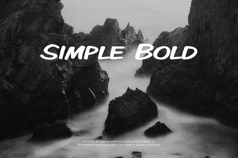
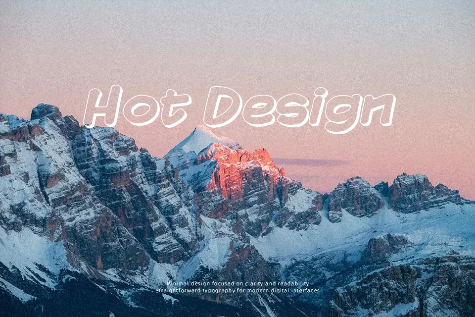
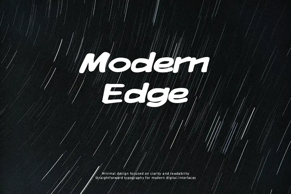
There’s an unmistakably playful tone in Komika Display, driven by its uneven strokes, chunky letterforms, and slightly exaggerated spacing. The characters lean into a hand-drawn comic aesthetic, with irregular curves and a lively rhythm that mimics speech bubbles or cartoon titles. It works well when you want text to feel loud and animated, such as in comic panels, children’s posters, or humorous branding. However, its exaggerated style quickly becomes tiring in long paragraphs and lacks the clarity needed for professional or formal layouts. It performs best in short bursts where personality matters more than precision.
Best For:
comic book titles and speech bubbles
kids event posters
playful social media graphics
cartoon-style branding
Not Ideal For:
long paragraph text
corporate reports or presentations
minimalist design layouts
formal editorial content
Perfect for branding, headline, and kids, with a creative and cartoon style.
License
Gallery