Zen Kaku Gothic Antique Font
Free for Commercial UseAbout
Zen Kaku Gothic Antique combines a traditional Japanese gothic skeleton with restrained, contemporary detailing, so strokes stay even, counters open, and spacing feels calm across weights from Light to Black. It reads as straightforward and professional rather than flashy, which helps when you have dense layouts, annotations, or captions mixing Latin and Japanese text. I like using it when the typography should feel structured but not cold, though its very neutral voice means it can disappear too much in highly expressive branding or whimsical editorial work.
Best For:
bilingual ui and app interfaces mixing latin and japanese
technical documentation, specs, and manuals with dense text
signage or wayfinding systems that demand quick legibility
subtitles and captions over video where clear kana shapes matter
Not Ideal For:
highly decorative branding that needs strong personality or flair
playful kids graphics where rounded, softer letterforms suit better
expressive display headlines that rely on distinct stylistic quirks
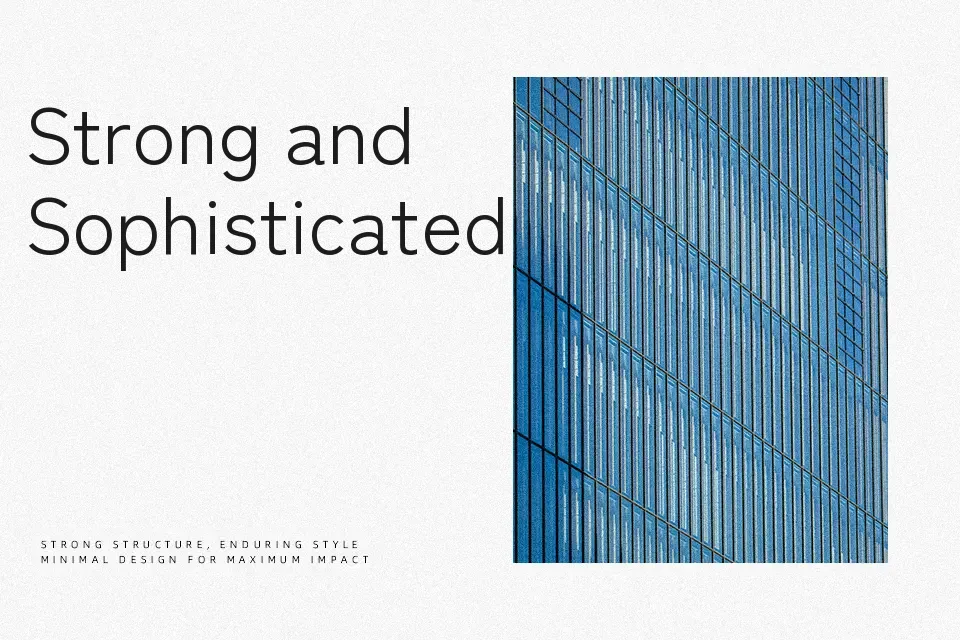
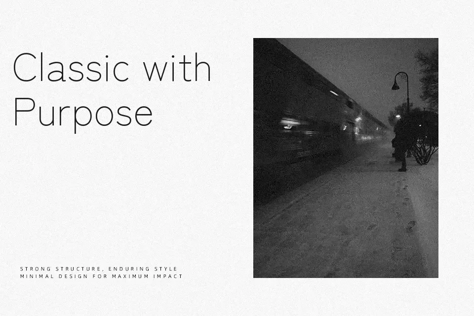
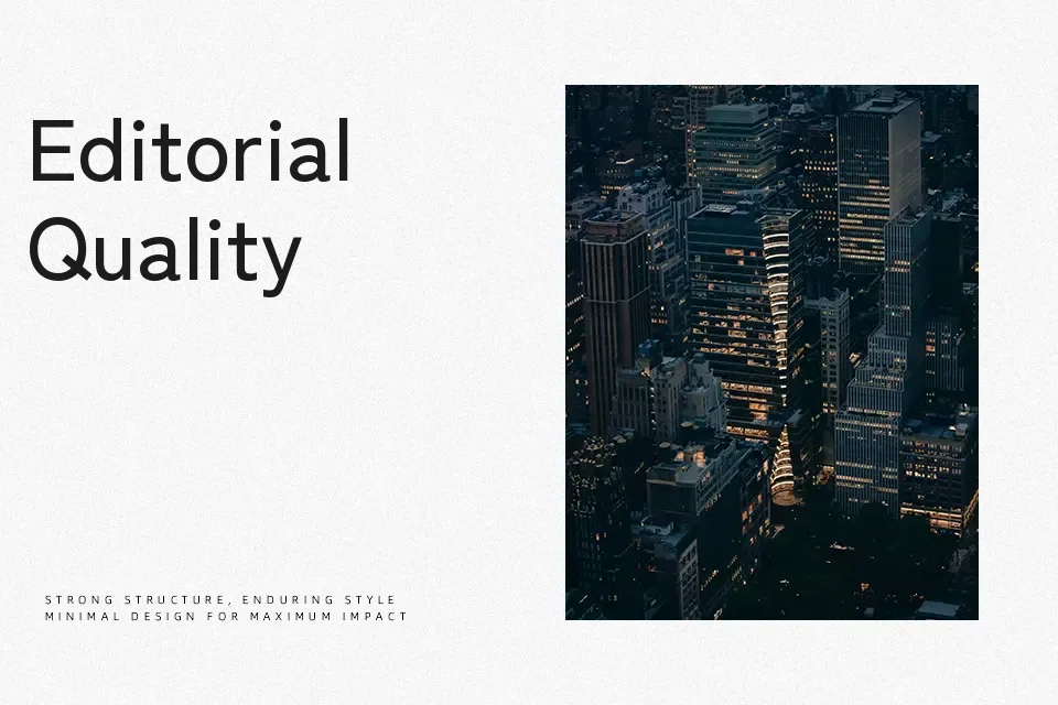
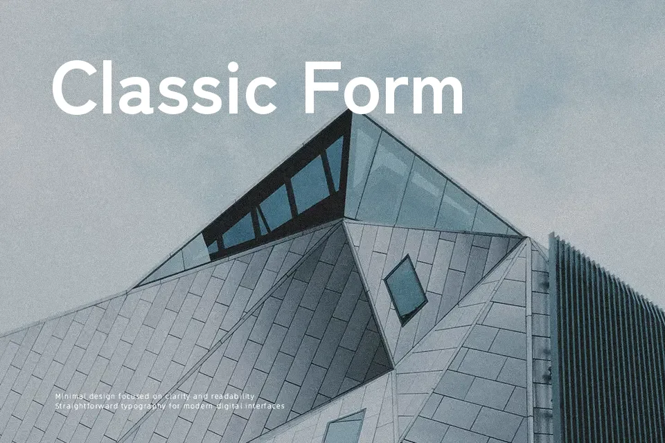
Perfect for body text, editorial, and headline, with a clean and geometric style.
License
Gallery