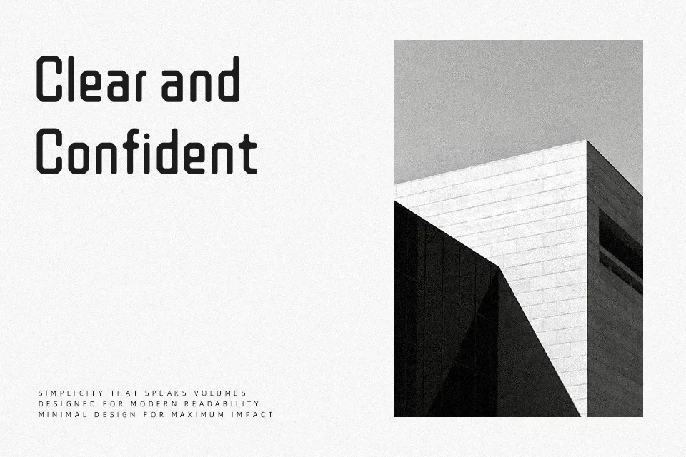
WDXL Lubrifont JP N Font
Free for Commercial UseAbout
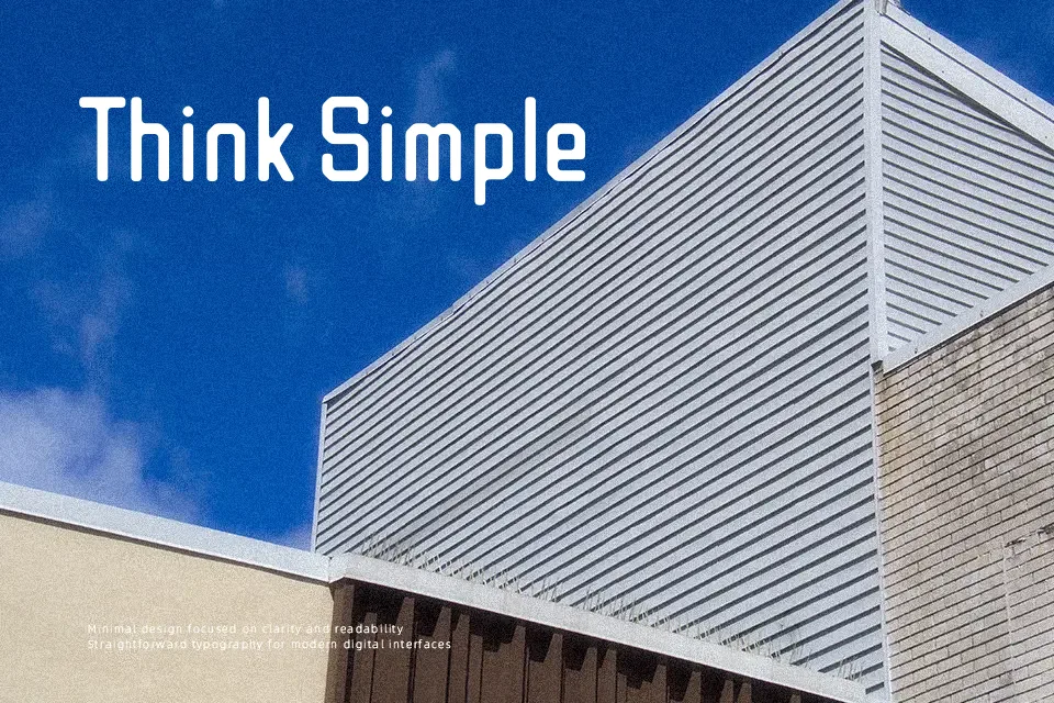
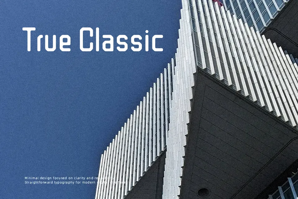
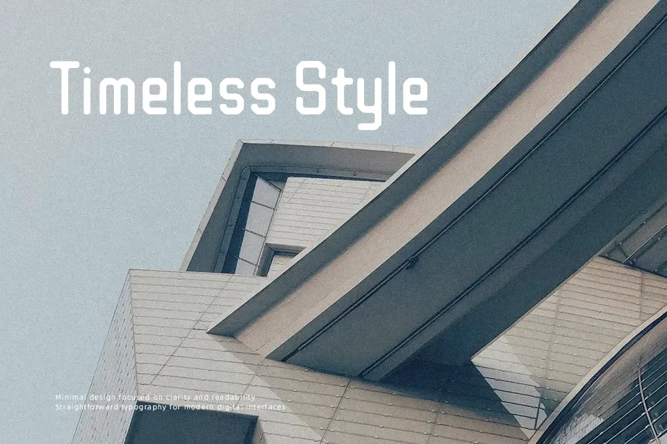
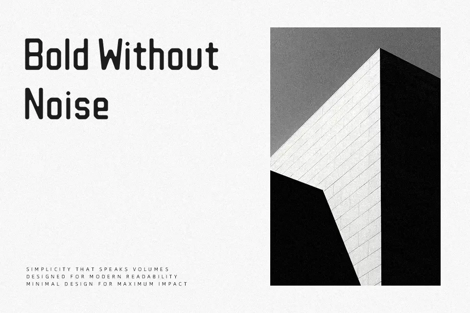
WDXL Lubrifont JP N combines tight spacing, low contrast strokes, and softly rounded terminals to create a dense grid of characters that still reads pleasantly at medium sizes. It carries the flavor of East Asian display fonts while staying structurally simple, so headings, badges, and data-heavy interfaces look organized rather than noisy. I like it for dashboards, small banners, and tool UIs where you want a bit of personality but still need quick legibility; for long body text or highly formal layouts it can feel cramped and informal.
Best For:
compact UI labels and menus
app dashboards and tool interfaces
Japanese-themed headings and badges
casual branding in digital products
Not Ideal For:
long paragraphs or dense editorials
formal corporate reports or documents
large luxury branding campaigns
very small text on print-heavy layouts
Perfect for advertising, branding, and headline, with a bold and display style.
License
Gallery