Trykker Font
Free for Commercial UseAbout
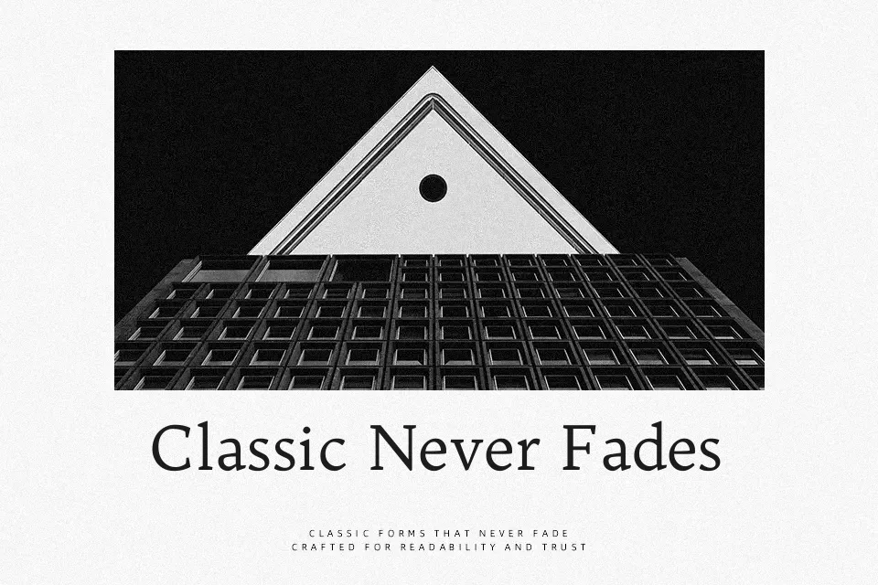
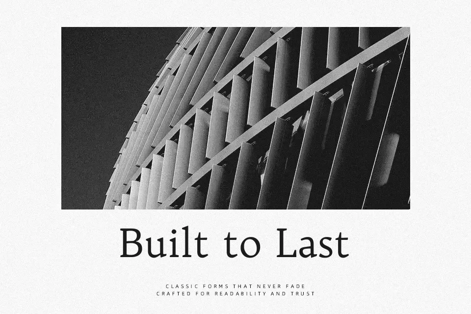
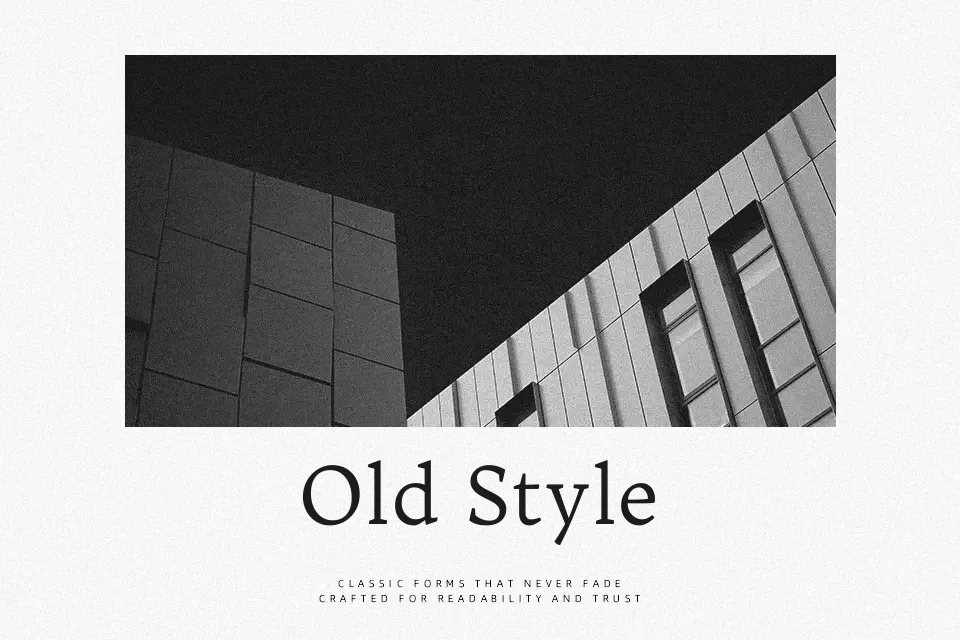
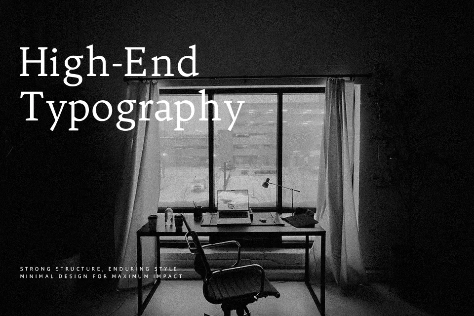
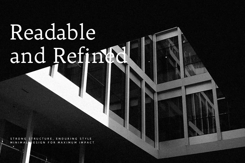
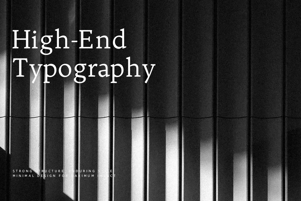
Trykker is a text-focused serif with noticeable contrast, compact proportions, and sturdy, slightly old-style detailing that feels closer to a calm book face than to sharp display lettering. Strokes are firm rather than delicate, with clear counters and spacing that stay readable when columns get dense or the line length stretches a bit. It carries a quiet, vintage tone that works nicely in editorial layouts, long-form articles, and reading-heavy homepages that want a literary edge without looking fussy. On the other hand, if you need a flashy logo, ultra-modern tech branding, or tiny UI labels, its old-fashioned rhythm and contrast can feel slightly out of place or too fragile at very small sizes.
Best For:
literary blogs and essay platforms
editorial layouts inspired by print books
reading-focused websites and online magazines
calm, text-heavy landing pages
Not Ideal For:
high-impact tech or startup branding
tiny UI components or dense dashboards
loud promotional posters or sports graphics
playful kids or cartoon themes
Perfect for body text, branding, and editorial, with a calm and serif style.
License
Gallery