Trochut Font
Free for Commercial UseAbout
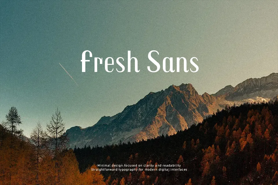
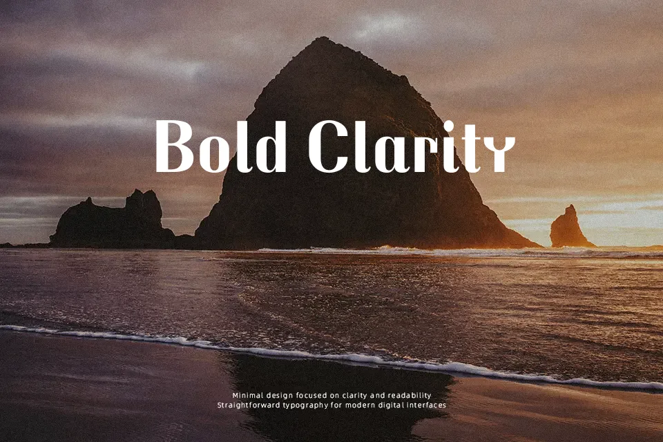
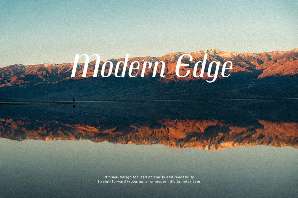
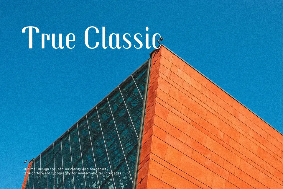
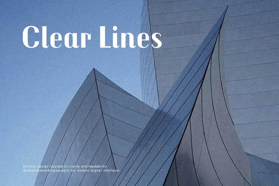
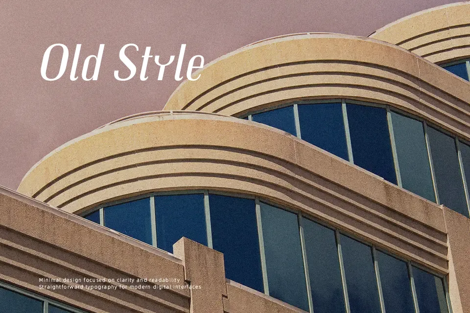
Trochut combines sturdy, low‑contrast strokes with rounded geometry and slightly irregular curves, so text feels playful but still controlled. The bold weights have a compact structure and tight spacing that push letters together into a dense, energetic block, while the italics introduce a slanted rhythm that feels almost hand‑lettered. It leans clearly into display territory, with a retro, magazine‑style flavor that suits covers, section titles, and short pull quotes more than long paragraphs. Use it when you want a friendly, graphic voice on posters, book jackets, or web hero graphics, but avoid using it for small body copy or information‑heavy interfaces where its quirky shapes can become tiring to read.
Best For:
bold magazine covers and section titles
poster headlines and event graphics with personality
book jackets and album art needing a playful retro tone
Not Ideal For:
long-form body text in print or web
dense UI layouts or data-heavy dashboards
very small captions where details blur
Perfect for branding, editorial, and headline, with a artistic and display style.
License
Gallery