Trocchi Font
Free for Commercial UseAbout
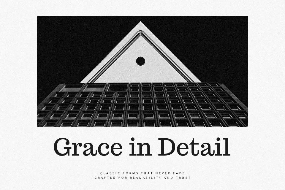
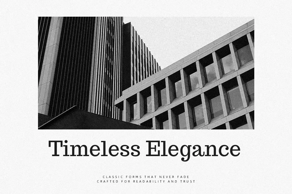
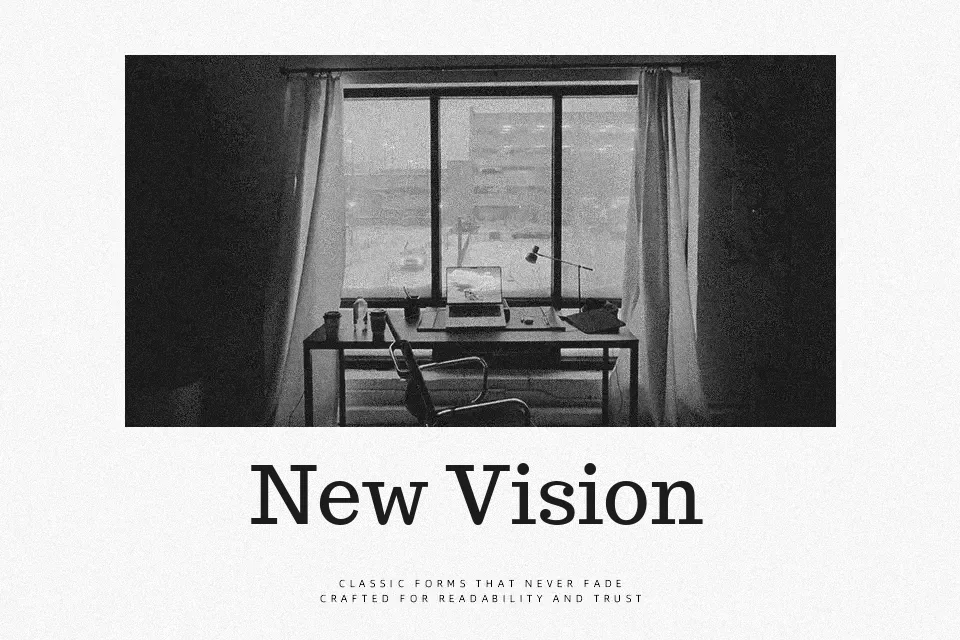
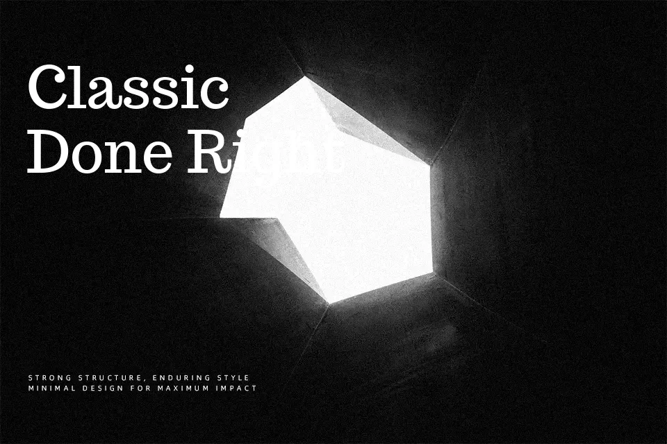
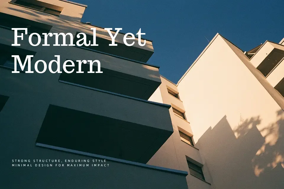
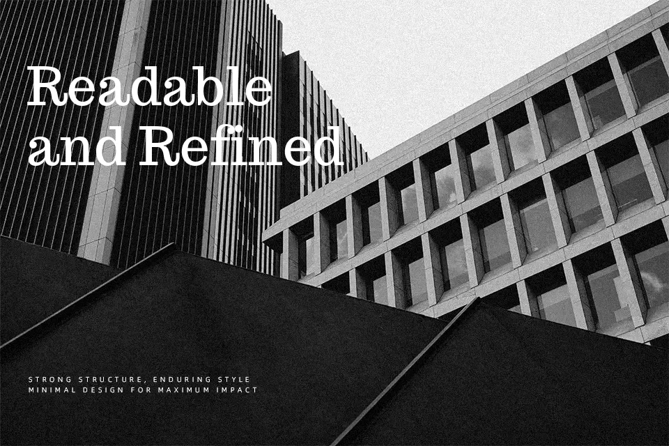
Trocchi is a serif typeface with chunky, slab-leaning terminals, moderate contrast, and open counters that keep text legible even at smaller sizes. The strokes feel steady rather than fussy, with measured spacing and a slightly informal rhythm that softens what could otherwise be a very strict slab serif. In practice, it works well for essays, opinion pieces, and editorial-style landing pages where you want a literary tone without looking old-fashioned. I would reach for it in reading-heavy layouts or bold pull quotes, but avoid it for tiny UI labels or ultra-minimal tech branding where a crisper sans serif would communicate more clearly.
Best For:
Long-form editorial articles and essays
Readable blog posts with a literary tone
Print-style headings and pull quotes that need a solid serif voice
Content-heavy websites wanting a relaxed slab serif feel
Not Ideal For:
Very small interface labels or dense data tables
Ultra-minimal or futuristic tech branding
Highly decorative event graphics that rely on expressive scripts
Kids-focused visuals where a softer, rounder style reads better
Perfect for body text, branding, and editorial, with a classic and serif style.
License
Gallery