Noto Sans Font
Free for Commercial UseAbout
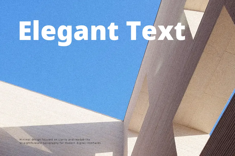
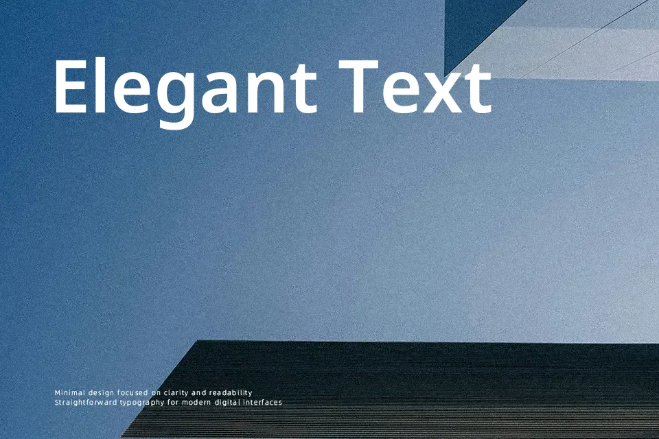
Noto Sans sits in that sweet spot between engineered precision and everyday practicality. Strokes are even and low-contrast, counters are open, and letterforms lean toward a geometric construction without feeling sterile. The spacing is tuned for screens, so text stays legible at small sizes and still looks orderly in dense UI layouts. Its overall voice is modern, neutral, and professional, closer to a workhorse than a showpiece. I reach for it in interface copy, dashboards, and multilingual layouts where Latin, Greek, or Cyrillic scripts need to sit together comfortably, but I would not use it as a characterful display face for expressive branding or editorial mastheads.
Best For:
interface copy and UI labels
app and web dashboards
long on-screen articles
multilingual layouts with Latin/Greek/Cyrillic
Not Ideal For:
expressive display wordmarks
highly decorative branding
luxury editorial mastheads
Perfect for body text, branding, and headline, with a clean and geometric style.
License
Gallery