The Nautigal Font
Free for Commercial UseAbout
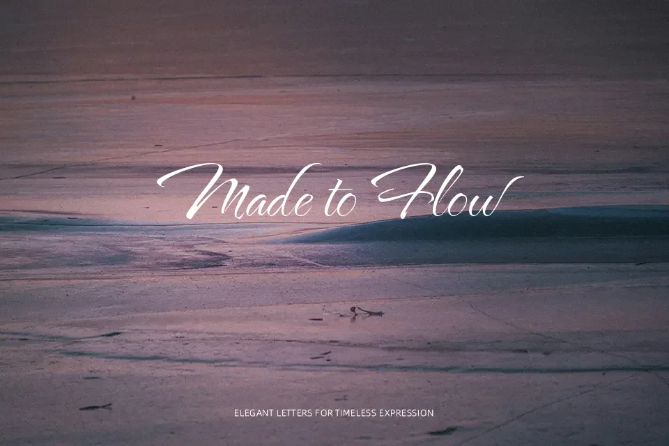
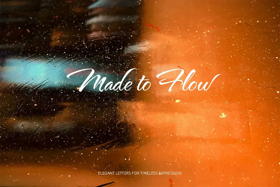
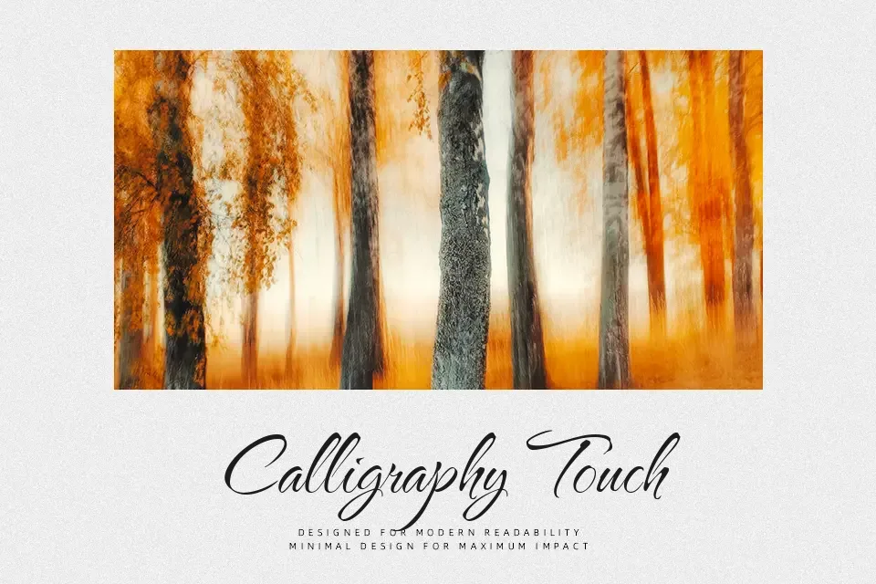
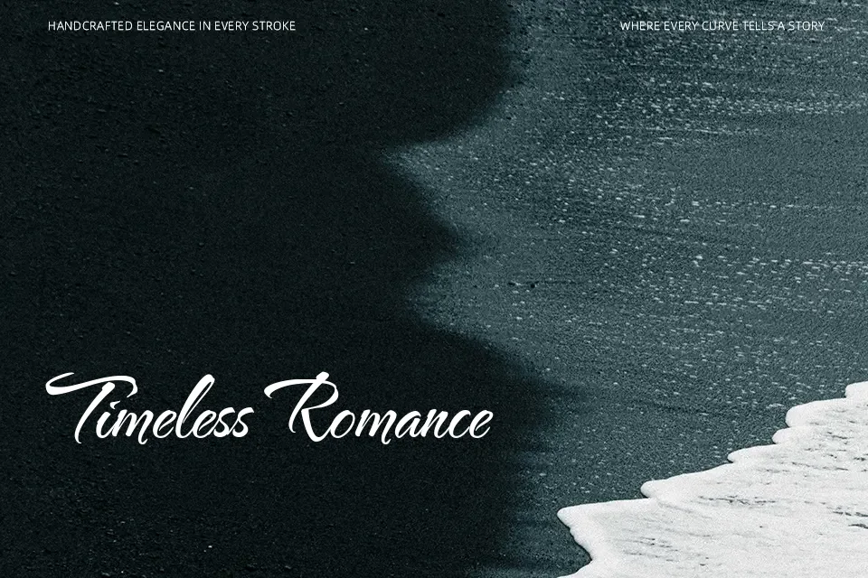
The Nautigal draws its character from expressive hand lettering, with long, looping ascenders, tight connections, and a contrasty stroke that still reads clearly at medium sizes. It sits in that comfortable space between casual note and dressed‑up script: the forms are relaxed, but the joins are tidy and deliberate, so a line of text looks considered rather than improvised. I find it works especially well for names, short headlines, and one‑line logos on packaging, menus, or social posts where you want a bit of flourish without tipping into hard‑to-read calligraphy. For dense body copy, small captions, or interfaces that demand strict legibility, its decorative swashes and variable spacing can feel busy, so a simpler companion typeface is usually a better choice.
Best For:
short branding wordmarks and product names,
social media quote graphics and announcements,
wedding or event invitations with a relaxed upscale tone
Not Ideal For:
long paragraphs or editorial body text,
tiny UI labels or data-heavy interfaces,
highly technical or austere corporate documents
Perfect for branding, invitation, and logo, with a artistic and calligraphy style.
License
Gallery