Tenor Sans Font
Free for Commercial UseAbout
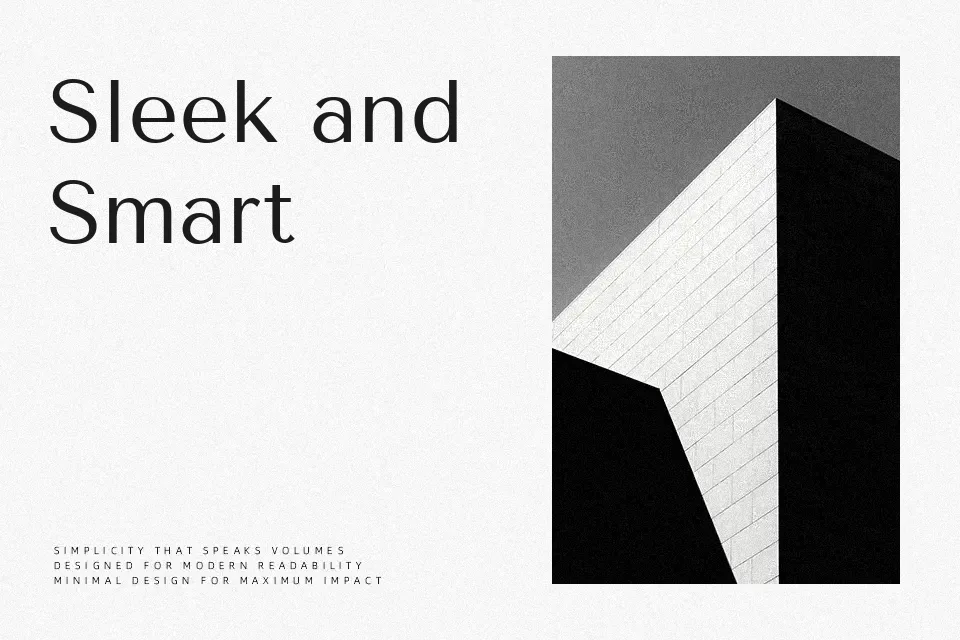
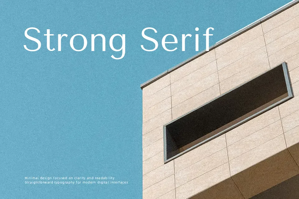
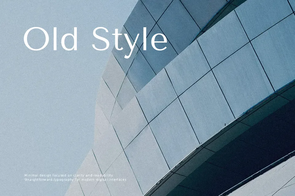
Tenor Sans sits in the humanist sans serif camp, with slightly widened proportions, gentle stroke modulation, and open counters that keep long paragraphs comfortable to read. It feels composed rather than flashy, so it works well for article pages, minimalist blogs, book interiors, and interface text where you want clarity without a rigid “corporate” tone. The single regular weight can also scale to subheads and quiet headlines, though it lacks the punch needed for loud promotional graphics. If you like the softness of Optima-style sans serifs but need something more neutral for both print and web, Tenor Sans is a sensible, workhorse option.
Best For:
long-form editorial layouts and news-style articles
content-focused websites and blogs with a restrained aesthetic
book interiors, reports, and reading-heavy documents
subtle headings where a softer sans serif fits the tone
Not Ideal For:
bold marketing campaigns needing heavy weights or strong contrast
logo systems that rely on multiple weights within one family
tiny UI labels in very dense interfaces
highly decorative or expressive typography
Perfect for body text, branding, and editorial, with a calm and geometric style.
License
Gallery