TASA Explorer Font
Free for Commercial UseAbout
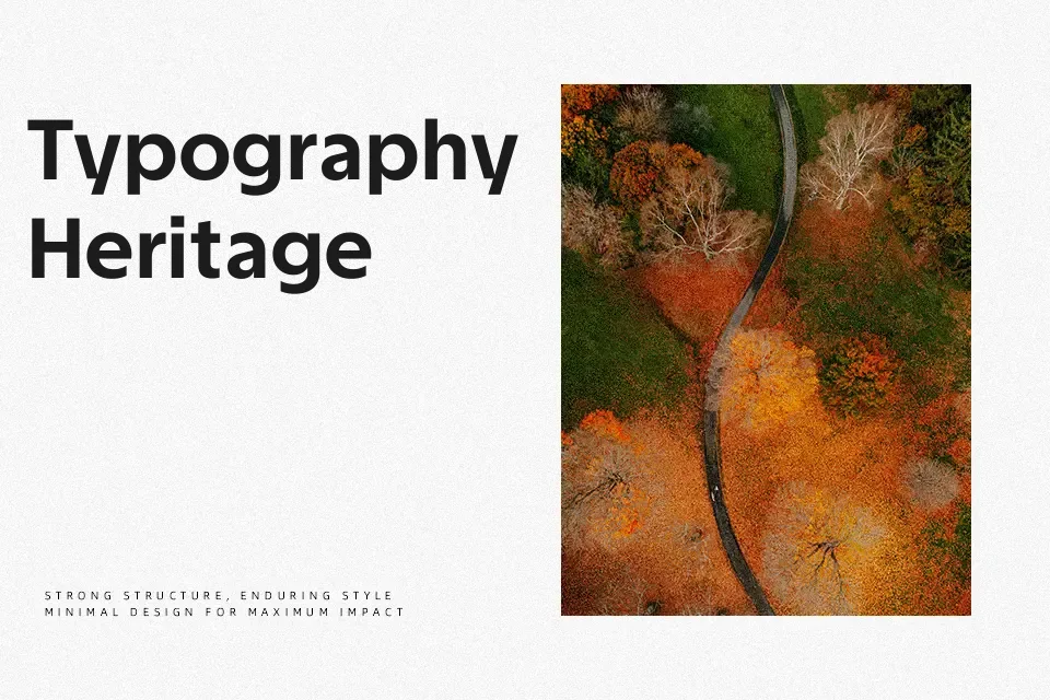
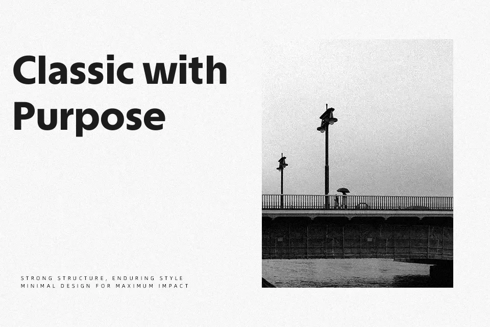
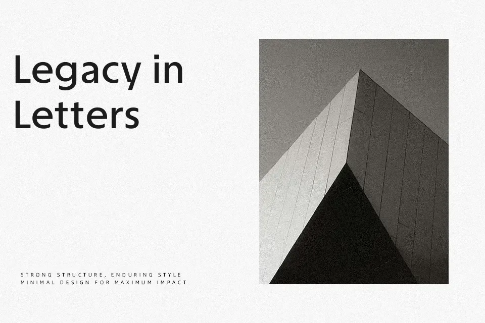
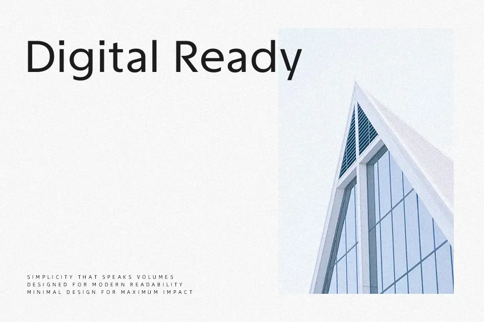
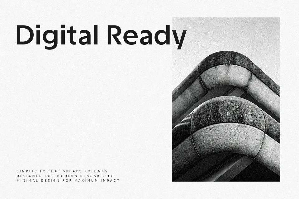
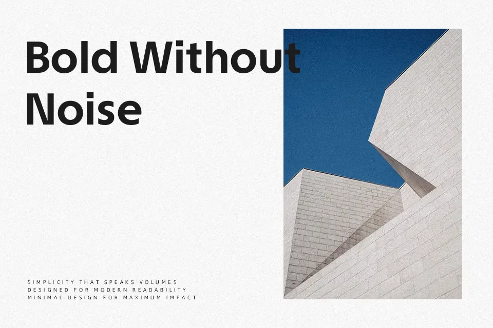
TASA Explorer is a geometric sans serif originally drawn for the Taiwan Space Agency, so it naturally leans into a clean, engineered look with a subtle sci‑fi edge. Its strokes are mostly monolinear, with sharp corners and vertically cut terminals that keep counters open and text shapes clear, especially in mid to bold weights. The updated version softens some curves and slightly lowers the x‑height, which makes paragraphs more breathable than many rigid geometrics. I reach for it when I want branding, UI, or editorial work to feel technical and forward-looking without drifting into gimmicky “space” lettering. It can feel a bit sterile in very emotional or highly decorative contexts, so if you need warmth or strong personality, you may want to pair it with something more expressive.
Best For:
space-related branding and campaigns
tech or science magazines and articles
UI layouts and dashboards with data-heavy screens
event posters for conferences or exhibitions
Not Ideal For:
highly decorative or nostalgic vintage themes
playful kids content or handcrafted aesthetics
dense body text at very small sizes on low-res screens
projects needing strong script-like personality
Perfect for branding, editorial, and headline, with a clean and geometric style.
License
Gallery