Syne Mono Font
Free for Commercial UseAbout
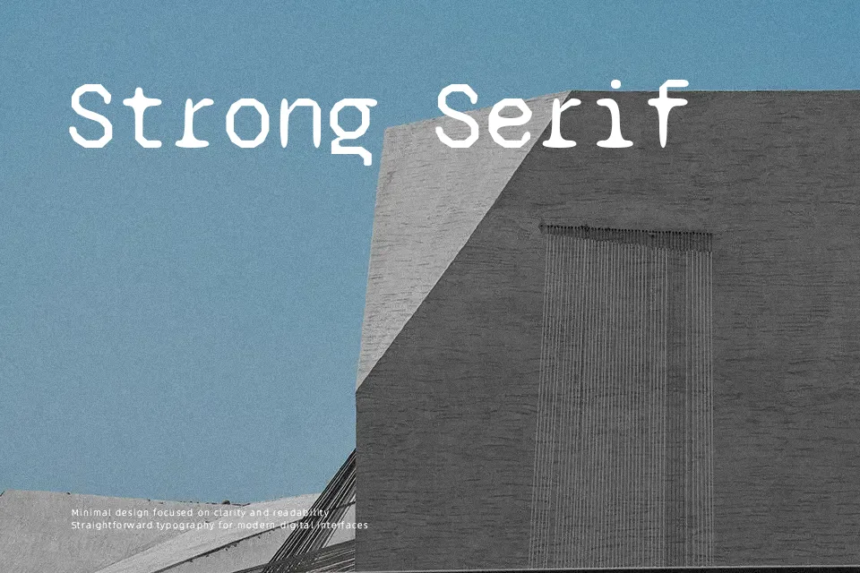
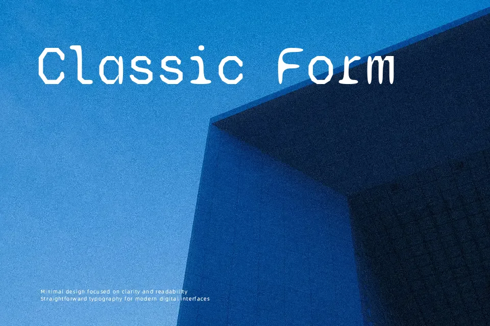
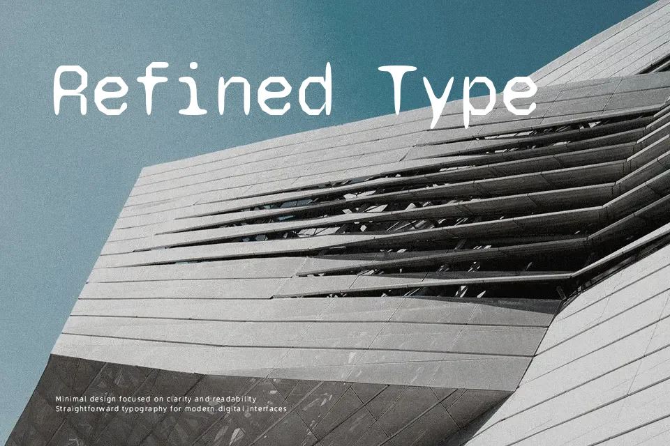
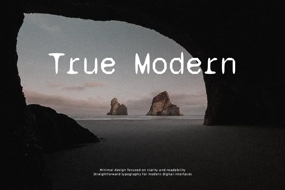
Syne Mono sticks to a strict monospaced grid, yet its outlines feel slightly misaligned and organic, so text looks structured but never cold. Strokes are fairly even, counters are open, and spacing is generous enough that lines breathe, which helps at small UI sizes and in dense tables. Visually it leans modern and experimental rather than neutral: you see the glitches and odd angles, especially in letters like “a”, “g”, and punctuation. That character makes it engaging for code blocks, technical side notes, branding systems that mix grotesque sans for body text with a more characterful monospace accent, and editorial spreads that need a data or “terminal” voice. It is less convincing for long-form reading or corporate decks that demand a very sober tone, where a calmer coding font would stay out of the way.
Best For:
UI code snippets and terminal-style blocks
Interface labels, metadata, and tables in design systems
Editorial layouts that need a technical accent line
Branding that mixes neutral sans text with a characterful mono
Not Ideal For:
Long paragraphs or immersive reading
Very conservative corporate presentations
Projects needing a fully neutral coding font
Highly ornate or romantic visual themes
Perfect for branding, editorial, and headline, with a bold and display style.
License
Gallery