SUSE Font
Free for Commercial UseAbout
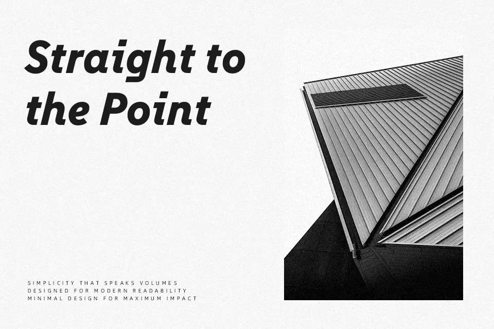
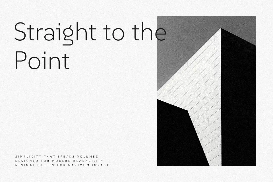
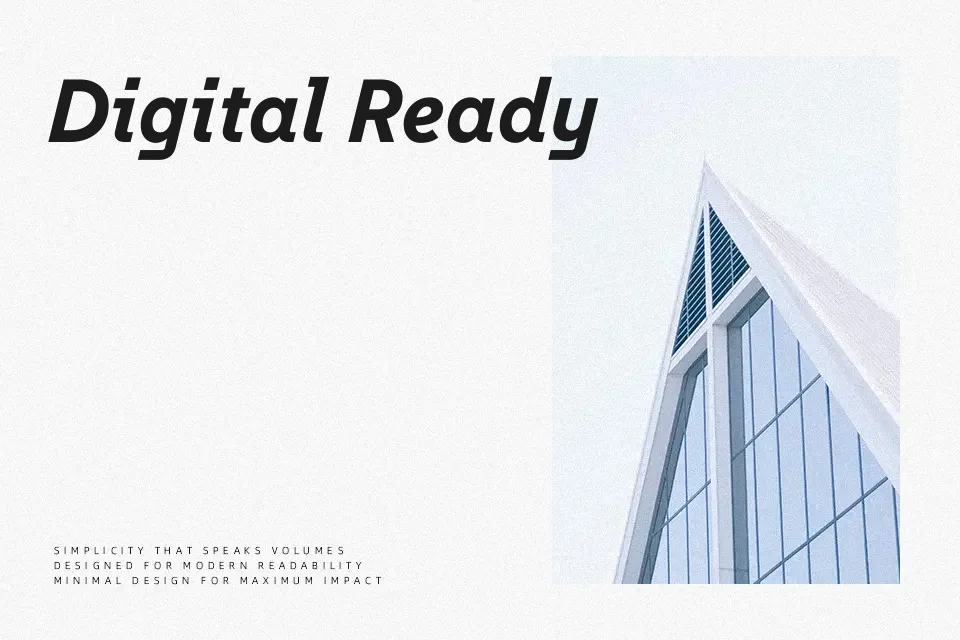
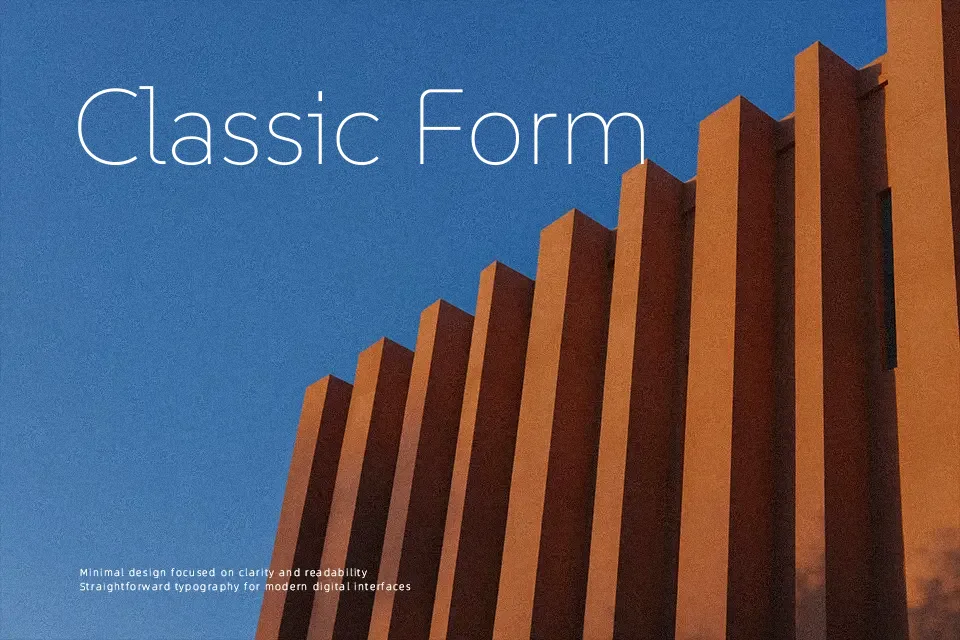
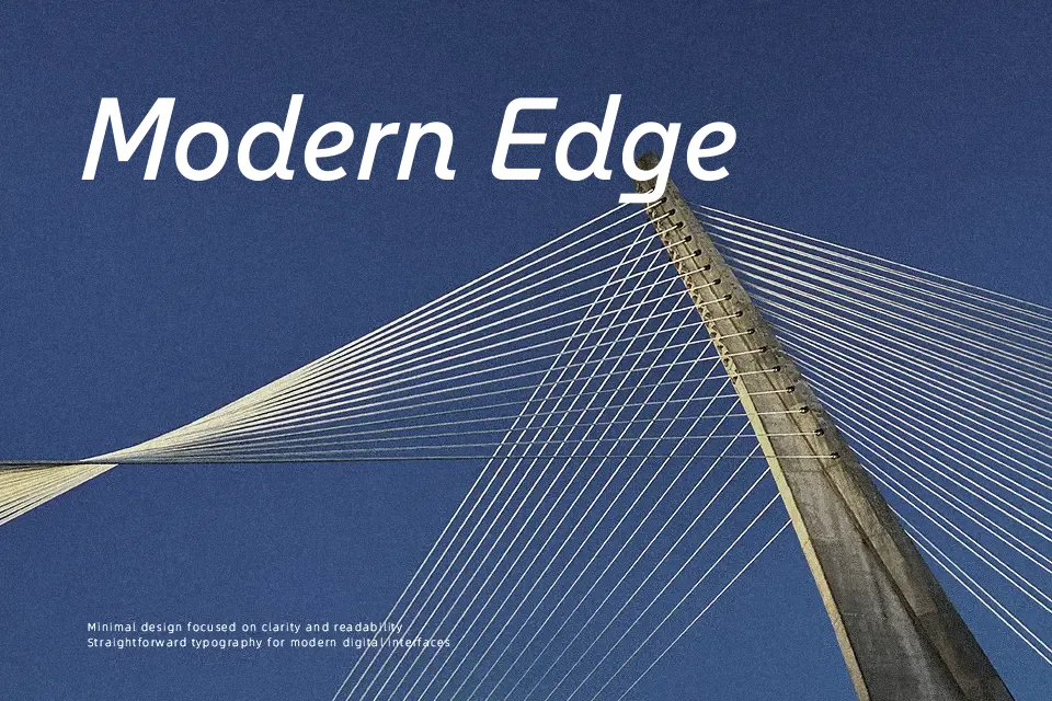
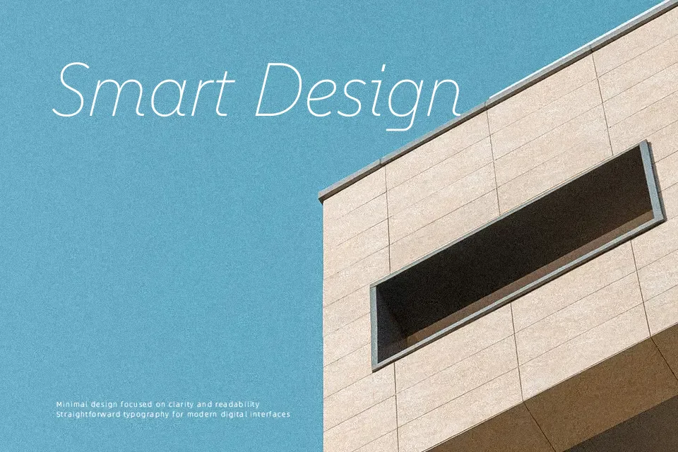
SUSE Font leans on clean, low-contrast strokes, generous x-height, and disciplined spacing, so text stays crisp on dense UI screens and complex layouts. Its hybrid feel—somewhere between geometric and console-inspired—adds a quiet tech character without looking cold or experimental. Multiple weights and italics make it easy to build hierarchy from product headlines to in-app microcopy and charts. It shines in design systems, dashboards, and engineering-focused brands, but feels a bit too clinical for emotional campaigns, playful kids’ work, or ornate editorial mastheads where stronger personality is needed.
Best For:
UI dashboards and product interfaces
Developer tools, terminals, and technical documentation
Tech brand websites and open-source project pages
Not Ideal For:
Highly expressive editorial covers or magazine mastheads
Playful kids content or character-led illustrations
Romantic event stationery or luxury lifestyle branding
Perfect for body text, branding, and headline, with a clean and geometric style.
License
Gallery