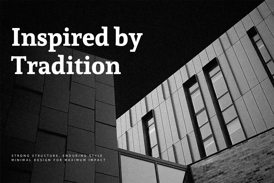
Sura Font
Free for Commercial UseAbout
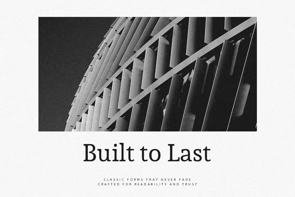
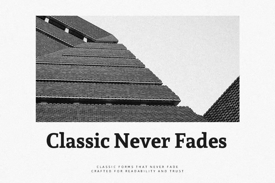
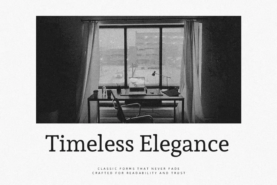
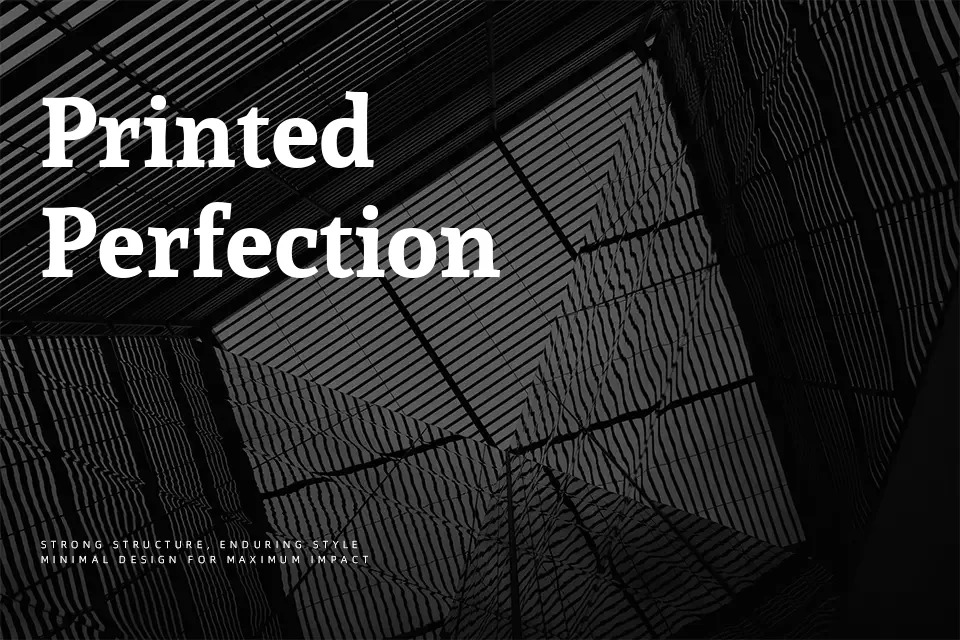
Sura combines humanist slab-style serifs with medium stroke contrast, so letters feel sturdy without looking stiff. The proportions are open, the curves are soft, and spacing is tuned for continuous reading rather than decorative impact. It carries a subtle Devanagari influence, which gives Latin text a distinctive rhythm that stands out from more generic book serifs. In practice, it works well for bilingual layouts, thoughtful content marketing pages, and interfaces where body text must stay legible across scripts. However, if you need extreme display drama or ultra-tight geometric branding, Sura can feel too restrained and text-oriented.
Best For:
Long-form editorial layouts and articles with bilingual content
Reading-focused websites that combine headings and body text
Cultural or educational branding that needs a composed, literary voice
Not Ideal For:
Highly expressive display logos requiring strong visual impact
Ultra-minimal tech interfaces that rely on strict geometric shapes
Very small UI labels where a simpler sans serif reads more cleanly
Perfect for body text, branding, and editorial, with a calm and serif style.
License
Gallery