Supermercado One Font
Free for Commercial UseAbout
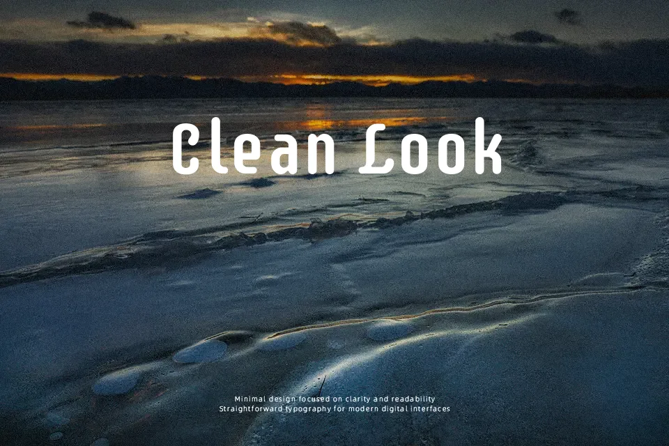
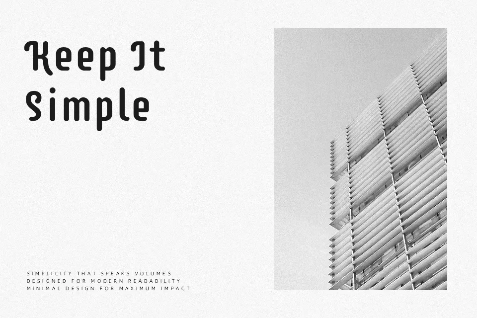
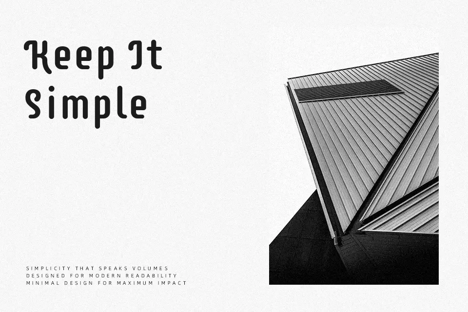
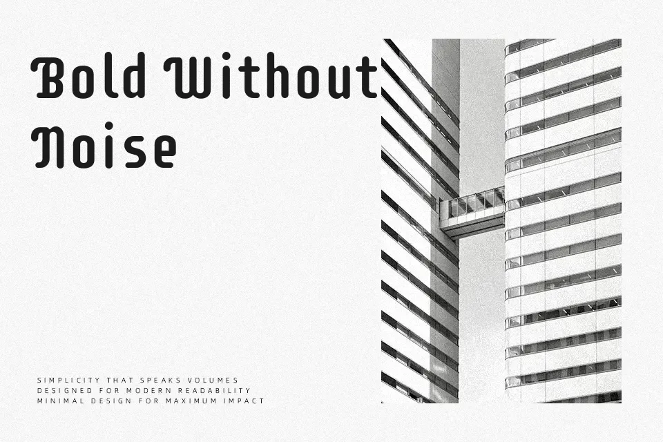
Supermercado One has chunky, low-contrast strokes, open counters, and slightly squared curves that give it a sturdy yet approachable look. The spacing feels a bit tight and energetic, so words tend to form compact, eye-catching blocks rather than airy lines. Overall it reads as a casual display sans, somewhere between handmade shop signage and a simplified geometric style, which works nicely for food brands, bistro menus, price tags, promos, and playful product packaging. It holds up well at medium to large sizes where its quirky shapes can be appreciated, but it becomes noisy in dense body text or small UI labels. If you like friendly display sans serifs but find some script fonts too decorative, this lands in a practical middle ground.
Best For:
colorful grocery or market branding,menu boards and chalkboard-style price lists,food and beverage packaging headlines,playful promo posters and social graphics
Not Ideal For:
long-form body paragraphs or articles,formal corporate reports or legal documents,tiny UI labels or dense data tables,minimalist tech or luxury branding
Perfect for branding, headline, and logo, with a bold and display style.
License
Gallery