Sulphur Point Font
Free for Commercial UseAbout
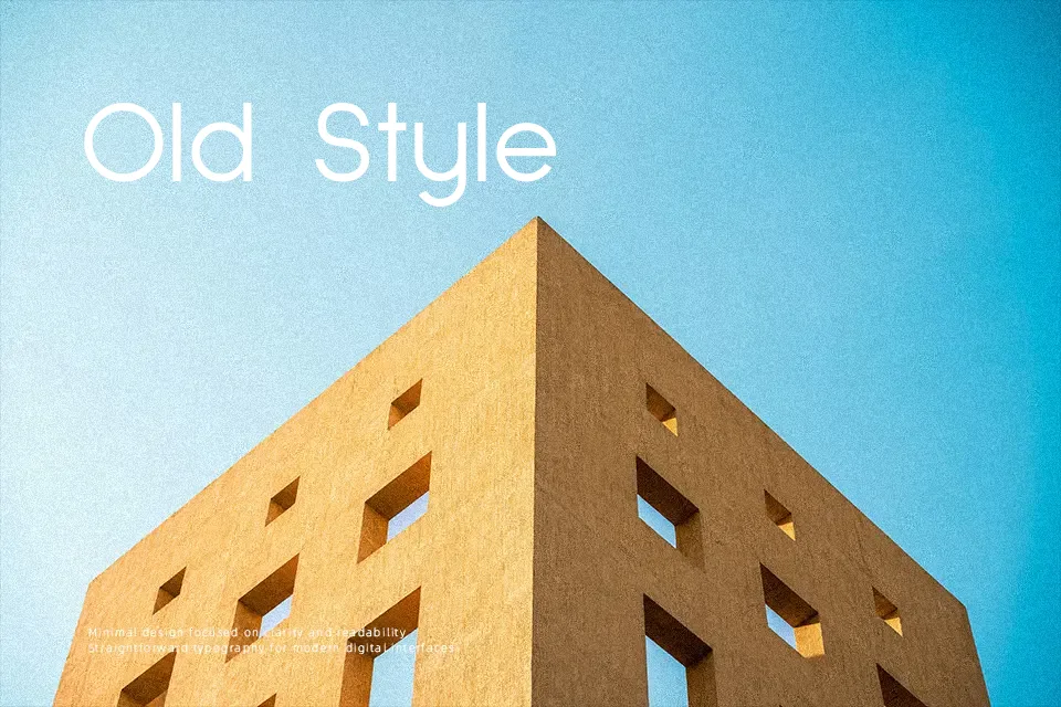
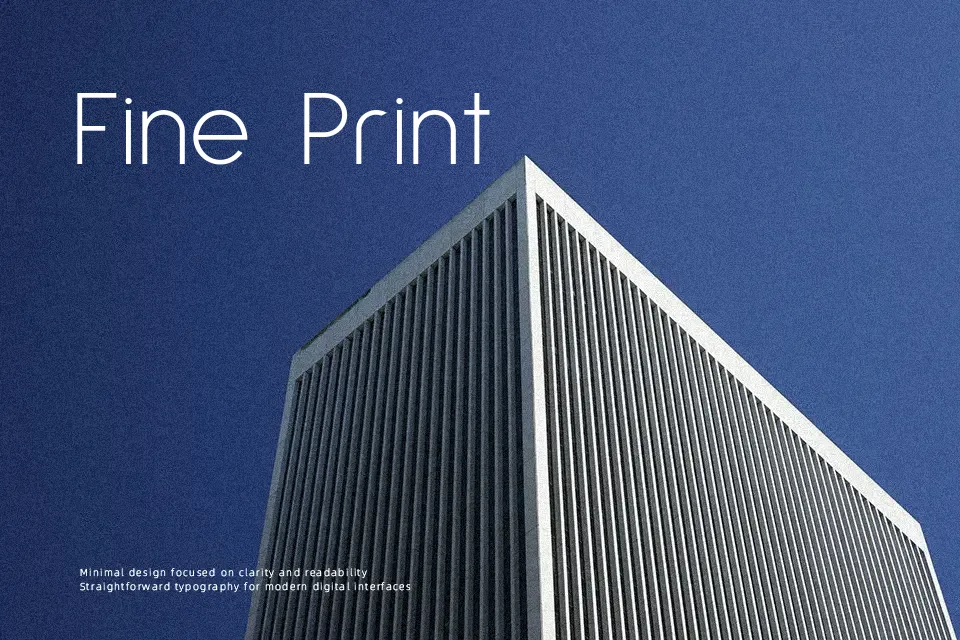
Sulphur Point is a geometric sans serif with low-contrast stems, a tall x-height, and restrained ascenders and descenders, so text blocks feel compact without becoming cramped. The drawing leans rational and measured, with minimal optical corrections, which gives paragraphs a calm, engineered voice rather than a showy personality. It holds up nicely in UI labels, data-heavy dashboards, and contemporary editorial where you want typography to support the content, not dominate it. On the downside, the strict geometry can feel a little cold in highly emotional storytelling or ultra-luxury branding, where softer or more expressive letterforms usually perform better.
Best For:
clean editorial layouts and long-form reading on screen
interface labels, dashboards, and product UI where clarity matters
straightforward visual identities that favor neutral, geometric type
Not Ideal For:
highly expressive logos that rely on decorative lettershapes
luxury or romantic branding that needs softer, more ornate typography
very playful kids’ graphics where exaggerated curves read better
Perfect for body text, editorial, and headline, with a calm and geometric style.
License
Gallery