Staatliches Font
Free for Commercial UseAbout
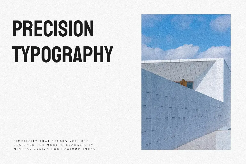
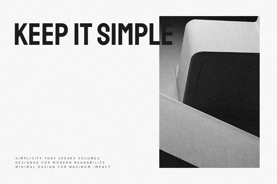
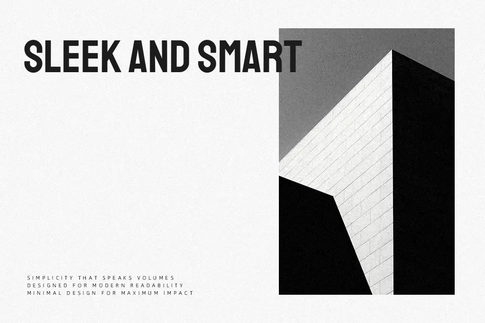
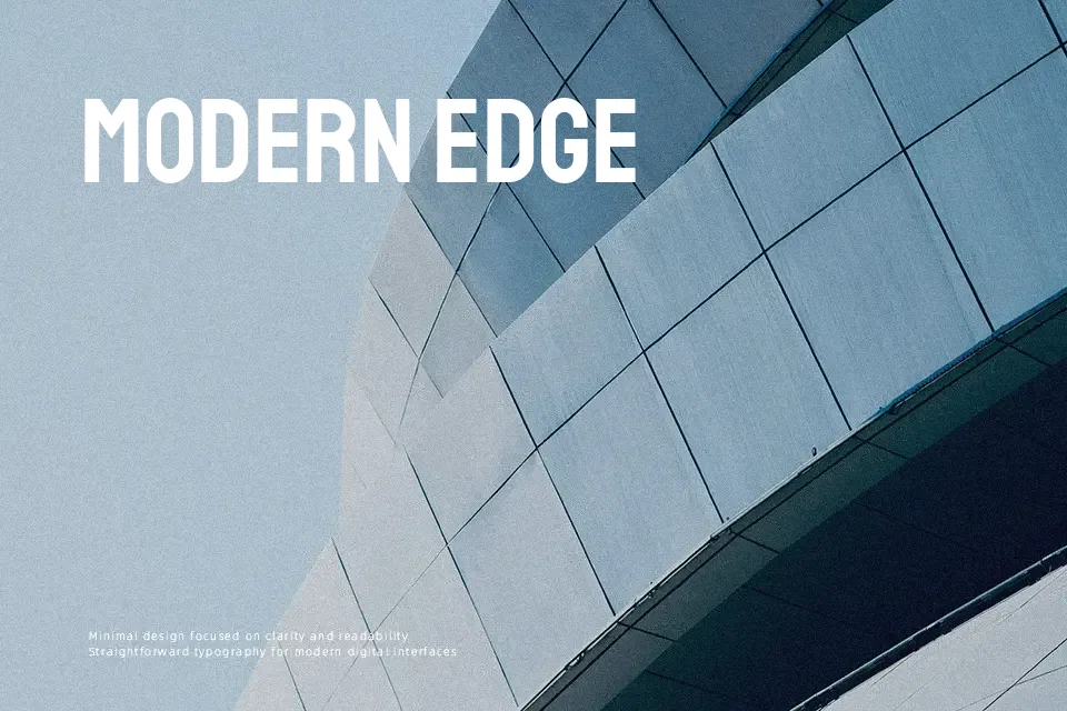
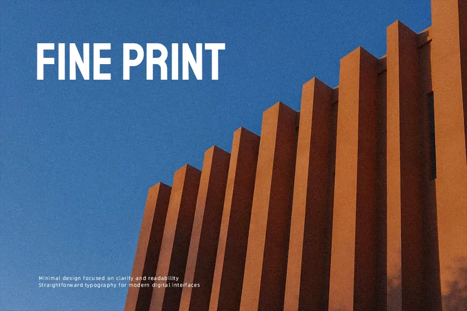
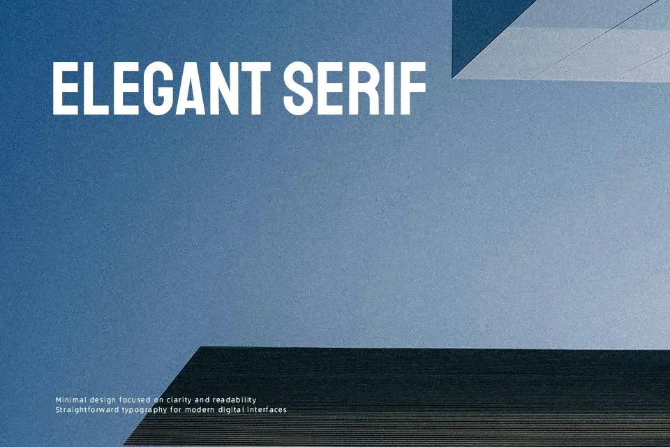
Staatliches is a single-weight display typeface with tall, narrow caps, firm horizontal cuts, and tight but orderly spacing that gives text a compact, architectural feel. Its structure leans strongly geometric and sans serif, echoing early Bauhaus lettering, so it reads more engineered than handwritten. The font shines in short, high-impact text like large headlines, exhibition titles, packaging wordmarks, and bold navigation labels where a rigid grid-like rhythm is an asset. For long paragraphs, small UI copy, or content that needs nuance and softness, its all-caps, uniform weight can feel tiring and shouty, so it works best paired with a more neutral text companion. If you like industrial grotesque styles but want something more stylized, this sits in that space without becoming overly decorative.
Best For:
bold editorial headlines
posters and exhibition titles with a Bauhaus tone
distinctive branding wordmarks and logos
Not Ideal For:
long-form body text or dense reading experiences
small UI labels or accessibility-critical copy
projects needing a soft, warm, or handwritten feel
Perfect for branding, headline, and logo, with a artistic and display style.
License
Gallery