Space Grotesk Font
Free for Commercial UseAbout
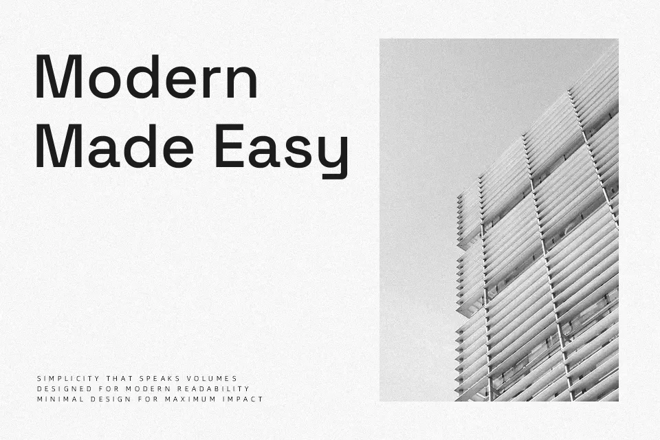
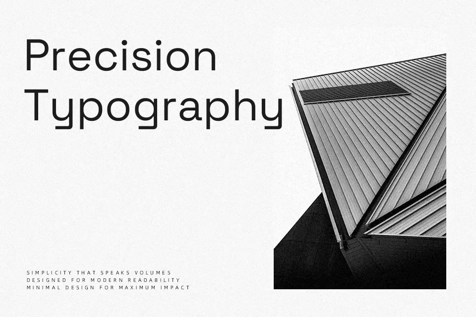
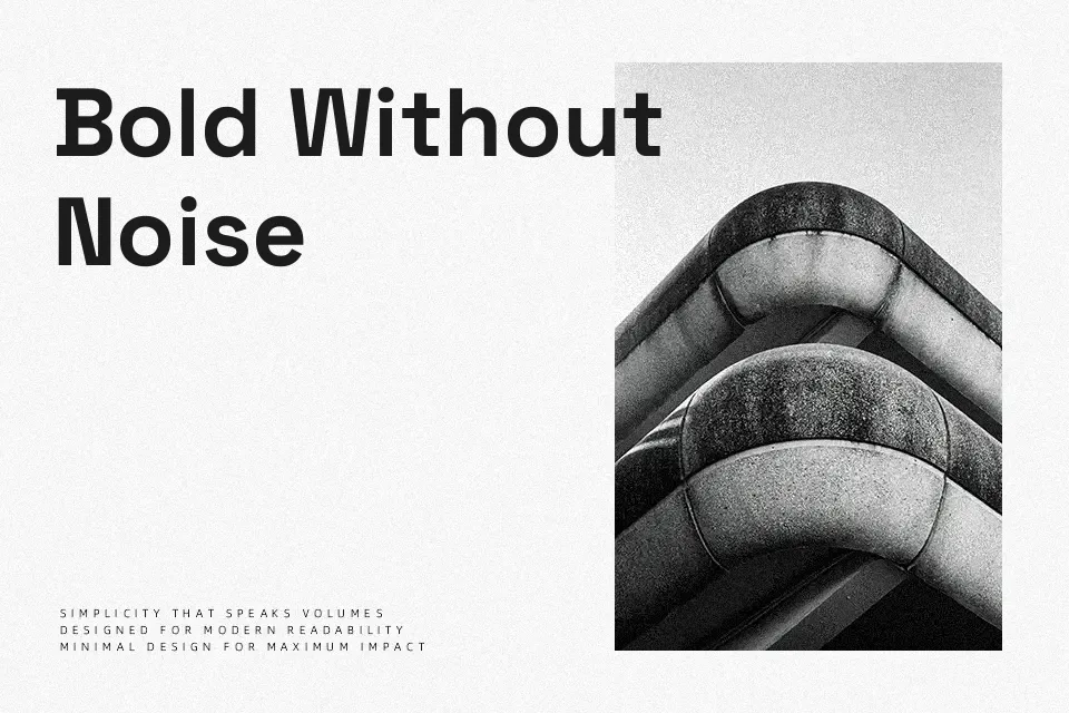
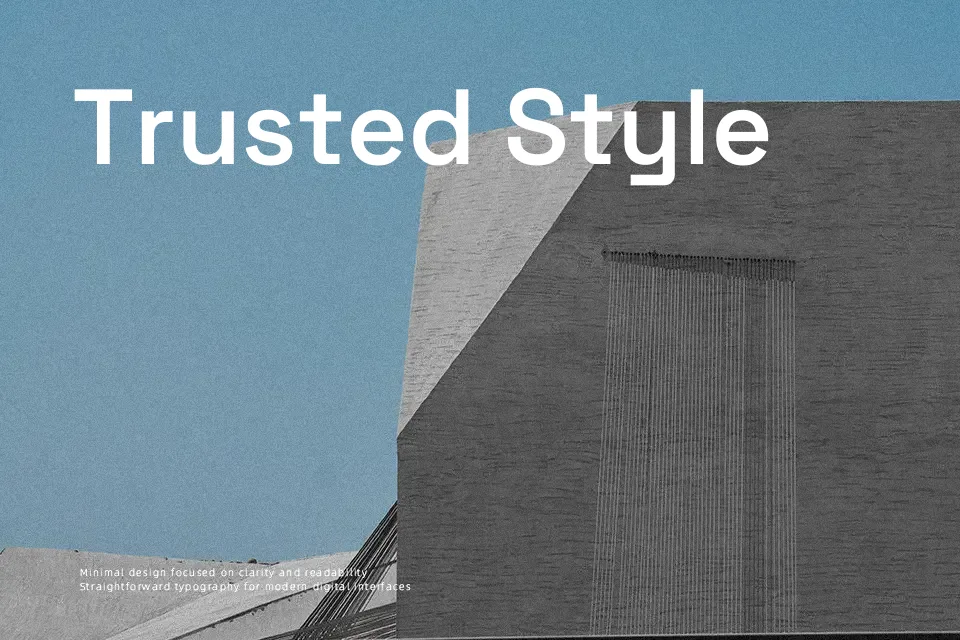
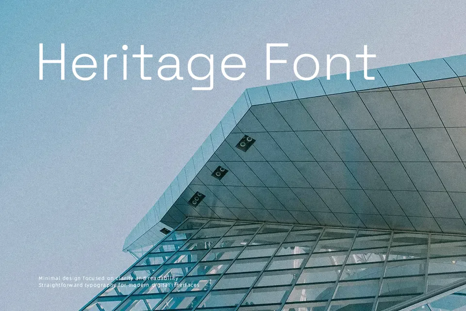
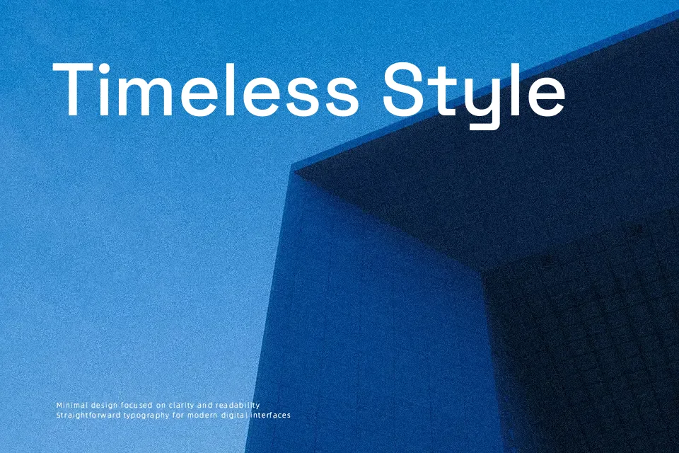
Space Grotesk translates the eccentric geometry of Space Mono into a proportional sans serif with a tighter rhythm, sturdy strokes, and generous counters that hold up well on screens. Its structure feels modern and restrained, but subtle angled terminals and unusual letterforms keep it from looking anonymous. In practice, it works especially well for product landing pages, UI labels, and editorial-style layouts where headings and body need to share a consistent voice across several weights. It can feel a bit too characterful for very conservative corporate documents or long, dense book text, so it suits confident, design-led brands more than strictly formal publishing.
Best For:
Interface and product websites with a contemporary tech tone
Editorial-style web layouts mixing headings and medium-length copy
Branding for startups and digital products wanting a clean but distinctive sans
Not Ideal For:
Highly traditional corporate reports or institutional documents
Long-print book interiors demanding completely neutral text typefaces
Projects needing decorative or script-like personality
Perfect for branding, editorial, and headline, with a clean and geometric style.
License
Gallery