Sofia Sans Extra Condensed Font
Free for Commercial UseAbout
Sofia Sans Extra Condensed belongs to a large wayfinding type system originally created for the city of Sofia, Bulgaria, combining tight horizontal spacing with open counters and a relatively tall x-height. Strokes feel rational and engineered, but small humanistic touches in curves and terminals keep it from looking sterile. On screen and signage it holds up at smaller sizes better than many condensed grotesques, though in long paragraphs the density can start to feel tiring. I tend to reach for it when space is genuinely limited—metro maps, transport apps, vertical navigation, mobile UI labels—rather than as a default text face for essays or books. If you already use neutral workhorses like other technical sans serifs, this family gives you a narrower, more urban-flavoured option without drifting into decorative territory.
Best For:
wayfinding signage and city maps
mobile and web UI labels where space is tight
transport, municipal and civic branding systems
stacked headlines in posters and editorial layouts
Not Ideal For:
long-form body text or dense reports
projects needing soft, decorative or handwritten character
logos that rely on highly distinctive letterforms
very small captions where extreme legibility is critical
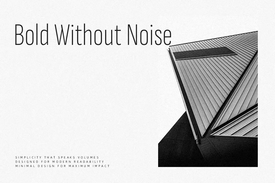
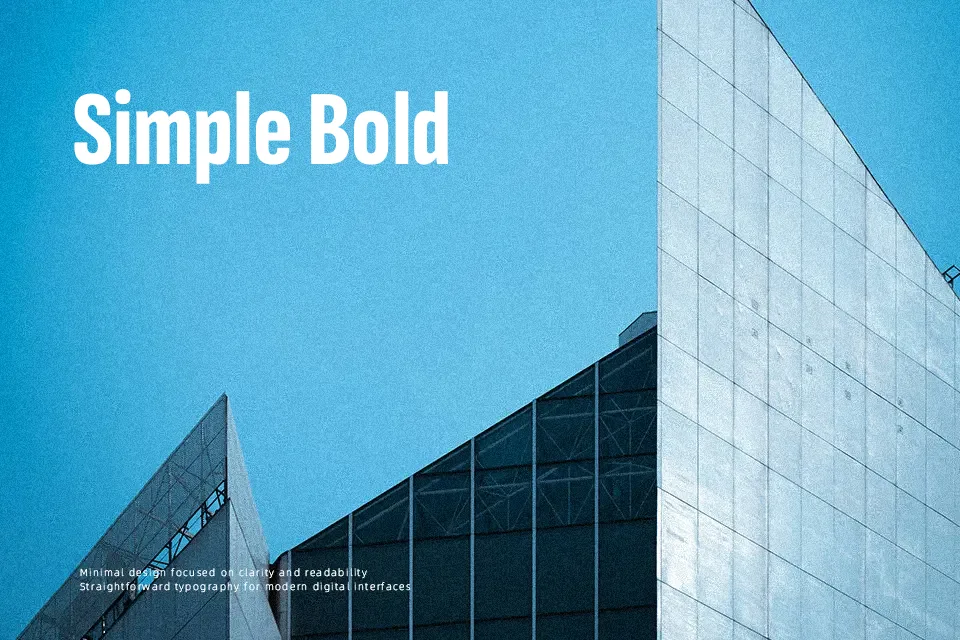
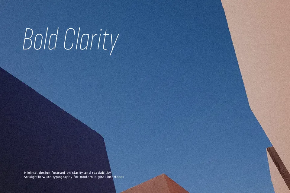
Perfect for branding, headline, and poster, with a clean and condensed style.
License
Gallery