Sofia Sans Condensed Font
Free for Commercial UseAbout
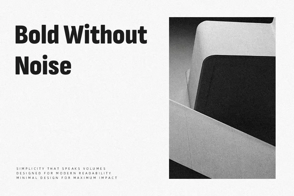
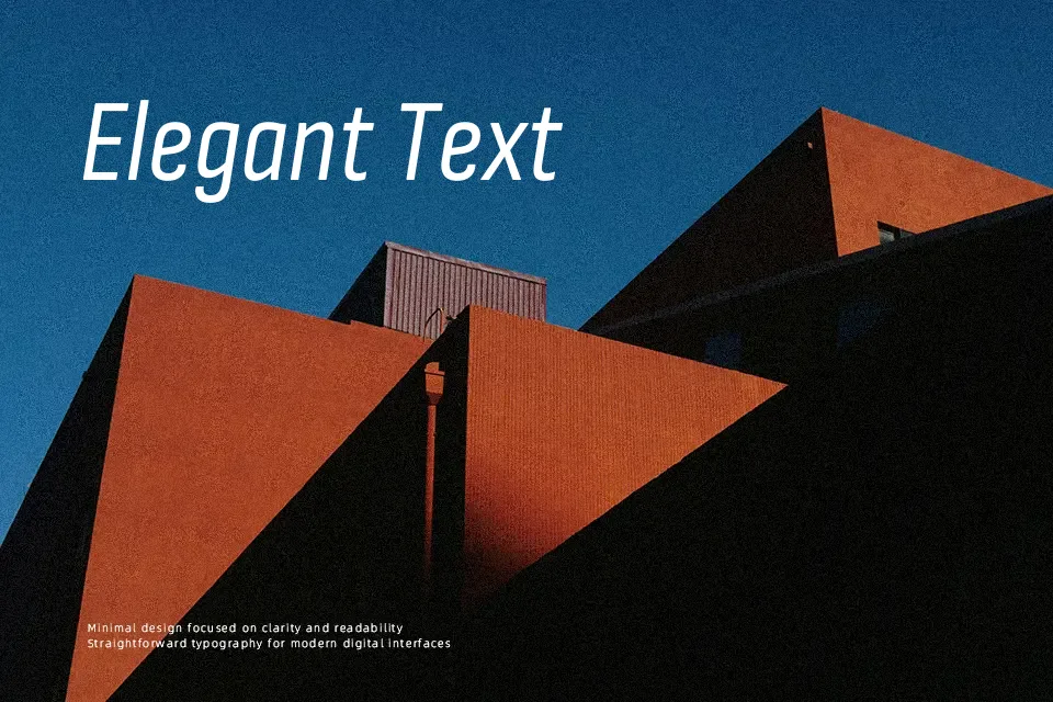
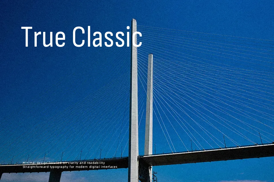
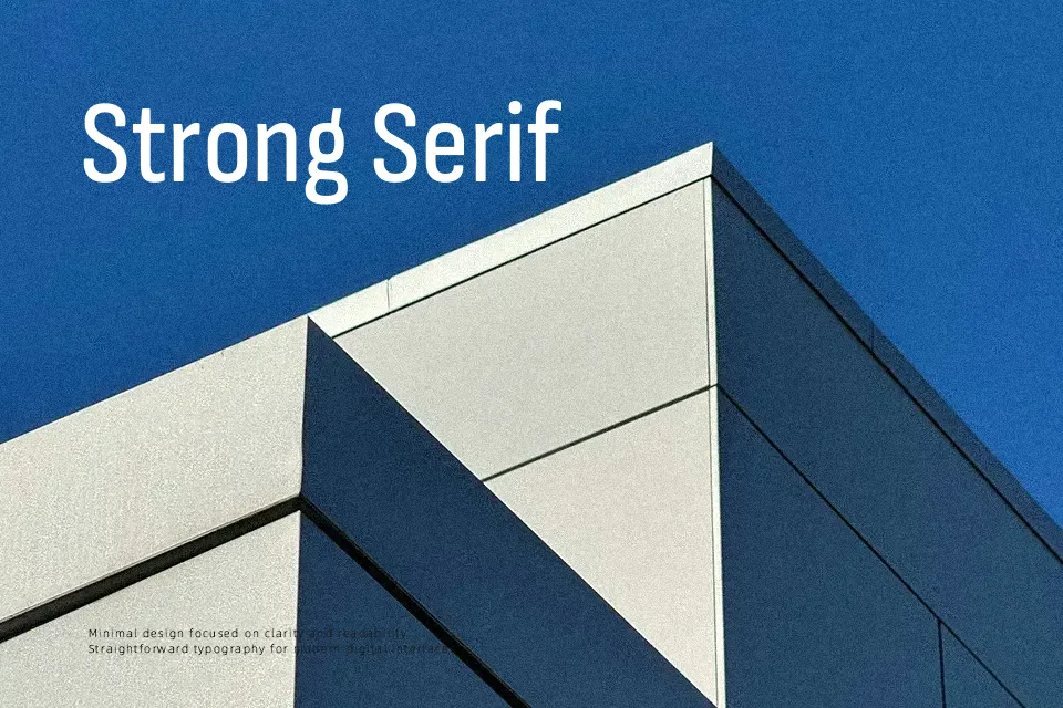
Sofia Sans Condensed combines tight horizontal proportions with an open x-height, so text feels compact but not cramped. Strokes are clean and mostly uniform, with subtle humanistic curves that soften the otherwise rational structure. In practice it works well for dense editorial columns, information-heavy dashboards, transit-style wayfinding, and branding systems that need many weights within a single family. It can, however, feel a bit stiff in very expressive or highly decorative settings, and long paragraphs in the thinnest weights may read as fragile on low-resolution screens. If you like the tone of workhorse neo-grotesques but want something narrower and more space-conscious, this family fills that gap without becoming cold or sterile.
Best For:
Navigation or transit-style signage where space is limited
Editorial layouts and data-dense reports with narrow columns
Branding systems needing many weights in a compact footprint
Not Ideal For:
Highly decorative or expressive display typography that needs strong personality
Very long-form reading on low-resolution screens at small sizes
Projects that rely on calligraphic or script-like warmth
Perfect for branding, editorial, and headline, with a clean and condensed style.
License
Gallery