Shippori Mincho Font
Free for Commercial UseAbout
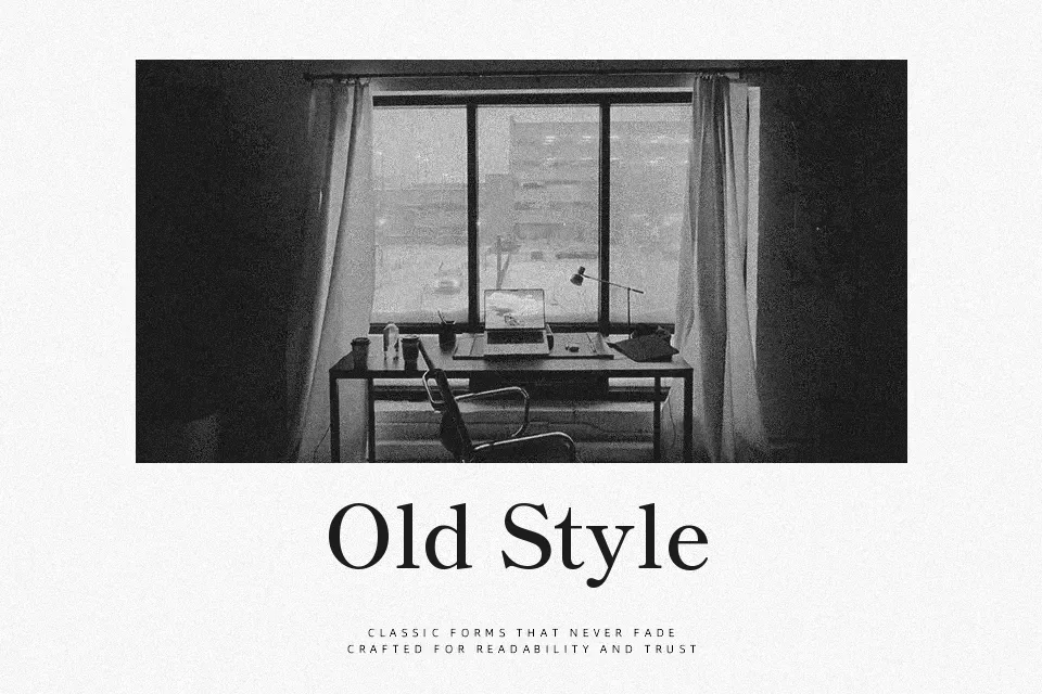
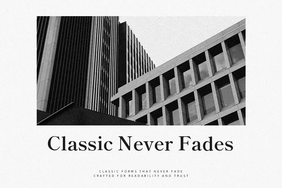
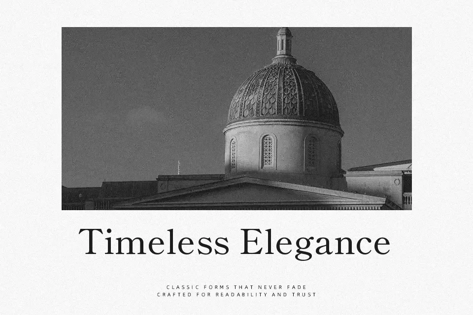
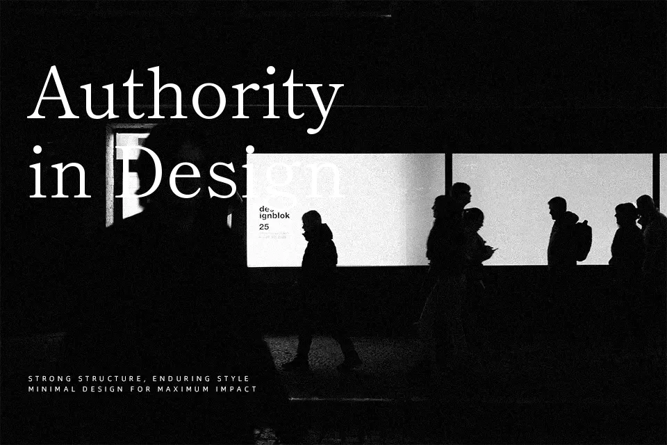
Shippori Mincho is a serif typeface inspired by traditional Japanese metal type, with moderate stroke contrast, softly rounded corners, and subtle ink‑trap touches that give paragraphs a relaxed, bookish rhythm. Text blocks stay steady and legible thanks to even counters and spacing, so it works nicely for essays, editorial features, and documentation where users sit with content for a while. Compared with harsher Mincho faces, it feels less stiff and slightly warmer, making it useful when you want formality without intimidation. It is less suited to loud, compressed headlines or kinetic layouts that rely on ultra-bold, geometric shapes, where its calm proportions can look understated or get visually lost.
Best For:
Long-form Japanese/Latin editorial layouts
Reading-heavy websites and blogs
Literary branding, book covers, and catalogs
Calm product or service documentation
Not Ideal For:
Highly condensed, space-starved headlines
Ultra-loud promotional banners
Playful kids graphics or cartoon visuals
Experimental kinetic typography
Perfect for body text, branding, and editorial, with a calm and serif style.
License
Gallery