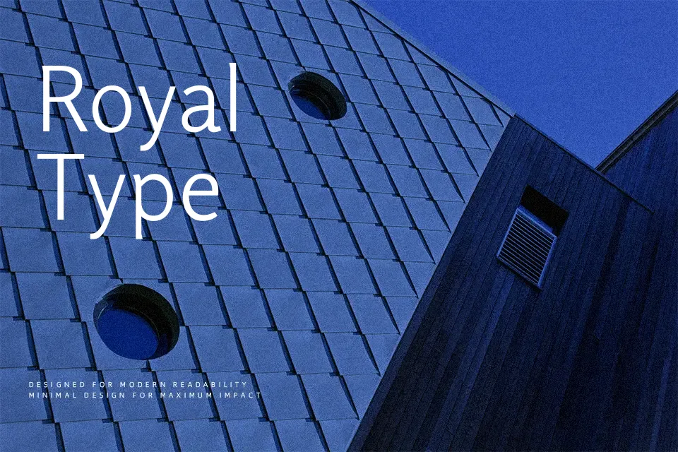
Rosario Font
Free for Commercial UseAbout
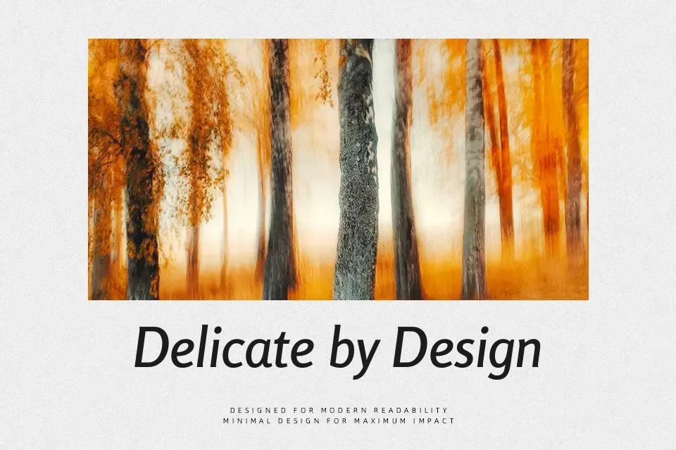
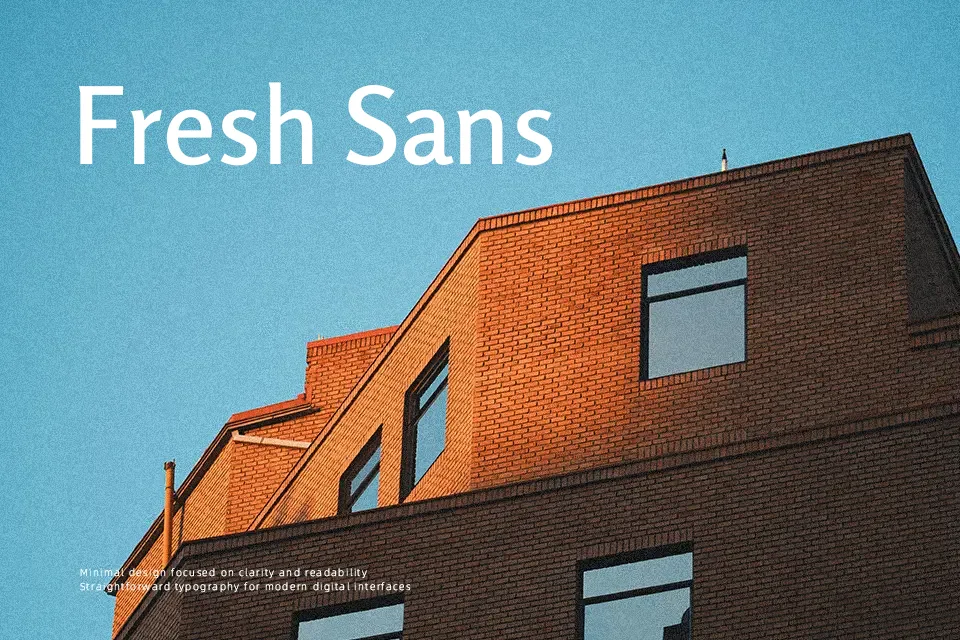
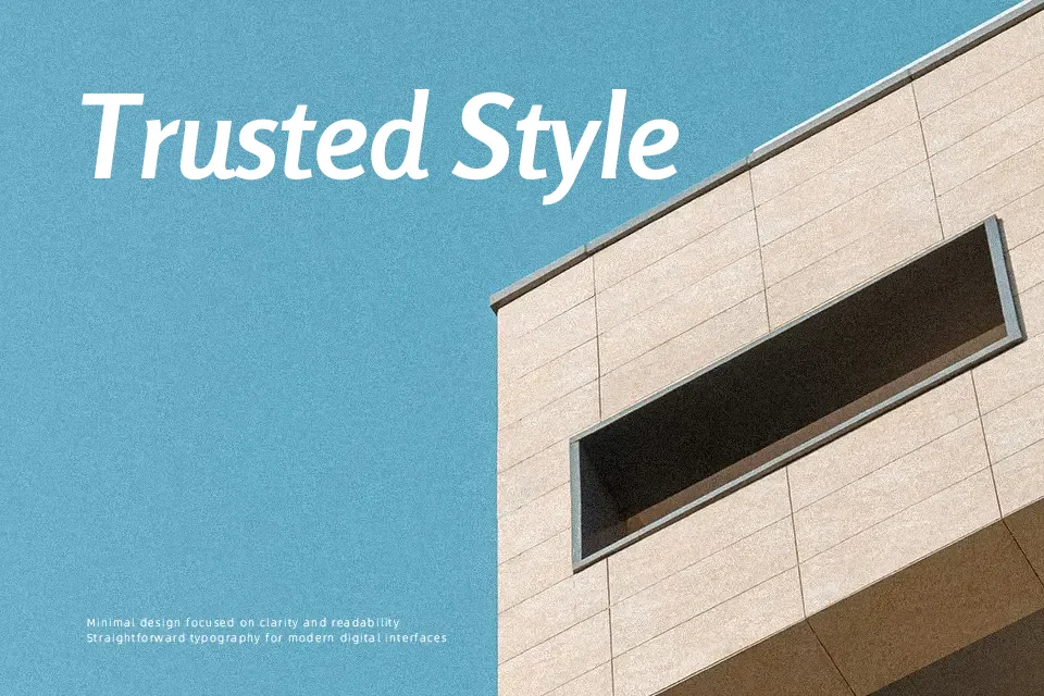
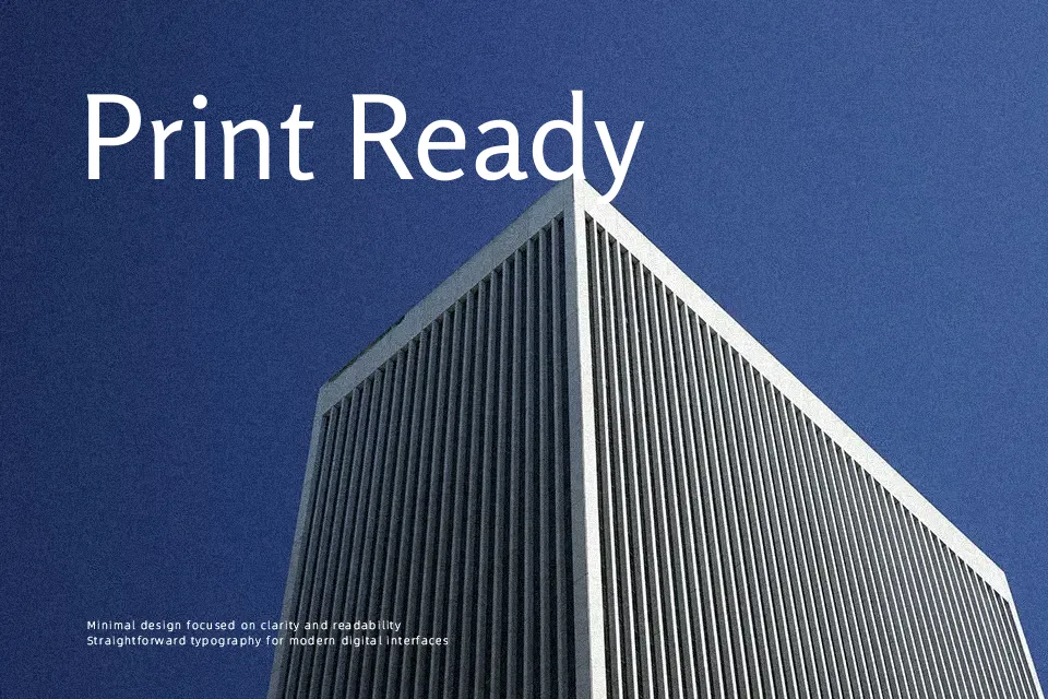
Rosario sits in that space between classic book typography and clean digital sans, with gentle stroke contrast, open counters, and slightly soft terminals that keep paragraphs readable even at small sizes. It carries a formal, editorial tone rather than a chatty one, so it feels natural in magazines, reports, academic journals, and content‑heavy websites where consistency matters. I tend to reach for it when I want a modern look that still respects traditional text rhythm, especially for bilingual layouts or long PDFs where some geometric sans serifs start to feel stiff. It is less convincing for ultra-expressive branding or loud display work, where its restraint can come across as too quiet.
Best For:
Editorial body text in magazines and journals
Text-heavy reports, theses, and long PDFs
Content-focused websites that need calm typography
Not Ideal For:
Highly expressive display logos or wordmarks
Loud promotional posters needing strong visual impact
Playful kids or novelty layouts
Perfect for body text, branding, and business card, with a clean and sans serif style.
License
Gallery