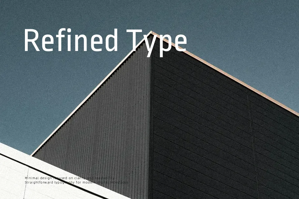
Ropa Sans Font
Free for Commercial UseAbout
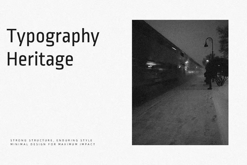
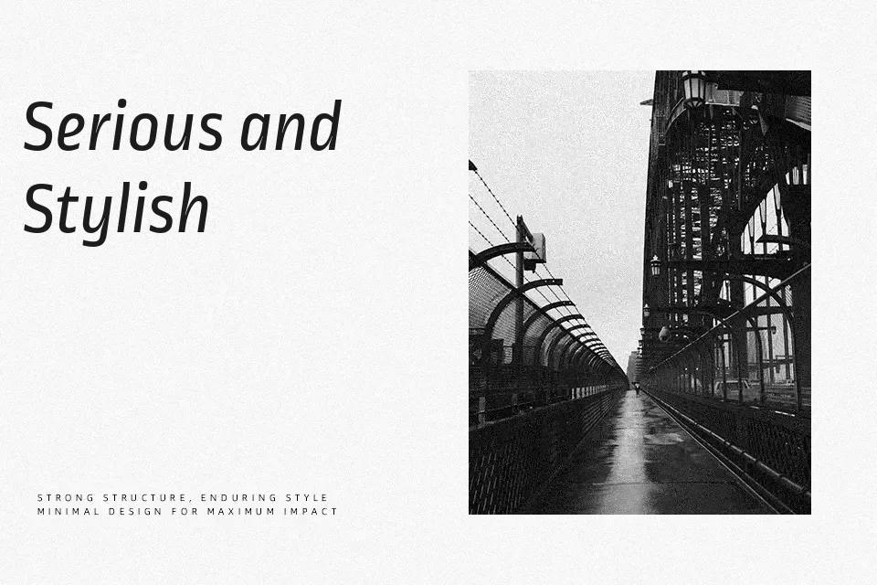
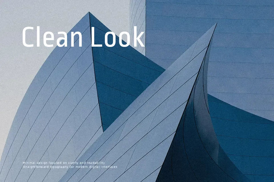
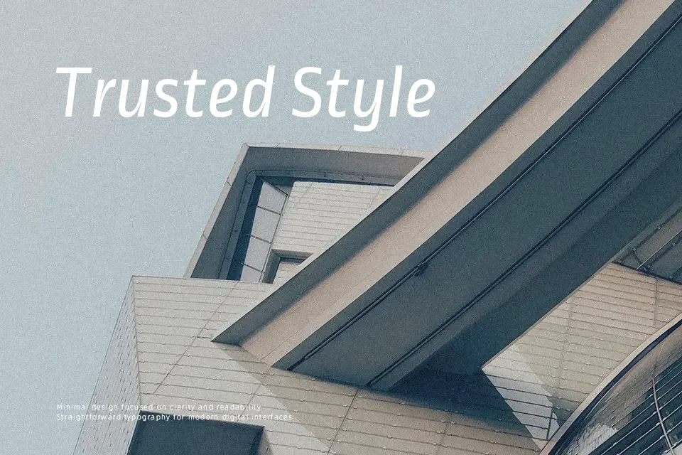
Ropa Sans blends a technical backbone with softer humanist details: steady verticals, modest stroke contrast, and slightly condensed proportions that save space without feeling cramped. The italics feel more expressive than the upright, with quirky curves that add personality in highlights and subheads. It stays readable at small sizes, so it handles interface text, compact editorial layouts, and product descriptions with little fuss. Where it can fall short is in highly formal corporate identities or long-print book interiors, where its casual undertone and limited weight range may not provide the gravitas or typographic hierarchy you might want.
Best For:
UI labels and settings menus in apps and dashboards
Editorial-style blog layouts and magazine-inspired websites
Friendly product landing pages and light-touch branding systems
Not Ideal For:
Very formal corporate identities needing strict neutrality
Dense long-form book interiors with complex hierarchies
Loud display work that relies on heavy or ultra-condensed weights
Perfect for body text, branding, and editorial, with a calm and condensed style.
License
Gallery