Roboto Slab Font
Free for Commercial UseAbout
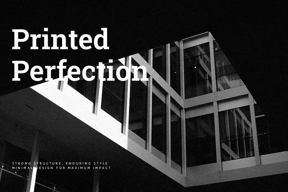
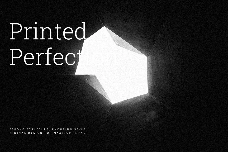
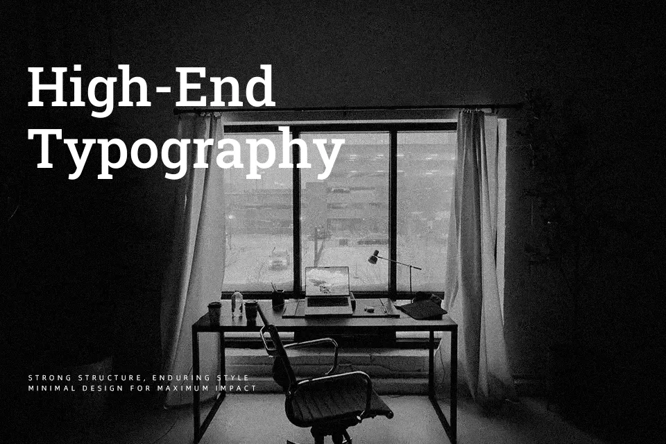
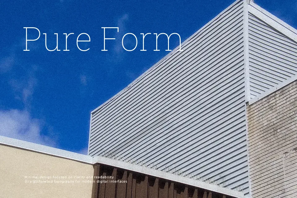
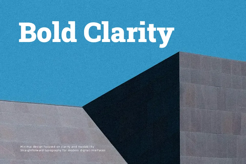
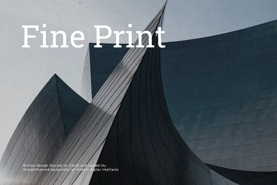
Roboto Slab combines a mechanical skeleton with blunt slab serifs and open curves, so text feels orderly without becoming stiff. Strokes are relatively even, spacing is consistent across weights, and the counters stay open, which keeps paragraphs readable on both screens and print. Visually it leans modern and functional rather than decorative, so it suits news-style editorial, documentation sites, dashboards, and product storytelling where clarity matters more than personality. I tend to use it for headlines and short sections of body text; in very long-form reading or highly expressive branding, its rigid rhythm can feel a bit dry compared to more humanist serifs.
Best For:
UI dashboards and product pages with a structured feel
Editorial-style blogs and tech articles that need a solid voice
Headlines paired with a neutral sans in design systems
Not Ideal For:
Highly expressive branding that needs strong personality
Very long-form literary text where a softer serif reads better
Playful kids or craft designs that rely on decorative letterforms
Perfect for body text, editorial, and headline, with a clean and serif style.
License
Gallery