Amiko Font
Free for Commercial UseAbout
Amiko has compact proportions, relatively open counters, and even stroke contrast that keep paragraphs steady and readable on low‑resolution or mobile displays. Letterforms lean toward a humanist structure, so text feels functional but not cold, with spacing tuned for dense copy rather than airy layouts. Devanagari and Latin have been drawn to sit comfortably together, which is useful for bilingual interfaces or content where scripts frequently mix. It shines when you need clarity at small sizes, but looks a bit plain for expressive branding or highly character‑driven titles.
Best For:
bilingual UI text
long-form web articles
app interfaces with small labels
documentation and knowledge bases
Not Ideal For:
expressive display logos
luxury editorial branding
large hero headlines needing strong personality
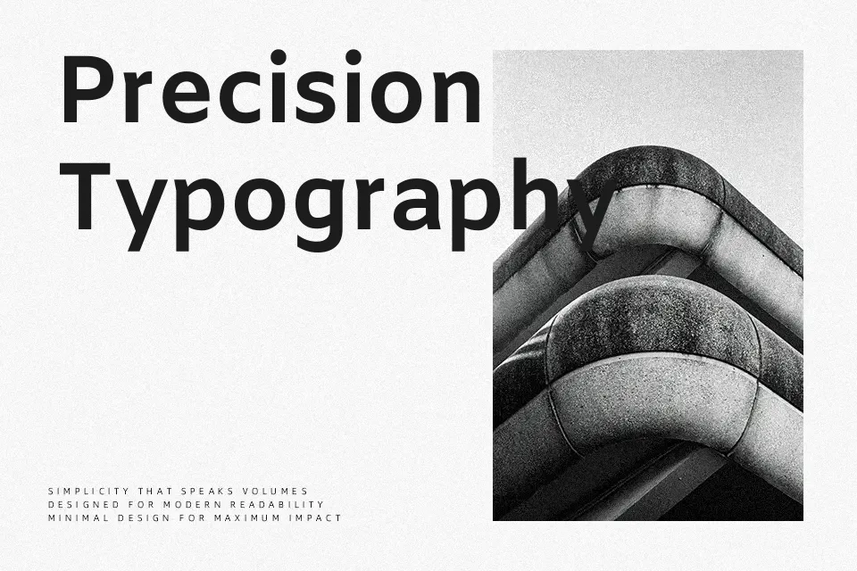
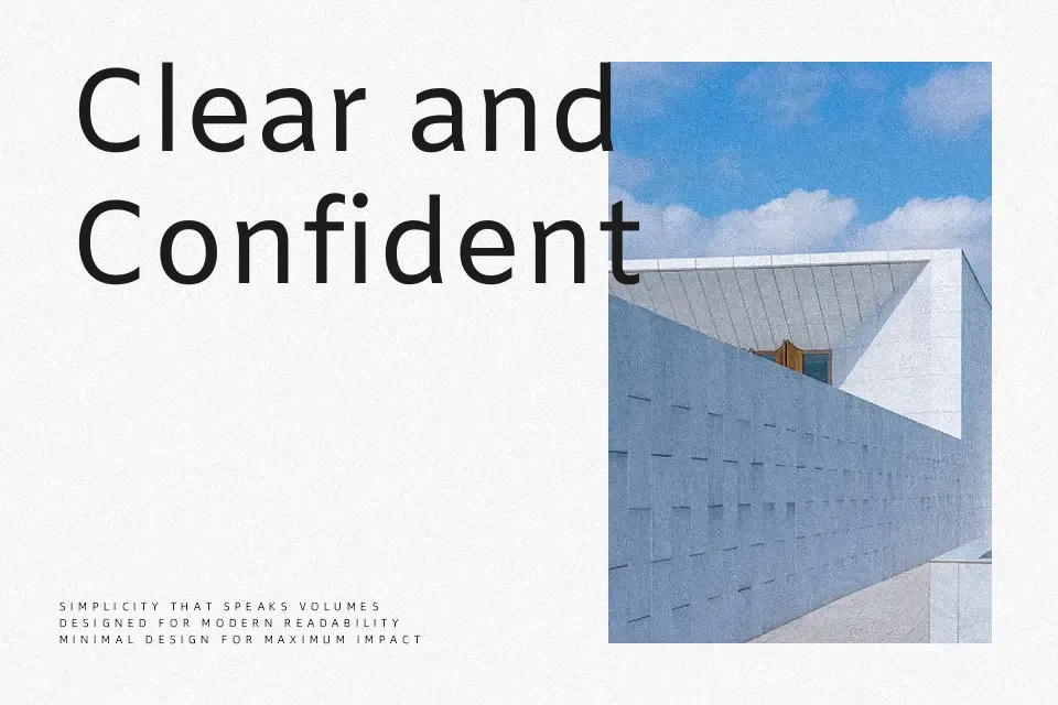
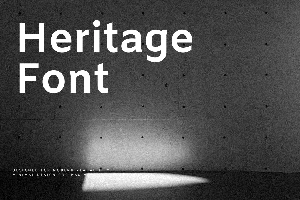
Perfect for body text, editorial, and headline, with a calm and geometric style.
License
Gallery