Reddit Sans Font
Free for Commercial UseAbout
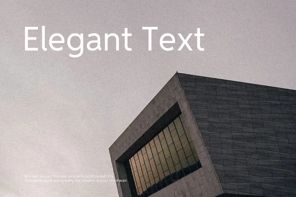
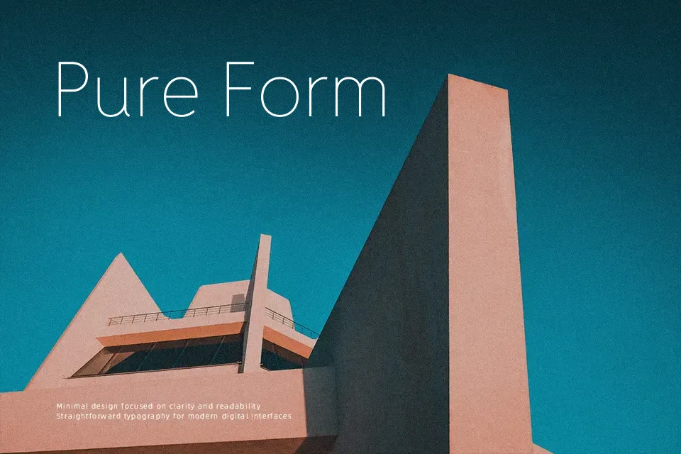
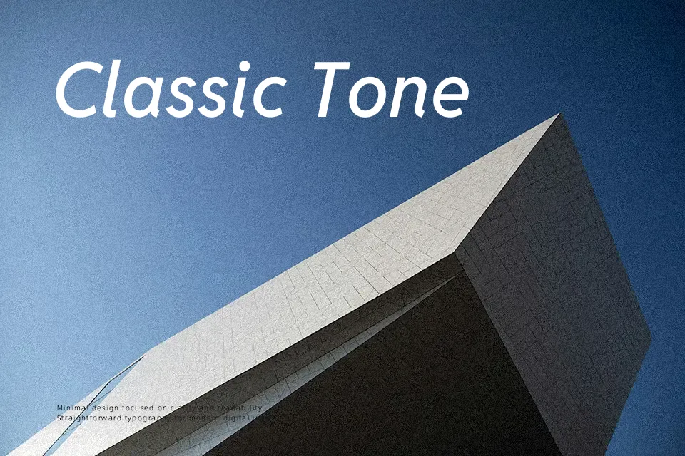
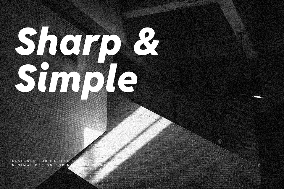
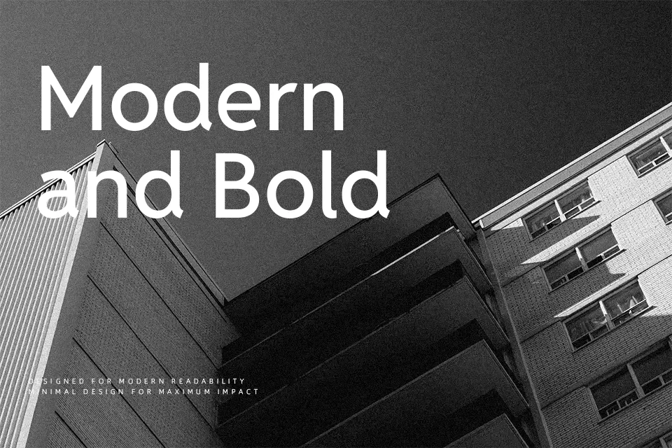
Reddit Sans Font is a humanist sans serif with open counters, moderate stroke contrast, and a weight range that runs from light to very heavy, supported by matching italics. Its spacing feels tuned for interfaces and continuous reading, so menus, comments, and app content stay readable without looking mechanical. The shapes mix a geometric backbone with softer curves, which gives it a contemporary but not cold tone that works nicely for product copy, dashboards, and brand systems that live mostly online. It tends to shine in ecosystems where type needs to scale fluidly across sizes, but it can feel too informal or “web-native” for very traditional print identities or ornamental editorial mastheads.
Best For:
UI dashboards and product interfaces on web or apps
Long-form reading on websites and community platforms
System-wide typography in digital products and design systems
Not Ideal For:
Highly ornate editorial mastheads or fashion magazines that need strong display personality
Heritage or very formal print branding where a classic serif tone is expected
Logo wordmarks that rely on distinctive decorative letterforms rather than functional clarity
Perfect for body text, branding, and headline, with a clean and geometric style.
License
Gallery