Raleway Dots Font
Free for Commercial UseAbout
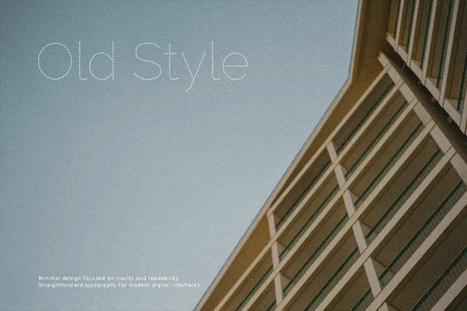
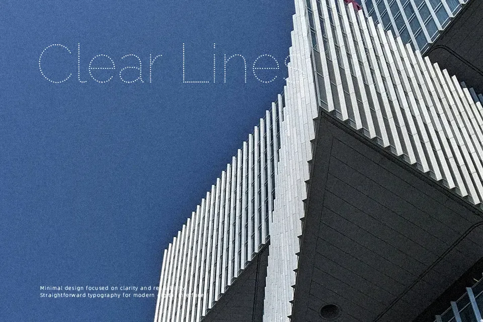
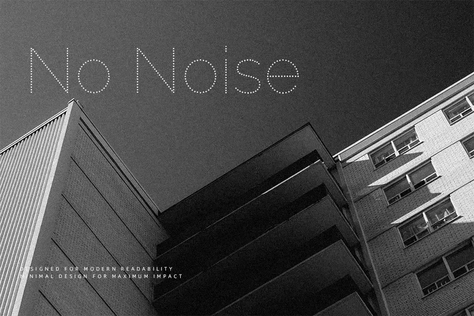
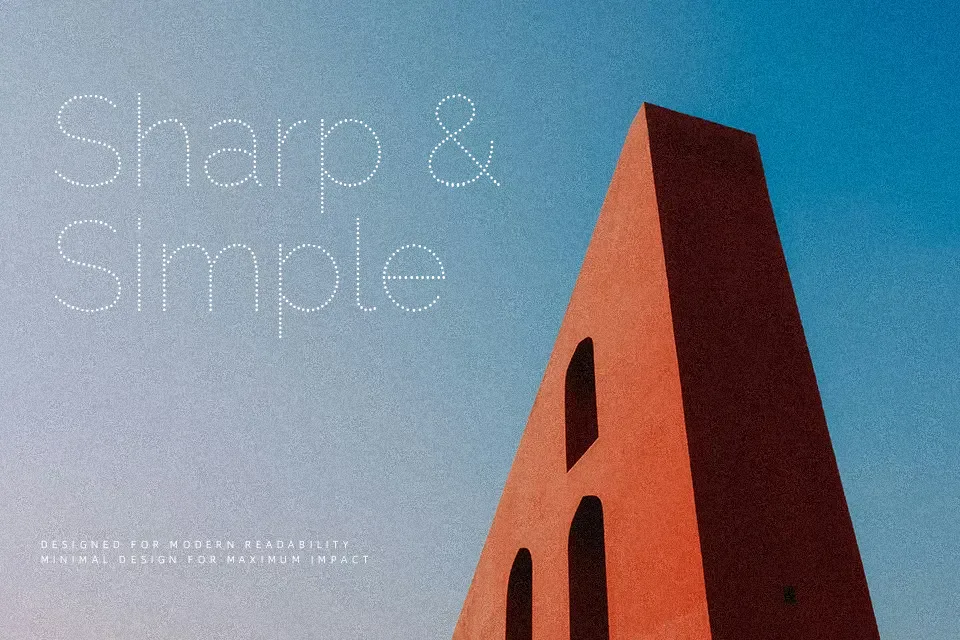
Raleway Dots takes the geometric skeleton of Raleway and redraws it as tidy, evenly spaced dots, so letters feel light but still readable at medium sizes. The single regular weight has open counters, generous spacing, and a clean rhythm that holds up on screens and simple print work. It works best for short headlines, wordmarks, or section titles where the dotted texture is part of the concept, such as music artwork, kids’ event posters, or decorative labels. For dense body copy, small UI labels, or serious corporate reports, the broken strokes quickly become tiring to scan and can look gimmicky, so a solid sans serif is a better companion there.
Best For:
Short headlines and title graphics with a playful accent
Posters, flyers, and event graphics that need a light dotted texture
Brand marks or wordmarks paired with a solid sans serif family
Not Ideal For:
Long paragraphs or small body text where dots reduce legibility
Formal corporate or legal documents that require a more serious tone
Highly detailed UI where crisp, continuous strokes matter
Perfect for branding, headline, and kids, with a creative and display style.
License
Gallery