Quando Font
Free for Commercial UseAbout
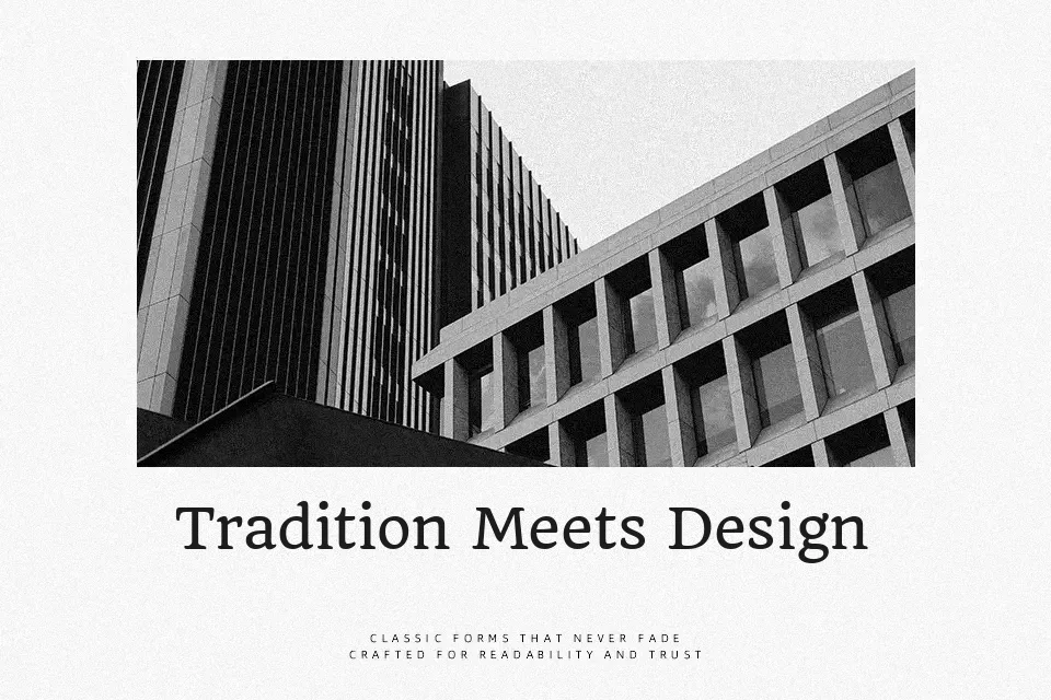
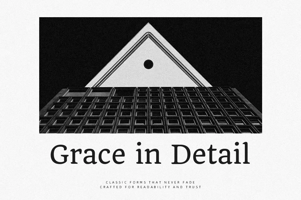
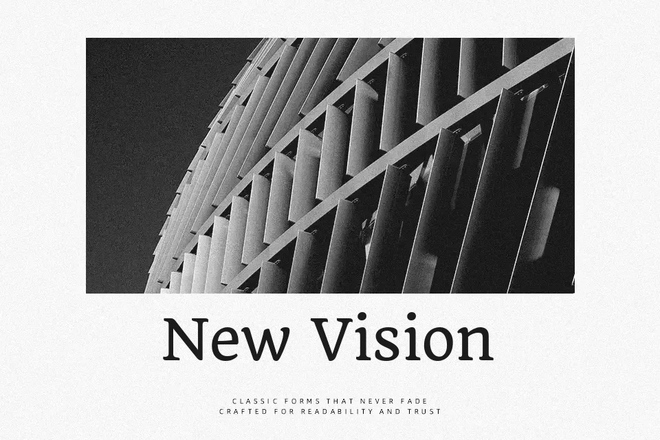
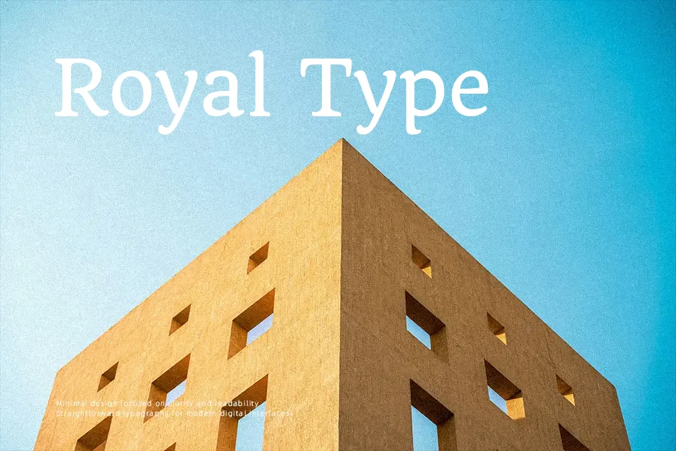
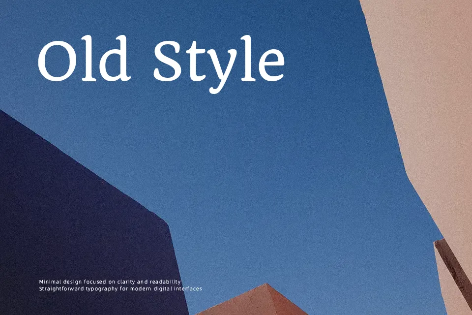
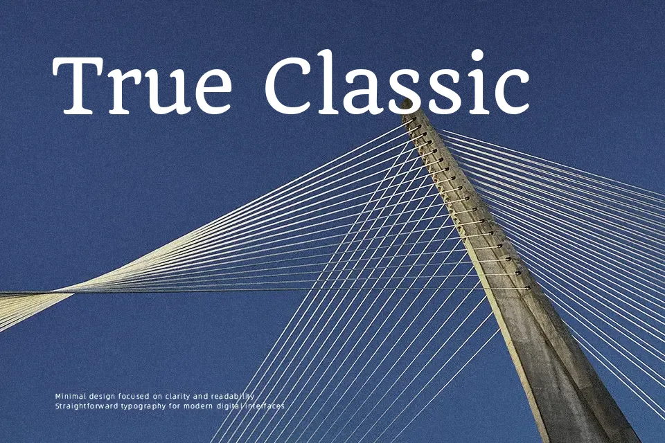
Quando is a serif text typeface influenced by brushy lettering from mid‑century Italian posters, so its curves feel a bit hand-painted rather than purely mechanical. The strokes are moderate in weight, contrast is low, and the x‑height is generous, which helps paragraphs hold together on smaller screens. Notable letters like the a, g, x, and Q give copy a friendly, slightly nostalgic voice without drifting into novelty. In practice it suits editorial layouts, reading-heavy websites, and brand materials that need a traditional backbone but still feel approachable; I would be cautious using it for dense data tables, tiny legal text, or ultra-minimal tech UI where a crisper serif or sans would stay cleaner.
Best For:
long-form editorial on web and tablet,brand storytelling pages and about sections,reading-friendly blog themes,print pieces with a soft vintage tone
Not Ideal For:
very small legal or UI microcopy,highly technical dashboards or data tables,ultra-modern tech branding,compact mobile interfaces with tight spacing
Perfect for advertising, body text, and branding, with a calm and serif style.
License
Gallery