Prata Font
Free for Commercial UseAbout
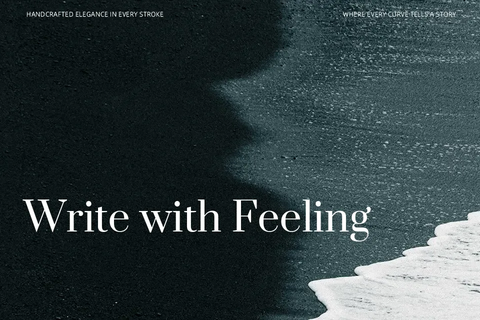
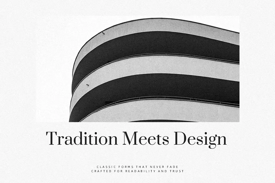
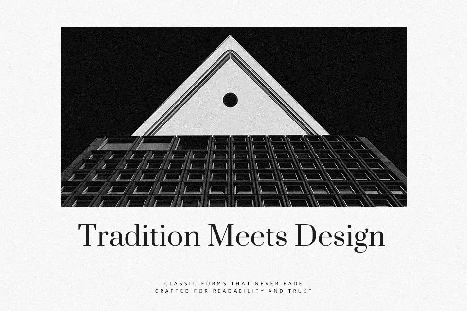
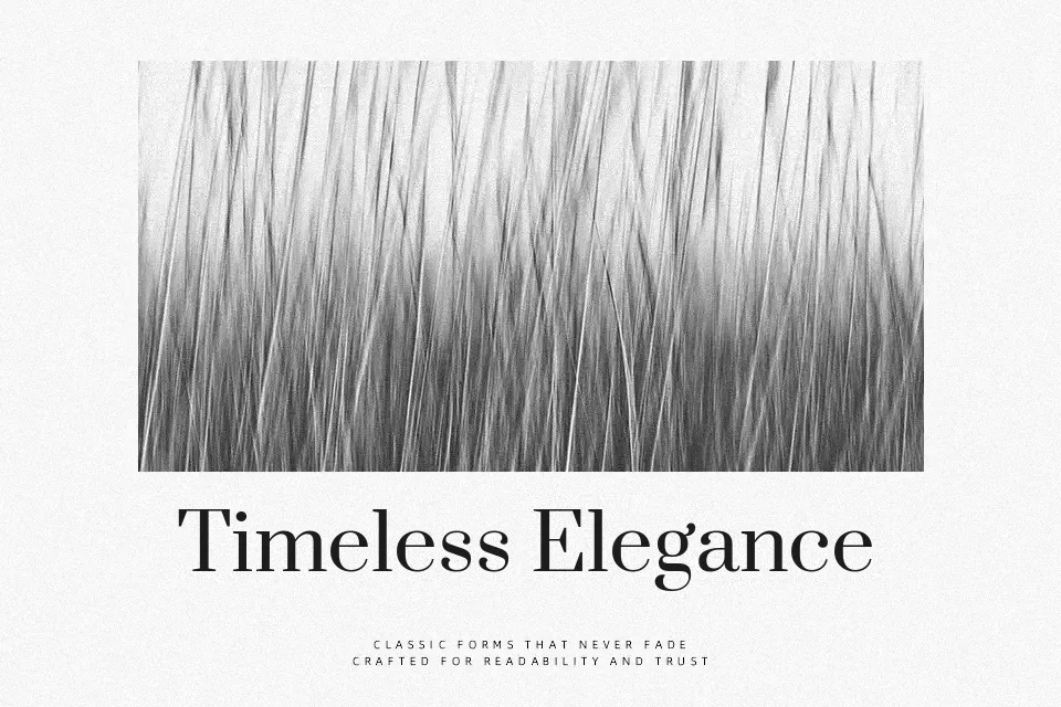
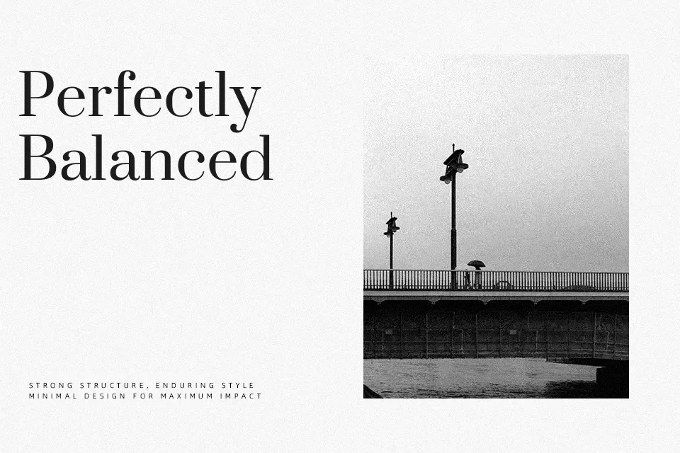
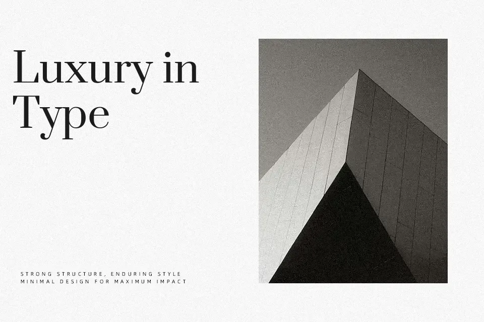
Prata is a Didone-style serif with lean verticals, fine hairlines, and crisp triangular serifs that end in subtle teardrop terminals, giving text a poised, high-fashion feel. Its single regular weight leans toward display use, where the high contrast can really show up in headlines, hero typography, and cover treatments rather than dense paragraphs. When you want something elegant but not fragile, it lands in a sweet spot between classic book serifs and more decorative fashion faces. It can feel stiff in playful or low-contrast layouts, and it is not the best option when you need multiple weights or small-size body copy.
Best For:
Editorial headlines and feature titles
Brand-focused hero text on websites or landing pages
Logo wordmarks for refined, boutique-style brands
Posters or packaging that lean into a dramatic, fashion-forward look
Not Ideal For:
Long body text at small sizes
Projects requiring multiple weights or styles from the same family
Casual, playful, or kids-oriented designs where the contrast feels too formal
Perfect for body text, branding, and editorial, with a classic and serif style.
License
Gallery