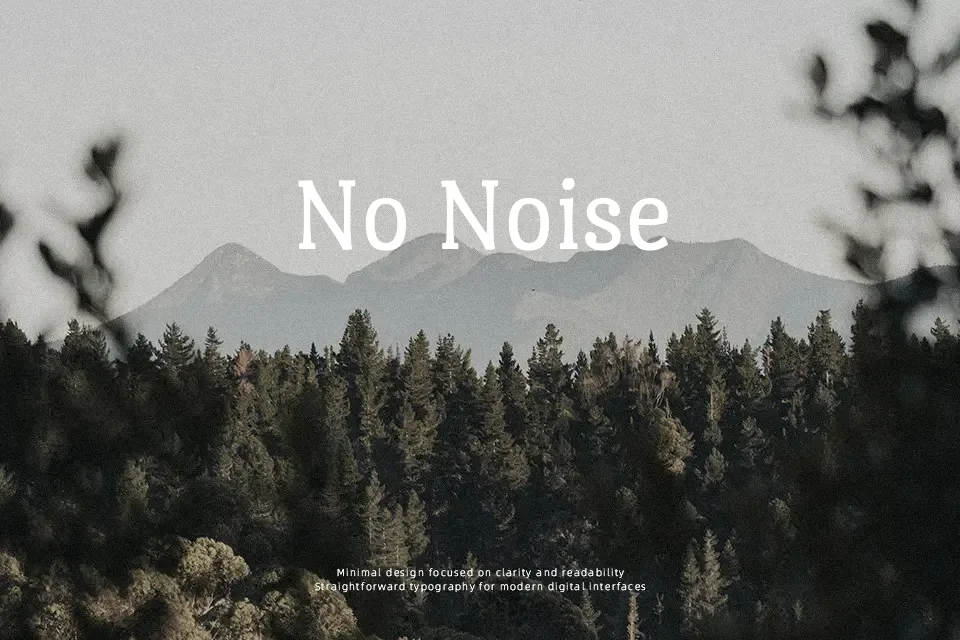
Port Lligat Slab Font
Free for Commercial UseAbout
Port Lligat Slab combines a condensed structure, soft modulation of strokes, and heavy slab serifs with rounded terminals, so text feels compact but still readable on screens and in print. Its vertical stress and even rhythm give paragraphs a slightly groovy, handcrafted character rather than a cold, mechanical tone. In practice, it shines in food or travel branding, packaging, and short editorial pieces where you want a subtle Mediterranean flavor, similar in use to other humanist slab serifs but with more warmth. For very dense body copy or tiny UI labels, the tight width and strong personality can become tiring, so it works better as a supporting text face than a universal workhorse.
Best For:
short editorials and feature intros with personality
food, beverage, or artisanal product branding and packaging
headlines and subheads in travel or lifestyle layouts
screen-based reading where a narrow slab serif is desired
Not Ideal For:
long-form books or reports with heavy continuous reading
tiny UI labels or dense data tables where neutrality matters
highly formal corporate documents requiring a strict tone
Perfect for branding, editorial, and headline, with a creative and serif style.
License
Gallery