Port Lligat Sans Font
Free for Commercial UseAbout
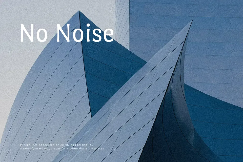
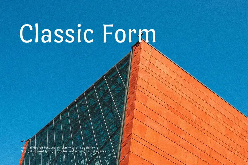
Port Lligat Sans is a narrow sans serif with gentle stroke modulation, tight rhythm, and a noticeable vertical stress that gives text a slightly groovy, flowing movement. Its structure feels informal yet controlled, so it reads comfortably in short paragraphs and UI labels while still standing out in titles and callouts. Compared to more neutral grotesque or geometric sans fonts, this family leans more decorative and characterful, which works nicely for branding elements, blog headers, and expressive captions rather than highly corporate interfaces. If you need a strictly formal, invisible text face or very heavy hierarchy in multiple weights, this single-style design will feel limiting.
Best For:
expressive headlines and titles on websites
short editorial intros and pull quotes
branding for creative or lifestyle projects
on-screen captions where a narrow width helps
Not Ideal For:
large blocks of dense body copy in print
highly formal or corporate brand systems
interfaces requiring multiple weights and styles
very small text where details may get lost
Perfect for body text, branding, and headline, with a clean and condensed style.
License
Gallery