Poor Story Font
Free for Commercial UseAbout
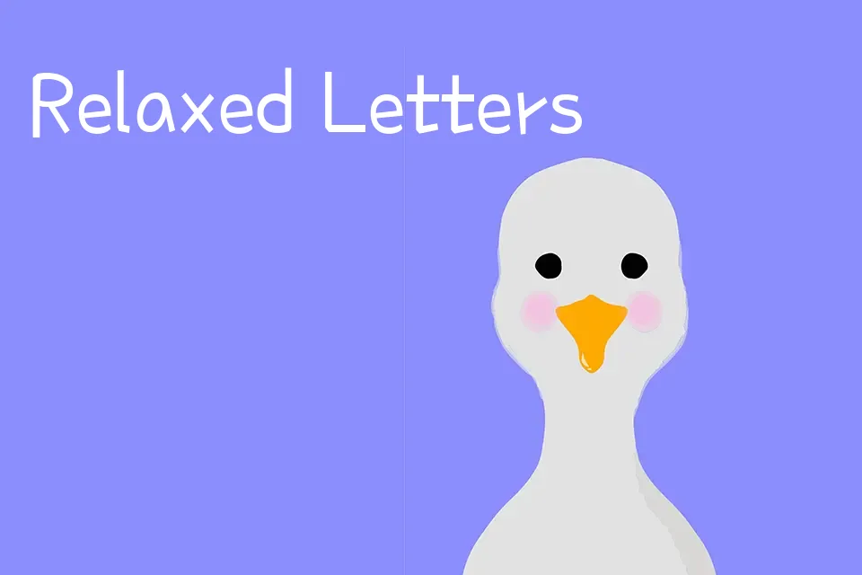
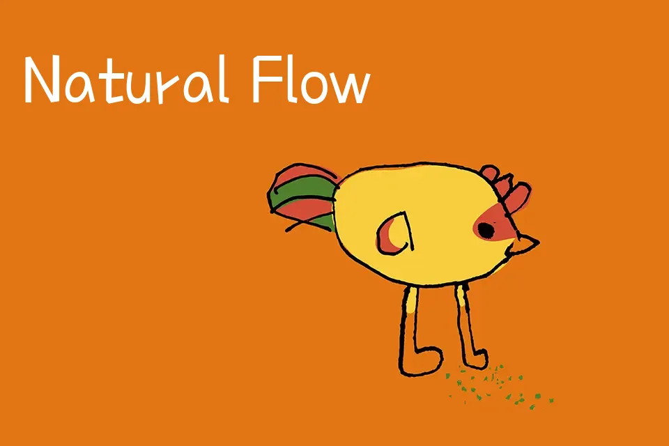
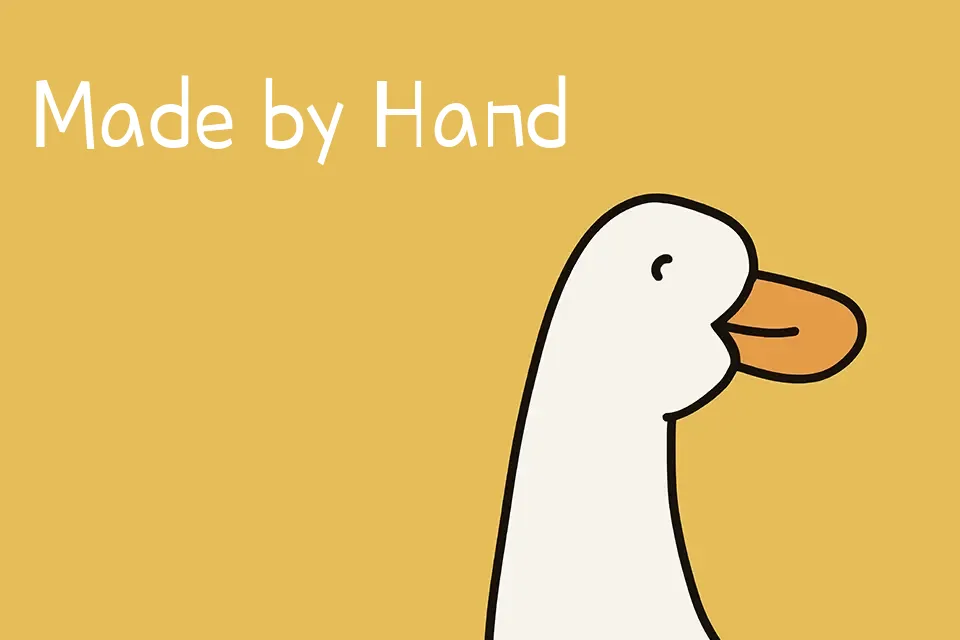
Poor Story Font mixes Korean and Latin letterforms with a loose, hand-drawn construction, showing varied stroke widths, slightly shaky curves, and open counters that feel like quick notes in a sketchbook. Its single regular weight sits between light and medium, with generous vertical rhythm but somewhat irregular spacing that adds character more than polish. The overall mood is casual and playful, closer to comic or kids handwriting than to a polished script, so it shines in headings, stickers, social posts, or school-themed graphics where you want a chatty tone. It tends to look messy in dense paragraphs or serious editorial layouts, so it is better treated as an accent or display face rather than your main reading text.
Best For:
playful headings on kids or school posters
casual captions on social media graphics
friendly display text in comics or illustrated stories
lighthearted branding for snacks,toys,or hobby projects
Not Ideal For:
long-form body text or dense paragraphs
formal corporate or editorial documents
interfaces that demand strict legibility at very small sizes
luxury or highly minimalist branding systems
Perfect for branding, headline, and kids, with a creative and comic style.
License
Gallery